
Dash Creative, a prominent digital agency, has officially unveiled its comprehensive rebrand and a cutting-edge new website, signaling a strategic shift towards a more distinctive and immersive digital presence. The overhaul, which culminated after several months of intensive development, is anchored in a novel concept dubbed "magnetic commerce," aiming to create digital experiences that not only inform but also inherently draw users in. This strategic move positions Dash Creative at the forefront of innovative web design, showcasing their prowess in blending sophisticated aesthetics with advanced technical execution.
The impetus for the rebrand had been building for some time. The agency recognized the evolving landscape of digital marketing and the increasing need for brands to articulate their unique value proposition with clarity and impact. Their objective was not merely to refresh their visual identity but to fundamentally redefine what they do and how they communicate it. This internal introspection led directly to the "magnetic commerce" concept—a philosophy that posits truly great digital experiences possess an inherent pull, captivating audiences beyond mere functionality. This core idea became the guiding principle for every subsequent design and development decision, permeating the new logo, user interface elements, and, most notably, the website’s dynamic interactive features.
Conceptualizing a New Identity: The Genesis of Magnetic Commerce
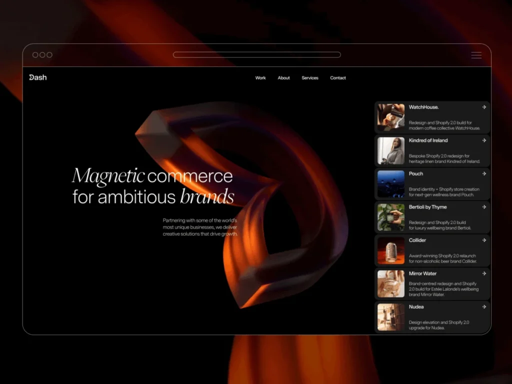
The concept of "magnetic commerce" rapidly took shape, crystallizing the agency’s ambition to craft digital solutions that are irresistibly engaging. It transcends traditional e-commerce or informational websites, suggesting a deeper, more visceral connection between the user and the brand. This metaphor of attraction and engagement was meticulously translated into the new brand identity, starting with the logo itself. The redesigned emblem features a subtle yet powerful visual cue: a part of the "D" in Dash is depicted as being pulled inward, as if by an unseen magnetic force. This singular detail was more than just a stylistic choice; it was a deliberate embodiment of the "magnetic commerce" principle and served as the foundational element from which nearly all subsequent design decisions emanated.
Once the 2D logo concept was established, the natural progression was to render it as a rotating 3D object on the website. This move allowed the concept to manifest interactively. The most intuitive interaction that emerged was a cursor-driven pull effect: as a user’s cursor hovers over the 3D logo, it visibly reacts, drawing inward. This seemingly small detail was pivotal, setting the overarching tone for how motion and interactivity would be integrated throughout the entire site, ensuring a cohesive and conceptually driven user experience. It underscored the agency’s commitment to interaction that supports the core brand narrative rather than merely serving as decorative flourish.
Design Principles and User Experience Crafting
Beyond the interactive logo, Dash Creative adopted several key design principles to shape the user interface. A significant influence came from iOS design paradigms, particularly in the handling of cards and Call-to-Actions (CTAs). Project cards, for instance, were intentionally designed to evoke the familiar, tactile feel of iOS notifications. This choice aimed to create an experience that was not only intuitive and user-friendly but also subtly unexpected within the context of a professional services website. The familiarity of the design pattern, combined with its application in a novel environment, contributes to the site’s overall distinctiveness.

The design process was further guided by a set of strict brand guidelines. While constraints might typically be viewed as limitations, for Dash Creative, they proved to be immensely beneficial. These guidelines acted as a critical anchor, preventing design decisions from straying off-course and instead pushing the team towards more considered, purposeful solutions. This disciplined approach ensured that every visual and interactive element consistently reinforced the "magnetic commerce" concept and the overall brand identity.
The entire project, from initial concept to final launch, spanned a period of several months. Interestingly, the core "magnetic commerce" concept and its visual representation landed relatively quickly. The bulk of the project timeline, however, was dedicated to the meticulous refinement of content and the intricate development of animations. This allocation of resources highlights Dash Creative’s commitment to not only innovative ideas but also flawless execution, recognizing that even the most brilliant concepts falter without precise implementation and compelling narrative.
The Technological Foundation: A Stack for Innovation
To bring their ambitious vision to life, Dash Creative leveraged a robust and versatile technology stack, carefully chosen to balance creative freedom with technical efficiency and scalability.
- Figma for Design: For the design phase, Figma served as the central hub. Its collaborative features and systematic approach were invaluable, especially given the tightly defined brand guidelines. Figma allowed the team to maintain consistency across typography, spacing, and components, facilitating rapid iteration without compromising the integrity of the design system. This ensured a unified visual language that seamlessly translated the "magnetic commerce" concept into tangible design elements.
- Webflow for the Build: The primary platform for the website’s construction was Webflow. This choice was strategic, serving a dual purpose: it allowed Dash Creative to efficiently build their own site while simultaneously demonstrating to prospective clients the extensive capabilities of the Webflow platform. Most of the website’s interactions are powered by Webflow’s native animation system, showcasing its power in creating dynamic and engaging user experiences directly within a visual development environment.
- GSAP for Advanced Interactions: While Webflow’s native animations are powerful, certain highly precise and nuanced interactions required a more granular level of control. For these instances, the GreenSock Animation Platform (GSAP) was integrated. GSAP enabled the development of complex cursor-driven behaviors and intricate sequencing that extended beyond Webflow’s inherent capabilities, adding layers of sophisticated motion and responsiveness to the site.
- Custom WebGL for the Hero Background: The most technically demanding element of the website, and a standout feature, is the hero background. This highly interactive component necessitated custom WebGL development, a testament to Dash Creative’s commitment to pushing the boundaries of web technology.
Deep Dive: The Distorting Hero Background
The hero background is a prime example of "magnetic commerce" in action. It began with a seemingly straightforward idea: to use a fullscreen video as a texture and dynamically distort it in response to cursor movement. The core objective was to create a background that felt alive and responsive, yet never distracting, ensuring content readability remained paramount.
A critical design distinction was established early on: the effect should not behave like a simple ripple emanating from the cursor’s center. Instead, the distortion was engineered to possess momentum, continuing to propagate in the direction of cursor movement. This gives the impression that the underlying surface is actively being pulled and stretched, rather than merely reacting to a static hover state. This subtle yet significant difference elevates the interaction from a mere visual trick to a more organic and engaging experience.
The Technical Approach to Distortion

The sophisticated hero background effect is implemented almost entirely within a fragment shader, a small program that runs on the graphics card to determine the color of each pixel. Instead of layering visual effects on top of the video, the shader directly manipulates the video’s texture coordinates. The cursor’s position defines the "area of influence," while its movement direction dictates how the distortion propagates across the screen. A damped sine function is employed to generate the wave-like displacement, creating a fluid and natural-looking distortion.
Key configurable values are defined once and passed into the renderer, allowing for fine-tuning of the effect:
const SETTINGS =
  radius: 0.41,
  amplitude: 0.082,
  frequency: 13,
  speed: 0.98,
  carry: 6,
  stagger: 12,
  centerPower: 2,
  verticalDampPower: 2.2,
  motionGain: 220,
  speedDecay: 0.86,
;
These parameters control various aspects of the distortion, such as the size of the affected area (radius), the intensity of the wave (amplitude), how quickly it propagates (speed), and its persistence. The geometry for this effect is surprisingly simple, consisting of a single fullscreen quad onto which the video texture is mapped:
const vertices = new Float32Array([
  -1, -1, 0, 0,
   1, -1, 1, 0,
  -1,  1, 0, 1,
  -1,  1, 0, 1,
   1, -1, 1, 0,
   1,  1, 1, 1,
]);
The actual distortion calculations occur within the fragment shader, where functions like maskFn determine the influence based on cursor proximity, and the wave calculation applies the sine-based displacement. This direct manipulation of UV coordinates by the shader is what creates the dynamic pulling effect.
Motion Direction and Persistence: The Illusion of Momentum
To achieve a truly organic feel, the distortion doesn’t immediately cease when the cursor stops moving. Instead, a sophisticated smoothing and decay mechanism is implemented on the JavaScript side before values are passed to the shader.
motionTarget *= SETTINGS.speedDecay;
const mappedMotion = Math.min(motionTarget * SETTINGS.motionGain, 1);

motion += (mappedMotion - motion) * SETTINGS.momentum;
dirSm.x += (dirTarget.x - dirSm.x) * SETTINGS.dirSmooth;
dirSm.y += (dirTarget.y - dirSm.y) * SETTINGS.dirSmooth;
This code snippet illustrates how motionTarget is gradually decayed, and the motion and dirSm (smoothed direction) variables are updated with a controlled momentum. This persistence ensures that the distortion gradually loses energy and returns to its resting state, rather than abruptly stopping. The result is an interaction that feels continuous, fluid, and less mechanical, significantly enhancing the user’s perception of a "live" and responsive surface.
Visual Restraint: Prioritizing Content

Despite its technical complexity, the hero background’s design prioritizes visual restraint. The aim was to introduce dynamic movement without ever competing with the foreground content, particularly the typography. The effect subtly sits behind the text, adding depth and visual interest while ensuring that the primary message remains legible and accessible.
The influence field of the distortion employs a soft falloff rather than a harsh, defined edge, preventing the effect from appearing like a spotlight following the cursor. Furthermore, vertical damping is applied to limit the vertical spread of the wave, giving the distortion a more directional and controlled shape rather than an evenly expanding ripple. The rest of the hero section is deliberately minimalist: a stark black background, a full-bleed video, and the shader applied directly to its texture. This deliberate simplicity ensures that the focus remains squarely on the innovative interaction itself, highlighting Dash Creative’s ability to craft impactful experiences with elegant precision.
Architectural Simplicity and Efficiency
The underlying architecture supporting this complex interaction is surprisingly straightforward, designed for efficiency and ease of integration. The HTML structure is minimal:
<section id="us-sine-bg" class="hero-sine-bg">
  <video id="bgvid" class="hero-sine-bg__video" muted playsinline autoplay loop></video>
</section>
This setup consists of a hero container, a hidden video element acting as the texture source, and a WebGL canvas layered directly above it. The renderer itself performs five core tasks: initializing the WebGL context, creating and compiling shaders, setting up geometry and textures, updating uniforms with interaction data, and drawing frames in a continuous animation loop. Crucially, it does not rely on a complex scene graph, an extensive post-processing pipeline, or additional geometry, working instead with a single texture, a fullscreen quad, and a pair of shaders. This lean approach makes it highly portable and straightforward to integrate into various production environments.
Efficiency is further ensured by only uploading video frames to the GPU once the video is sufficiently loaded (video.readyState >= 2). The render loop is kept lightweight, with interaction values smoothed over time, the shader primarily remapping UV coordinates, and the canvas scope limited to the hero section. This optimized implementation not only delivers a smooth user experience but also allows the same approach to be easily adapted and reused with different video sources, distortion profiles, or across various sections of a website without requiring fundamental structural changes.
Reflections and Broader Implications
The culmination of the rebrand and website launch has brought Dash Creative’s digital presence much closer to their desired communication goals. The technical implementation, particularly the WebGL hero background, came together relatively efficiently. However, the true investment of time was in the painstaking refinement of motion, the precise editing of content, and ensuring a harmonious synergy between the two.

One of the most significant challenges encountered during the project was discerning when to halt the addition of new features and effects. The team discovered that subtle adjustments to timing, easing curves, and even minor textual revisions often yielded more profound impact than the introduction of entirely new interactive elements. This reinforces a crucial lesson in web development: less is often more, and thoughtful refinement can elevate an experience far beyond mere feature bloat.
Looking back, Dash Creative acknowledges that one aspect they would approach differently in future projects is the heavy reliance on cursor interaction. The immersive experience, while highly effective on desktop devices, naturally changes significantly on touch-enabled devices. Adapting these intricate cursor-driven interactions for mobile and tablet users requires a distinct design strategy that ideally should be considered much earlier in the design process, rather than being an afterthought. This highlights a persistent challenge in modern web design: balancing innovative desktop experiences with universally accessible and intuitive touch interfaces.
Ultimately, the entire project reinforced the core idea that shaped the rebrand from its inception: interaction is most effective when it serves to bolster and articulate the underlying concept, rather than merely drawing attention to itself. Dash Creative’s new website stands as a powerful testament to this philosophy, showcasing how a deep conceptual foundation, combined with sophisticated technical execution and meticulous refinement, can create a truly magnetic digital experience.
In the broader context of digital design, Dash Creative’s new website exemplifies a growing trend towards rich, immersive web experiences that move beyond static pages. The strategic integration of custom WebGL, GSAP, and Webflow demonstrates a forward-thinking approach to web development, pushing the boundaries of what is achievable within a browser. This project serves as an inspiration for other agencies and brands looking to differentiate themselves through innovative digital storytelling and interactive design, underscoring the increasing demand for websites that not only function but truly resonate and engage with their audience. The balance struck between technical complexity and user-centric design principles ensures that the site is not just a showcase of technology, but a compelling example of effective "magnetic commerce."