
Despite broad browser support, container queries remain one of the most underutilized and frequently misunderstood advancements in modern front-end development. Although the web has relied on viewport-based media queries for over a decade to dictate responsive design, the introduction of CSS Container Queries marks a fundamental shift in how developers should architect modular, component-based interfaces. While media queries focus on the external dimensions of a browser window, container queries allow individual components to adapt to the space they occupy, regardless of where they are placed within a page.
The Evolution of Responsive Design
The history of web responsiveness is inextricably linked to the emergence of the "mobile-first" era. When Ethan Marcotte coined the term "Responsive Web Design" in 2010, the industry was focused on solving a single, primary problem: how to make a single website layout function across a variety of screen sizes, from mobile devices to desktop monitors. The primary tool for this was the @media rule, which allowed developers to trigger specific CSS styles when the viewport reached certain thresholds.
For years, this served as the industry standard. However, as web applications grew in complexity, the limitations of viewport-based design became glaringly apparent. Developers began building modular design systems—collections of reusable components like cards, navigation bars, and widgets—that were intended to be dropped into various contexts. A "card" component designed for a main content column often broke when placed inside a narrow sidebar, not because the component was poorly built, but because the media query was asking the wrong question: "How wide is the screen?" instead of "How much room does this card have?"

Adoption Trends and Current Landscape
Despite the clear theoretical benefits, adoption has lagged significantly behind the technical readiness of the feature. According to the 2025 State of CSS survey, while 86% of developers are aware of the existence of container queries, actual implementation sits at approximately 41.4%. This gap between awareness and usage is particularly striking given that the feature currently enjoys roughly 94% browser support across all major engines.
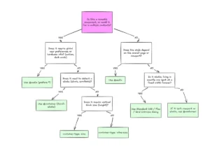
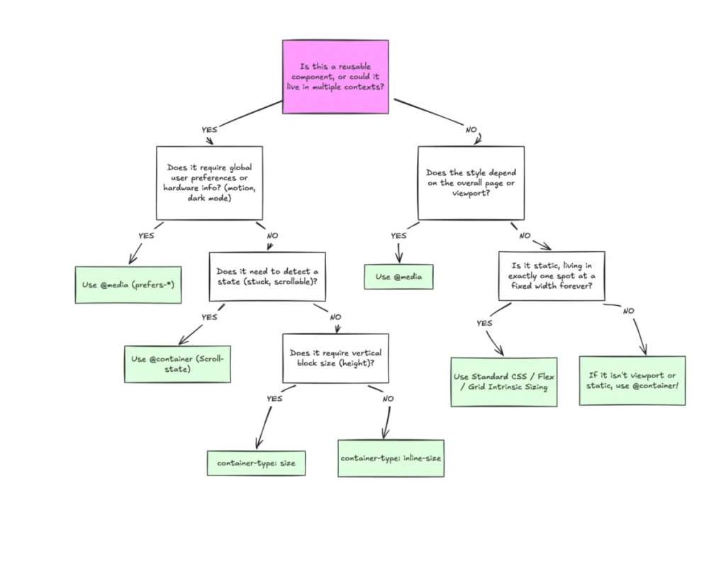
At the SmashingConf Amsterdam 2026, industry experts noted that the inertia behind this slow adoption stems from a common misconception: that container queries are simply a "different syntax" for media queries. Because the logic—declaring a condition and applying styles—looks identical to legacy methods, many developers have failed to see the paradigm shift. In reality, the two tools serve entirely different purposes: media queries are for macro-layouts (the global structure of the page), while container queries are for micro-layouts (the internal logic of specific components).
The Technical Divide: Viewport vs. Container
To understand why container queries are a necessary evolution, one must examine the fundamental logic of the browser’s rendering engine. Media queries are "dumb" in the context of component isolation; they are globally scoped. When a developer writes a media query to adjust a component at 1024px, that component will trigger its style changes whenever the browser window hits that size, regardless of whether the component is in a wide main grid or a cramped sidebar.
Container queries, introduced through the CSS Containment Module Level 3, invert this relationship. By utilizing the container-type property, a developer can define a parent element as a "container." Any child element can then query that parent’s dimensions using the @container rule. This enables a truly modular approach: the component carries its own responsiveness with it. If a card is moved from a header to a footer, it automatically adjusts its layout based on the available inline space, effectively decoupling the component from the global page state.

Addressing Performance and Implementation Caveats
While container queries provide superior architectural flexibility, they are not without technical considerations. One of the most common pitfalls involves the "self-querying" problem. Because a container cannot query its own dimensions without creating a circular dependency, developers must ensure that the container is a separate parent element from the component being styled.
Furthermore, developers must be cautious when using the container-type: size property. If a container is set to query its block (vertical) size, the browser often collapses the container to 0px because it ignores the content within when calculating the parent’s dimensions. To avoid this, industry best practices suggest relying on inline-size (horizontal) queries whenever possible, which allows the content to dictate the height of the container naturally.
Another significant constraint is the current inability to use custom properties (CSS variables) directly within a container query. Because custom properties cascade and can be updated within the query itself, allowing them inside the query condition would lead to infinite loop scenarios and performance degradation. As of the current specification, developers must rely on hardcoded pixel or relative units within the query conditions.
The Future of Fluid Interfaces
The implications of this shift are profound for the future of web design. With over 2,300 unique viewport sizes identified in modern web traffic analysis, it is no longer sustainable to rely on "break-point" management based solely on device sizes like "tablet" or "mobile." Container queries allow for "fluid" design, where components scale and reflow based on the actual physical space available to them.

One of the most innovative applications of this is in fluid typography. By using the cqi (container query inline-size) unit, developers can create text that scales proportionally to its parent container rather than the viewport. This ensures that headers and body text remain readable in narrow sidebars, a feat that is nearly impossible to achieve reliably with traditional viewport-relative units like vw or vh.
Conclusion: A Necessary Paradigm Shift
The reluctance to adopt container queries is a natural reaction to a major change in standard operating procedure. However, as the web continues to move toward highly modular, component-driven architectures, the limitations of viewport-based design will only become more pronounced.
Media queries will continue to hold a vital place in web development for global, macro-level styling—such as dark mode toggles or main layout grid definitions. However, for the components that constitute the vast majority of our interfaces, container queries offer a more precise, maintainable, and robust solution. The transition requires a departure from "page-first" thinking toward "component-first" architecture. For developers aiming to build resilient, future-proof interfaces, the adoption of container queries is no longer an optional optimization—it is an essential evolution in the craft of web design.