
The Australian frozen food sector has undergone a significant transformation over the last decade, evolving from a market dominated by industrial, low-cost options to a premium landscape defined by convenience and quality. At the forefront of this shift is The Dinner Ladies, a Sydney-based meal service that has recently unveiled a comprehensive corporate rebrand. This initiative, developed in partnership with the design agency Universal Favourite, seeks to reposition the brand as a market leader while honoring the company’s humble 2007 origins in a backyard shed.

The rebrand comes at a critical juncture for the meal delivery industry. As inflation and rising living costs place increased pressure on household budgets, consumer behavior has shifted toward "at-home" dining solutions that prioritize both nutrition and time-saving. The Dinner Ladies, which has spent seventeen years building a reputation for "home-cooked" quality, identified that its visual identity had become diluted through various iterations, necessitating a more cohesive and assertive market presence.

A Seventeen-Year Evolution: From Shed to Scale
The story of The Dinner Ladies began in 2007, founded by two women in a backyard shed with the intent to alleviate the daily burden of meal planning for busy families. Over the subsequent seventeen years, the company transitioned from a localized service to a significant player in the national frozen food market.

Historically, the brand relied on a mix of hand-drawn elements and informal messaging. However, as the company scaled, the lack of a standardized visual system began to hamper brand recognition in an increasingly crowded digital marketplace. The new branding project involved a deep archival review, analyzing early napkin sketches alongside current operational data to distill the brand’s core values: authenticity, "no-nonsense" reliability, and culinary quality.

Market Context and Consumer Demographics
The frozen meal industry is currently experiencing a period of intense competition. Data suggests that the pre-prepared meal delivery market is saturated with brands utilizing "same-same" marketing—often focusing on overly clinical or "wellness-obsessed" messaging. Industry analysts note that this approach has created a vacuum for brands that offer relatability and a sense of "genuine" home cooking.

The Dinner Ladies’ strategy to eschew what they characterize as the "mumsy" stereotype is a deliberate move to capture a demographic that feels alienated by overly earnest marketing. By adopting a "no-BS" tone of voice, the company is positioning its product as a tool for "doing life" rather than just a dietary supplement. This shift addresses the needs of time-poor professionals and families who require high-quality, heat-and-eat solutions without the pretense of artisanal perfection.

Visual Identity and Architectural Design
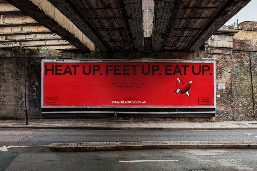
The technical execution of the rebrand was centered on flexibility and scalability. The design team at Universal Favourite focused on refining the logo by decoupling the heart icon from the wordmark. This allows for greater versatility across diverse touchpoints, from social media icons and digital banners to the physical constraints of frozen food packaging.

Illustrator Jake Foreman was commissioned to provide a gritty, textured aesthetic that draws inspiration from traditional tattoo art. This choice reinforces the "audacious" and "non-conformist" personality of the brand. The color palette, anchored by a "hero red," was selected for its high visibility and existing category attribution, while being updated with warmer, retro-inspired secondary hues to differentiate the brand from the stark, clinical whites and blues often found in the freezer aisle.

Furthermore, the implementation of the typeface Denim from the Displaay Type Foundry serves a dual purpose. The Denim Wide cut provides a bold, authoritative presence for headings, while the regular weight ensures high legibility for product descriptions and essential nutritional information. This typographic hierarchy is vital for consumer decision-making in retail and e-commerce environments where attention spans are limited.

Operational Efficiency in Packaging
A significant component of the rebrand addresses the user experience within the home freezer. One of the most common consumer complaints regarding subscription meal services is the difficulty in quickly identifying product contents. The new packaging system introduces a functional, color-coded structure that allows customers to distinguish between protein types at a glance.

This redesign is not merely aesthetic; it is a tactical response to the logistical challenges of the frozen meal market. By optimizing the packaging for quick identification and ease of storage, the brand aims to reduce the "friction" associated with the end-user experience, thereby increasing customer retention and repeat purchase rates.

The Role of Authentic Photography
The brand’s visual storytelling has been overhauled to reflect "the authentic messiness of real life." By collaborating with photographer Alana Dimou and a specialist production team, the new brand imagery moves away from the sterile, perfectly plated food photography common in the industry. Instead, the new assets feature remnants of meals, real-world dining scenarios, and candid interactions. This reflects a broader trend in food marketing where brands are moving toward "radical honesty" to build trust with a skeptical consumer base.

Broader Implications for the Industry
The move by The Dinner Ladies signifies a maturing of the independent meal delivery sector. As larger supermarket chains continue to expand their private-label frozen meal ranges, smaller, specialized companies are forced to compete on brand equity and personality rather than just price point.

The decision to lean into a "rebellious" and "straight-forward" identity is a calculated risk. By differentiating itself from the "over-sincerity" of competitors, The Dinner Ladies is attempting to establish a stronger emotional connection with its base. If successful, this rebrand may set a benchmark for other boutique food companies looking to professionalize their operations without sacrificing the "soul" of their founding story.

Conclusion: Preparing for Future Decades
As The Dinner Ladies looks toward the next stage of its growth, the new brand identity serves as the foundation for future scaling. The flexible design system ensures that as the company expands its product range or moves into new geographical markets, its visual language remains consistent yet adaptable.

In an era where "convenience" has become a commodity, the success of this rebrand will likely hinge on the company’s ability to maintain its "no-nonsense" promise. By aligning its visual and verbal identity with the practical realities of its customers’ lives, The Dinner Ladies has positioned itself to remain a staple in the Australian market, proving that a brand’s longevity is best served with a side of authenticity and a clear, functional design.

With the project now fully implemented, the brand is prepared to navigate the complexities of the modern retail landscape, effectively balancing its nostalgic, backyard-origin roots with the high-performance demands of a modern, technology-driven food service.