
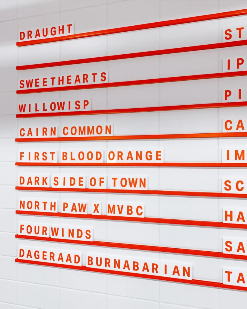

Nestled in the shadow of the Cascade foothills, the town of Hope, British Columbia, has long been recognized for its rugged landscape and cinematic history—most notably as the 1982 filming location for the action classic Rambo: First Blood. However, in recent years, the municipality has undergone a subtle shift in its cultural identity, driven in part by the emergence of local craft enterprises. Among these is Mountainview Brewing Co., a brewery that has successfully transitioned from a nascent startup into a cornerstone of the regional hospitality landscape through a comprehensive and deliberate approach to visual identity and consumer experience.

The establishment of Mountainview Brewing Co. represents a strategic pivot for the local economy. Occupying a converted mechanic garage, the brewery serves as both a communal hub for Hope residents and a critical transit point for travelers navigating the mountain passes of the Pacific Northwest. The success of the venture is rooted not only in its production of high-quality craft beer but in a cohesive branding strategy developed in partnership with the creative agency Memory.
The Genesis of a Brand Identity
The development of the Mountainview Brewing Co. brand was a holistic process that began at the company’s inception. Recognizing that a brewery’s identity extends far beyond the liquid inside the can, the ownership team sought to create an environment that felt both rugged and refined. The collaboration with Memory focused on crafting an "in-depth visual identity and brand voice" that would resonate with two distinct demographics: the long-term local resident and the weary, highway-bound traveler looking for a final stop before the steep mountain ascents.

This dual-market approach required a design language that was approachable yet sophisticated. The agency’s work spanned the entire brand suite, ensuring that every touchpoint—from exterior signage and wayfinding to the physical ergonomics of the tasting flight trays—contributed to a unified narrative. The decision to utilize Aktiv Grotesk, a typeface developed by Dalton Maag, provides a neutral, modern aesthetic that avoids the common tropes of "mountain-themed" design, favoring instead a clean, legible, and professional appearance that aligns with contemporary craft beverage standards.
Chronology of Development
The evolution of Mountainview Brewing Co. follows a clear trajectory of brand integration:

- Phase I: Strategic Concept and Foundational Identity: The initial phase focused on defining the brewery’s core mission—serving as a bridge between the local community and transient travelers. During this period, the visual identity was established, centered on the architectural heritage of the building.
- Phase II: Physical Implementation: Following the establishment of the digital and print identity, the team focused on physical assets. This included the fabrication of signage that needed to be visible from the road to capture "pit stop" traffic, as well as interior collateral that enhanced the atmosphere of the repurposed garage.
- Phase III: Operational Scaling: The introduction of flexible menu systems and custom packaging allowed the brewery to maintain a "long tap list" featuring both "crushable staples"—beers designed for broad appeal—and experimental small-batch brews for the enthusiast demographic.
- Phase IV: Market Integration: The current phase involves the maintenance of the brand suite across merchandise and specialized point-of-sale items, such as custom tasting flight trays, which serve to reinforce the brand in the hands of the consumer.
Economic and Cultural Context
The craft brewing industry in British Columbia has experienced significant growth over the last decade. According to industry data from the BC Craft Brewers Guild, the province boasts one of the highest concentrations of craft breweries per capita in Canada. For a town like Hope, which sits at a strategic junction of major highways, the emergence of a destination brewery serves as a catalyst for economic development.
The "mechanic garage" aesthetic chosen for the brewery is not merely an architectural choice but a nod to the town’s blue-collar history. By repurposing industrial space, Mountainview Brewing Co. taps into a growing trend of "adaptive reuse" in hospitality. This approach reduces the environmental impact of new construction while preserving the historical character of the town. Furthermore, by acting as a "last pit stop" before the mountain passes, the brewery captures a unique segment of the tourism market, turning a routine travel stop into an experiential destination.

Analysis of Design Implications
The use of a typeface like Aktiv Grotesk is a calculated choice in the context of modern brand design. In a market flooded with ornate, hand-lettered logos and highly stylized imagery, the clean, geometric sans-serif aesthetic of Aktiv Grotesk communicates reliability and quality. This design choice functions as a signaling mechanism to the consumer: the brand is professional, consistent, and transparent.
Moreover, the emphasis on "wayfinding" and "flexible menu systems" reflects an understanding of modern retail psychology. A brewery that is easy to navigate and provides clear, adaptable information is better positioned to manage high-volume turnover during peak travel seasons. The consistency across all collateral—from business cards to coasters—creates a sense of psychological continuity. For the consumer, this translates into a perception of higher quality; if the branding is handled with such precision, the consumer is more likely to infer that the brewing process itself is governed by similar standards of excellence.

Community Impact and Future Outlook
The integration of local businesses into the cultural fabric of small-town British Columbia is a vital component of rural sustainability. While larger urban centers often see the rapid turnover of craft breweries, establishments like Mountainview Brewing Co. rely on deep-rooted community support to survive the off-season. By positioning itself as a gathering space, the brewery provides a third place for local residents—a social environment separate from home and work.
Statements from industry analysts suggest that the "experience-first" model employed by Mountainview is becoming the benchmark for rural hospitality. Rather than competing solely on the basis of flavor profiles, breweries must now compete on the basis of "brand equity"—the total value of the customer’s interaction with the company.

As the brewery continues to evolve, the challenge will remain in balancing its experimental roots with the demand for its core, reliable product line. The infrastructure currently in place, characterized by its flexible menu systems and robust brand identity, suggests that the organization is well-prepared to scale its operations or adapt to changing consumer preferences without losing its foundational appeal.
Conclusion
Mountainview Brewing Co. stands as a case study in how small-scale enterprises can leverage professional design and strategic branding to define their place in the market. By transforming a defunct mechanic garage into a sophisticated, highly functional destination, the brewery has contributed significantly to the revitalization of the Hope, BC, business landscape. The commitment to a cohesive visual language, supported by the clean typography of Dalton Maag’s Aktiv Grotesk and the strategic design work of Memory, has allowed the brewery to transcend its physical limitations.

As it looks toward the future, the success of the brewery will likely serve as a model for other rural Canadian businesses seeking to capitalize on local identity while catering to a transient, globalized audience. Through careful attention to detail—from the physical tray in which a beer is served to the way the brand presents itself to the traveler on the highway—Mountainview Brewing Co. has proven that the intersection of craft, history, and modern design is a powerful driver of both community pride and commercial viability. The brewery remains a testament to the idea that a strong brand is not just an aesthetic layer, but an essential component of the business model itself.