
Despite broad browser support and significant anticipation from the developer community, CSS Container Queries remain among the most underutilized features in modern web development. While 94% of current browsers support the specification, data from the 2025 State of CSS survey indicates that only 41.4% of professional developers have actively integrated them into their workflows. This adoption gap persists despite a clear consensus that the viewport-based approach of traditional media queries is insufficient for the increasingly modular and component-driven nature of contemporary web design.
The Historical Context of Responsive Design
To understand the current frustration regarding adoption, one must look at the evolution of responsive web design. When Ethan Marcotte coined the term in 2010, the web was dominated by relatively simple page structures. Media queries were introduced as a breakthrough, allowing developers to apply specific CSS rules based on the width of the user’s viewport. For over a decade, this became the industry standard for "macro-layout" control.
However, as design systems matured and components became more portable—reused across sidebars, grid cells, and modal windows—the inherent limitation of the viewport-based model became apparent. A component designed to look perfect on a 1024px tablet might break when placed inside a narrow sidebar on a 1920px desktop. Because media queries only recognize the size of the browser window, they are "blind" to the actual space allocated to a specific element. This fundamental disconnect led to years of developer requests for a way to query the size of a parent container rather than the browser window itself.

Chronology of Implementation and Adoption
The path to container queries was long and rigorous. The W3C Working Group debated various iterations of the specification to ensure performance stability, as querying the layout of an element could theoretically trigger recursive layout loops.
- 2019: The concept of "container queries" appeared at the top of the CSS-Tricks "CSS Wishlist," reflecting widespread frustration with the constraints of media queries.
- 2021–2022: Initial experimental implementations began appearing in major browser engines, allowing developers to test the
container-typeandcontainer-nameproperties. - 2023: Widespread browser support achieved across Chromium, Firefox, and Safari, effectively making the technology a standard tool for the modern web.
- 2025-2026: Industry leaders, including prominent CSS educators and speakers at events like SmashingConf, began highlighting the "terrible" adoption rates, urging developers to move beyond legacy practices.
Why the Transition Stalls: The "Looks Like" Fallacy
The primary barrier to adoption is not technical complexity, but cognitive inertia. At a cursory glance, the syntax for container queries mirrors that of media queries. An @container block uses conditions like (min-width: 450px) in a manner that feels identical to @media.
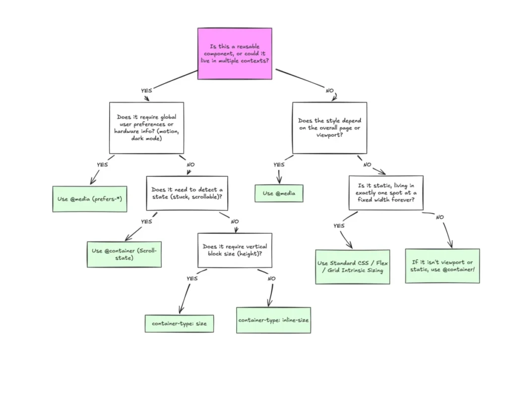
This familiarity is deceptive. When a developer writes a media query, they are asking the browser: "How wide is the screen?" When they write a container query, they are asking: "How much space is available to this specific component?" This shift from global context to local context requires a fundamental change in how a designer approaches a layout. The legacy habit of defining "tablet" or "mobile" breakpoints at the page level prevents developers from seeing the utility of fluid, context-aware components that adapt autonomously.
Quantitative Data and Responsive Fragmentation
The necessity for container queries is underscored by the current state of device fragmentation. Recent data suggests there are over 2,300 unique viewport sizes currently in use across the global web. Attempting to manage responsive layouts through viewport breakpoints has become a mathematical impossibility. By decoupling layout logic from the viewport, developers can create components that are "truly" responsive—meaning they look correct regardless of where they are placed in the DOM.

Technical Implications and Best Practices
The transition to container queries necessitates a deeper understanding of CSS architecture. For instance, the use of container-relative units—such as cqi (container query inline-size) and cqw (container query width)—allows for typography that scales based on the container’s dimensions. Unlike vw units, which remain tied to the screen width, cqi units ensure that text remains legible even when a component is constrained within a narrow column.
However, implementation comes with specific constraints:
- The Self-Querying Restriction: A container cannot query itself. To apply a style change to an element based on its own size, developers must wrap that element in a parent container. This prevents infinite layout loops, a safety measure built into the specification.
- Size Collapse: Querying the
sizeof a container (its block or vertical height) can cause the container to collapse to 0px if it lacks explicit dimensions. Developers are encouraged to useinline-sizefor horizontal layout adjustments, which is the most common use case. - Custom Property Limitations: Currently, container queries cannot directly consume CSS custom properties (variables) for breakpoints. This is a deliberate design choice to prevent cascading logic errors that could arise if a query changed a variable that it was simultaneously monitoring.
Industry Outlook and Strategic Recommendations
The consensus among modern web architects is that the future of CSS lies in the "micro-layout." Macro-layouts (the overall page structure) will continue to rely on media queries, but the components that populate these layouts should be governed by container queries.
For development teams, the implication is clear: the "mobile-first" approach must evolve into a "component-first" approach. By prioritizing the container’s capabilities, organizations can reduce the reliance on complex, often fragile JavaScript ResizeObserver implementations for responsive styling.

As the web continues to fragment across an ever-increasing array of devices—from foldables to ultra-wide desktop monitors—the ability to write self-contained, context-aware CSS will become a primary indicator of code quality and maintainability. The technology is stable, supported, and documented; the only remaining hurdle is the widespread shift in developer mindset required to fully embrace it.