
The competitive landscape of the functional beverage industry is undergoing a notable aesthetic shift as brands move away from neon-heavy, high-octane visual noise toward more sophisticated, minimalist paradigms. A prominent example of this evolution is unfolding in Austin, Texas, where functional beverage enterprise Lucky Energy has officially unveiled a comprehensive brand overhaul. Developed in close collaboration with the Los Angeles-based creative agency Dayjob, the sweeping rebrand encompasses a completely reimagined logo, a sophisticated black-and-white packaging system, a revised tone of voice, and a new corporate mission statement. The redesign spans the company’s entire product ecosystem, touching both its flagship canned energy beverages and its functional gummy supplements.
This strategic visual pivot aims to carve out a distinct space for the brand within crowded retail cooler doors. By trading chaotic graphics for a sharper, more restrained aesthetic, Lucky Energy is signaling a maturation of its market positioning. The rollout comes at a time when consumer demand for functional, cleaner-ingredient alternatives to traditional soft drinks continues to surge, prompting manufacturers to reevaluate how they communicate health, premium quality, and emotional resonance to an increasingly discerning demographic.
Anatomy of the Redesign: Minimalism Meets Edge
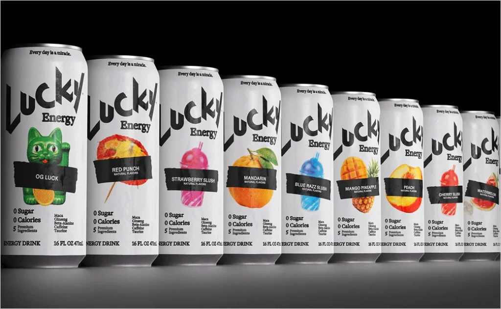
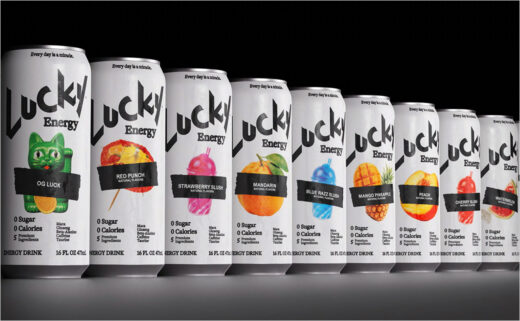
At the core of the refresh is an intentionally minimalist design system anchored by a striking black-and-white color palette. According to the company and its creative partners at Dayjob, the new visual framework is designed to be edgy, bold, and dynamic while maintaining a clean, premium visual standard.
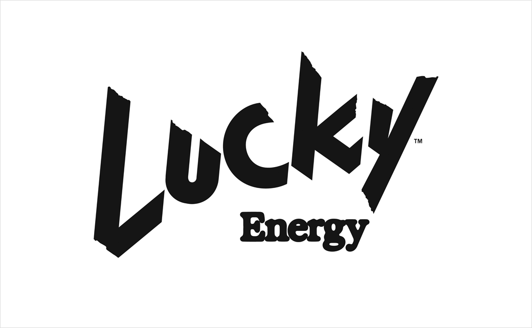
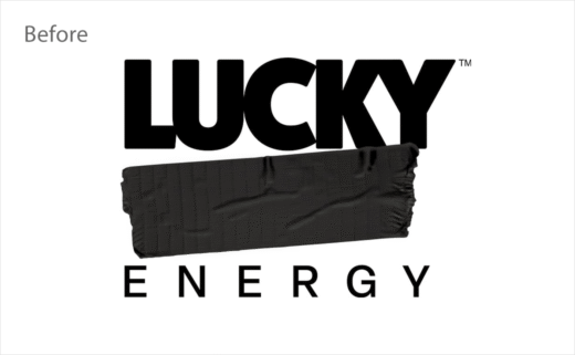
The redesigned 473-milliliter (16-ounce) cans feature a reimagined Lucky wordmark that cleverly expands upon the brand’s previous tape-system visual architecture. To maintain visual hierarchy and brand cohesion, vibrant, flavor-based graphics serve as the sole splash of color on each monochrome vessel. This deliberate restraint allows the product to pop against standard grocery and convenience store displays without relying on the sensory overload typical of the energy drink category.
Company leadership notes that the stripped-back aesthetic serves a dual purpose: it creates an elevated, grown-up look that appeals to a broader demographic, and it transparently communicates the simplicity of the product’s formulation. In an era where consumers routinely scrutinize ingredient lists and nutritional panels, packaging that projects clarity and simplicity holds a distinct competitive advantage.
From "LUCKY F*CK" to Mainstream Maturity: A Brand Chronology
To fully appreciate the significance of Lucky Energy’s current rebrand, it is helpful to examine the trajectory of the company since its inception. The brand’s journey reflects a calculated evolution from an underground, irreverent startup to a refined player in the mainstream functional beverage sector.
The timeline of Lucky Energy is marked by key developmental milestones:
- 2012: Entrepreneur Richard Laver founds Kate Farms, a medical nutrition enterprise specializing in plant-based, organic formulas for individuals managing chronic illnesses and utilizing tube feeding support. The company is born out of personal necessity, inspired by Laver’s daughter, Katie, who was diagnosed with cerebral palsy and faced severe dietary and weight-development challenges.
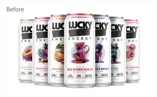
- 2023: Building upon his extensive background in developing nutritionally focused and specialized beverages, Laver establishes a new venture in the energy drink space. Initially launched with a deliberately provocative and cheeky moniker—"LUCKY F*CK"—the brand sets out to challenge traditional energy drinks by offering a formulation focused on clean ingredients and zero sugar.
- Late 2026: Lucky Energy announces and begins rolling out its major corporate and visual rebrand. Developed alongside LA-based agency Dayjob, the refresh trades the brand’s earlier, more rebellious styling for a sophisticated black-and-white aesthetic, pairs it with the new mission statement "Every day is a miracle," and extends the visual identity across both canned beverages and gummy supplements.
A Purpose-Driven Formulation
Beneath the sleek new exterior lies a product formulation engineered to differentiate itself from legacy energy drinks laden with artificial additives, high quantities of synthetic caffeine, and staggering amounts of sugar. Lucky Energy’s core beverage offering centers on a streamlined formulation built around five primary active ingredients.
Each 473-milliliter can contains 200 milligrams of caffeine, paired with a carefully selected blend of functional ingredients: maca root, beta-alanine, ginseng, and taurine. Crucially, the formulation contains zero sugar, positioning the beverage as a functional tool for sustained, jitter-free energy rather than a temporary sugar-spike-and-crash product.
This formulation philosophy is deeply intertwined with founder Richard Laver’s broader entrepreneurial philosophy. Having spent over a decade formulating products designed to nourish vulnerable populations through Kate Farms, Laver brings a health-conscious, functional-first mindset to the high-energy beverage category. The transition from the brand’s early, provocative labeling to its current polished look reflects a desire to make health-forward energy accessible to a mainstream audience without sacrificing efficacy.
The Philosophy of Luck: Leadership Perspectives
Central to the rebranding initiative is a philosophical pivot regarding the very concept of luck. Rather than framing luck as an arbitrary stroke of fortune or a matter of random chance, Lucky Energy’s new positioning defines it as an intentional state of mind—something that individuals actively choose, chase, and create.
This conceptual shift informs the brand’s new overarching mission statement: "Every day is a miracle." According to corporate communications, this ethos gives the brand a human voice that is optimistic, adventurous, and emotionally resonant, steering clear of the hyper-aggressive extremes and empty marketing hype that have historically dominated the energy drink sector.
Richard Laver elaborates on the psychological underpinnings of the new brand architecture, emphasizing agency and optimism.
"This new identity captures that idea," Laver stated. "It is cleaner, sharper, and more grown-up, but it still has the same heart. We are not telling people to wait around for luck. We are inviting them to recognise it, create it, and bring good energy to whatever comes next."
Dayjob, the creative agency tasked with bringing this vision to life, worked closely with internal stakeholders to ensure that the visual assets mirrored this conceptual maturity. By stripping away extraneous design elements, Dayjob’s team successfully translated an abstract philosophical stance—that luck is self-made—into a concrete, minimalist visual language.
Market Implications and the Evolving Energy Landscape
The rollout of Lucky Energy’s refreshed identity arrives at a fascinating juncture for the global functional beverage market. For decades, the energy drink aisle was defined by a homogeneous visual language: dark cans emblazoned with neon green, electric blue, or aggressive typography, often marketed exclusively toward extreme sports enthusiasts and night-shift workers.
However, shifting consumer demographics have driven a dramatic market evolution. Millennials and Generation Z consumers increasingly view wellness, cognitive performance, and everyday vitality as holistic lifestyle components rather than niche pursuits. As a result, beverage brands are racing to capture market share by offering clean-label alternatives that do not compromise on design aesthetics or taste profiles.
Industry analysts note that Lucky Energy’s strategic shift carries several notable implications:
- Retail Differentiation: In a crowded cooler environment where brand loyalty can be fleeting, a distinctive, minimalist black-and-white design system cuts through the visual clutter, making the product instantly recognizable to design-conscious consumers.
- Mainstream Credibility: Moving away from provocative, shock-value branding (such as the early "LUCKY F*CK" moniker) broadens the brand’s total addressable market. Major national retailers, upscale grocery chains, and corporate wellness purchasers are inherently more likely to stock and endorse products with a polished, mature visual identity.
- Cross-Category Expansion: By successfully applying the new design system uniformly across both liquid beverages and gummy supplements, Lucky Energy establishes a cohesive lifestyle brand ecosystem. This multi-format approach allows the company to capture consumer spend across different consumption occasions throughout the day.
- Emotional Resonance in Marketing: By anchoring its marketing in the philosophical concept of actively creating one’s own fortune—bolstered by the "Every day is a miracle" mantra—the brand creates a deeper psychological connection with consumers, fostering long-term loyalty that transcends functional benefits alone.
Looking Ahead
As the final quarter of the year unfolds, Lucky Energy is actively executing the physical rollout of its new packaging and logo across its distribution network in the United States. With manufacturing facilities and corporate operations rooted in Austin, Texas, the brand is well-positioned to scale its distribution footprint capitalize on the growing consumer appetite for clean, functional energy.
The transition from a rebellious, underground upstart to a sophisticated, purpose-driven lifestyle brand represents a significant gamble for Lucky Energy, but one backed by thoughtful design and a clear-eyed understanding of modern consumer behavior. By marrying a minimalist, high-end aesthetic with a clean, five-ingredient formulation and an optimistic brand ethos, Lucky Energy is demonstrating that the future of the energy drink industry belongs to brands that treat their consumers not as adrenaline junkies, but as intentional architects of their own daily success.