
The designer passed away at his home in Oakland, California, following a protracted battle with Alzheimer’s disease. His death marks the conclusion of a singular career that bridged the gap between the golden age of hand-lettered craftsmanship and the digital evolution of modern typography. He is survived by his wife, the noted book artist Dorothy A. Yule, who provided dedicated care for him throughout his illness.
A Legacy Written in Ink
Born on October 23, 1941, in Oakland, Parkinson’s trajectory as a master of the letterform began in his childhood neighborhood. His formative inspiration came from an unlikely source: his neighbor, Abraham Lincoln Paulsen. Known as the "Wizard Penman," Paulsen’s ability to execute complex calligraphy, including writing the Gettysburg Address in reverse, sparked a lifelong obsession in young Parkinson. This early exposure to the mechanics of the pen and the geometry of letters set the stage for a career defined by historical reverence and technical precision.
Parkinson formally pursued his passion at the California College of Arts and Crafts, graduating in 1963. Shortly after, he relocated to Kansas City, Missouri, to join the creative team at Hallmark Cards. While his initial assignment involved illustration, the company quickly identified his aptitude for lettering, moving him to a department that would serve as his professional crucible. It was there that he mastered the versatility required to render any style on demand—a skill that would later make him the most sought-after freelancer in the magazine industry.
Chronology of a Prolific Career
Parkinson’s career can be categorized into several distinct phases, each demonstrating his uncanny ability to adapt to the aesthetic demands of the era:

- 1963–1968: The formative years at Hallmark Cards, where Parkinson transitioned from general illustration to specialized lettering, learning the nuances of corporate design and commercial typography.
- 1968–1980: Returning to Oakland, he established a freelance practice that quickly gained traction. This period saw the solidification of his reputation as a "go-to" designer for high-stakes editorial work, including iconic nameplates for Rolling Stone and the Los Angeles Times.
- 1980–2000: Parkinson became a central figure in the transition from analog to digital design. He balanced his custom lettering projects with the creation of retail typefaces, ensuring his work remained relevant as publishing technology shifted.
- 2000–2020: The later phase of his career was marked by his exploration of fine art—specifically, the documentation of decaying American neon signage—and his role as a mentor within the typographic community.
- 2020–2025: His final years were spent managing his health while continuing to catalog his extensive archive, ensuring his lifetime of work was preserved for future generations.
The Architect of Modern Editorial Identity
Parkinson’s influence on the American visual landscape cannot be overstated. During the height of the magazine era, his hand-lettered logos were ubiquitous. By specializing in custom nameplates, he provided publications with a visual "anchor"—a unique, proprietary aesthetic that distinguished them from their competitors.
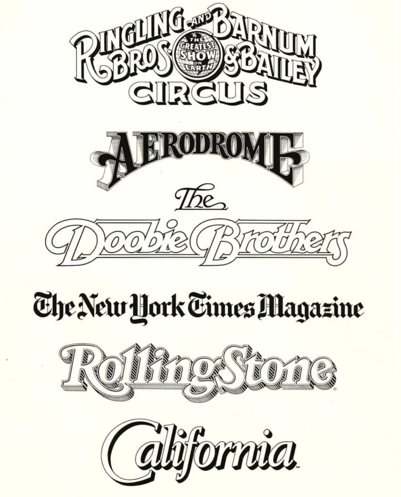
His portfolio included high-profile work for the Rolling Stone, the Los Angeles Times, and the New York Times Magazine. In the music industry, his logo for the Doobie Brothers became synonymous with the band’s identity, while his work for the Ringling Bros. and Barnum & Bailey Circus demonstrated his range in creating high-impact, display-oriented typography.
According to Stephen Coles of Typographica, who maintained a two-decade relationship with the designer, Parkinson’s value to art directors was his ability to "refresh" a brand while honoring its history. He did not merely draw letters; he interpreted the voice of a publication into a visual medium. His work on these nameplates often required multiple iterations over several decades, as he updated the designs to keep pace with changing printing standards and cultural shifts.
Fine Art and the Preservation of "Americana"
Beyond his commercial work, Parkinson developed a second, distinct career as a fine artist. He became fascinated by the disappearing aesthetic of mid-century neon signage found in the American West. Using his own photography as a base, he painted large-scale depictions of broken glass, peeling paint, and vintage tubing. These works, which hung in his home, were not merely reproductions; they were studies in texture and light. Critics have noted that his paintings often looked more tactile and "real" than the original photographs, showcasing his deep understanding of how light interacts with materials—a byproduct of his decades-long career analyzing the structure of letters.
Community and Mentorship
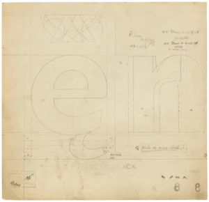
For those who knew him personally, Parkinson was as much a teacher as he was an artist. His Oakland home became a sanctuary for designers, students, and historians. He was known for maintaining an exhaustive archive of his own work, including original sketches, proofs, and ephemera.

"He welcomed anyone to his home," Coles noted, highlighting how Parkinson took great joy in displaying his flat files of original artwork to visitors. His involvement in local design communities, such as the semiregular picnics held in the Bay Area, cemented his reputation as a generous and humble figure. Despite his monumental contributions to the field, Parkinson famously adhered to the mantra attributed to ballerina Margot Fonteyn: "Take your work seriously, but never yourself."
Implications for the Design Industry
The passing of Jim Parkinson leaves a significant void in the world of typography. His career represented a bridge between the physical act of drawing letters by hand and the precision of digital font design. As the industry continues to move toward automated, AI-driven font generation, Parkinson’s work serves as a reminder of the "human touch"—the slight imperfections and stylistic choices that give a letterform its personality.
His contribution to the field will be further cemented in 2027, when the Letterform Archive is expected to publish his memoirs. This document is expected to serve as a comprehensive guide to his life and methodology, providing a blueprint for future generations of type designers who wish to balance commercial success with artistic integrity.
Commemoration and Support
A memorial service for Parkinson is being planned for the fall, with details to be released by his family. In a reflection of the challenges he faced in his final years, his family has requested that, in lieu of flowers, donations be directed to the Alzheimer’s Association.
As a testament to his enduring impact, several institutions are currently reviewing his vast collection of sketches and logos for future exhibitions. His influence will remain visible on newsstands across the country, where his hand-lettered titles continue to grace the covers of some of the most enduring publications in the United States. His life, characterized by a devotion to the "craft of the letter," serves as an enduring legacy for the design community at large.