Posted inTypography
Jim Parkinson, Master Lettering Artist and Type Designer, Dies at 83
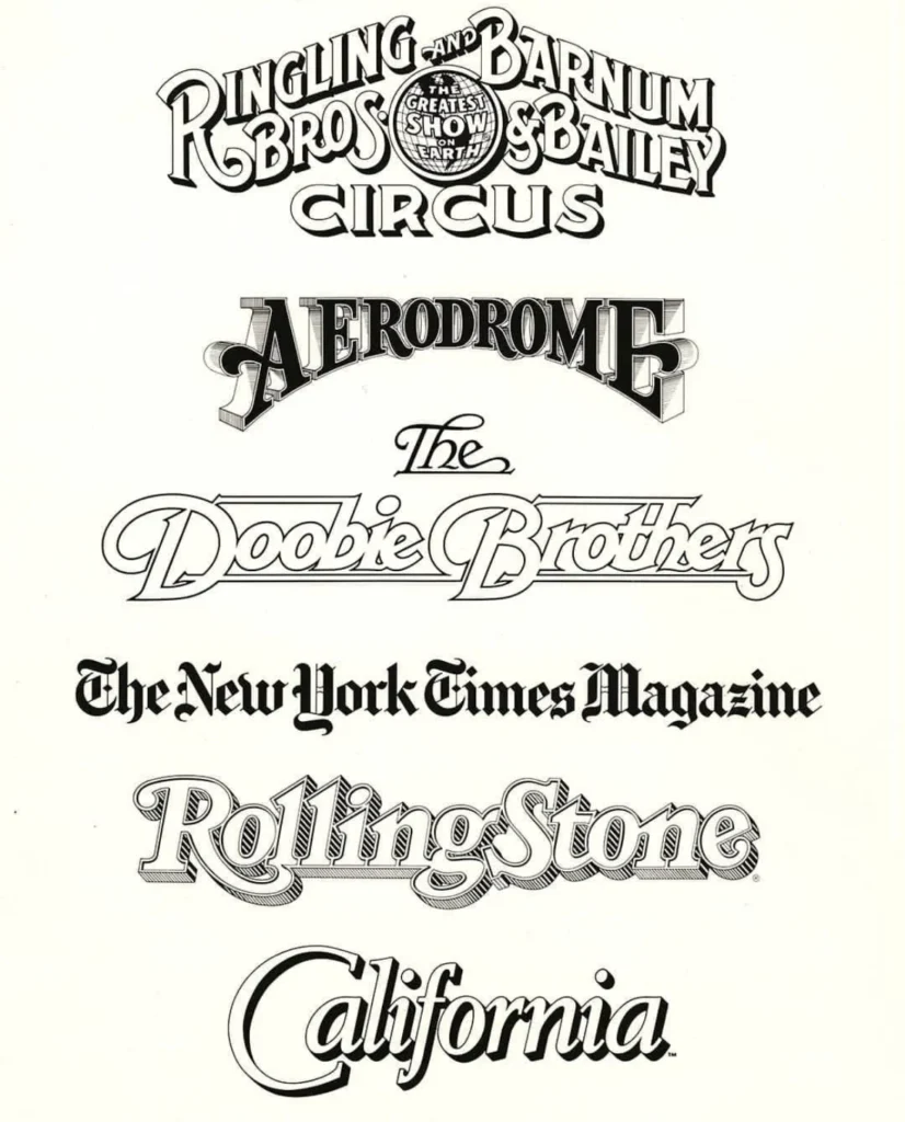
Jim Parkinson, a celebrated lettering artist, type designer, and painter whose masterful hand-crafted lettering graced countless iconic brands, publications, and logos for over half a century, passed away on June…