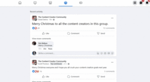


Microinteractions represent the subtle, often invisible architecture of modern digital engagement. These granular design elements—ranging from a simple button color change upon interaction to the fluid animation of a loading spinner—serve as the essential bridge between human intent and machine response. While once considered mere aesthetic flourishes, microinteractions have evolved into a fundamental pillar of user experience (UX) strategy, directly influencing user retention, task completion rates, and overall brand perception in an increasingly saturated digital marketplace.
The Evolution of Interaction Design
The concept of microinteractions gained significant traction in the early 2010s as mobile application development demanded more intuitive interfaces. As screen real estate shrunk, designers had to find ways to convey complex system states without overwhelming users with text. Dan Saffer, in his seminal work "Microinteractions: Designing with Details," codified these elements, providing a structural framework that shifted the industry’s focus from static page design to dynamic, behavioral interaction.

Historically, digital interfaces were binary and sterile; a user performed an action, and the system either succeeded or failed. Today, the expectation has shifted toward "conversational" interfaces. Industry data indicates that applications incorporating responsive, animated feedback see a 15% to 20% increase in user engagement compared to those relying on static interfaces. This shift reflects a broader psychological requirement: users seek validation that their input has been received, processed, and understood.
Anatomy of a Microinteraction
To effectively implement these features, designers must understand the four-part lifecycle that dictates how a microinteraction functions:
- Triggers: The catalyst for the interaction. These are either user-led (a click, swipe, or keystroke) or system-led (a notification alert or an exit-intent pop-up).
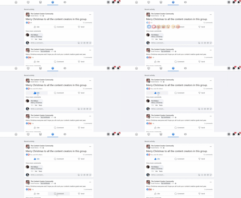
- Rules: The logic engine. These define the parameters of the response. For instance, if a user double-taps a social media post, the rule dictates that the "like" count increments by one and a heart graphic is rendered.
- Feedback: The communication phase. This is the most critical element for user reassurance. It confirms the system state through visual (color changes, animations), auditory (beeps, clicks), or haptic (vibration) means.
- Loops and Modes: These govern the behavior of the interaction over time. A "loop" manages the duration of an event, such as a progress bar, while "modes" allow the system to change states, such as toggling between light and dark themes.
Strategic Implementation: Seven Best Practices
For organizations aiming to optimize their digital products, the following seven practices serve as a professional standard for implementing microinteractions:

1. Purpose-Driven Design
Every microinteraction must justify its existence. Designers should ask if an animation serves to guide the user, provide status updates, or offer delight. If a design element lacks a clear function, it risks creating "visual noise" that distracts from the primary objective of the interface.
2. Deep User-Centered Research
Microinteractions should not be applied universally. A demographic analysis is essential; for example, a B2B enterprise software suite requires different interaction feedback styles than a consumer-facing gaming app. Creating detailed user personas ensures that the "feel" of the interaction aligns with the user’s workflow expectations.
3. Maintaining Visual Consistency
Consistency is the bedrock of intuitive navigation. If a "save" button uses a specific bounce animation in one part of an application, that same interaction should be consistent throughout the entire ecosystem. Discrepancies in feedback behavior can cause user confusion and erode trust in the product’s reliability.
4. The Virtue of Simplicity
The principle of "less is more" is paramount. A microinteraction should be brief, typically lasting between 0.1 and 0.4 seconds. Anything longer risks creating perceived latency, which can frustrate users and lead to high abandonment rates.
5. Prioritizing Universal Accessibility
Designers must ensure that all microinteractions are accessible. This includes providing text-based alternatives for screen readers via ARIA labels, ensuring color-blind accessible contrast ratios for status indicators, and allowing users to reduce motion if they suffer from vestibular disorders.
6. Performance Optimization
Animations that are not properly optimized can lead to "jank"—a drop in frame rates that makes a website or app feel sluggish. Developers must ensure that CSS animations or Lottie files used for microinteractions do not negatively impact the Core Web Vitals or the overall page load speed.

7. Rigorous Usability Testing
Data-driven validation is the final step. Utilizing platforms like UserTesting or Hotjar allows designers to observe how real users interact with these elements. If users repeatedly miss an interactive cue, it is a clear signal that the microinteraction requires refinement.
Real-World Applications and Industry Impact
Major digital platforms have successfully integrated these practices to enhance their competitive advantage. For example, Pinterest’s transition of the "Save" button—which changes both its label and state color—provides immediate, unambiguous feedback that the user’s intent was successfully processed. Similarly, the Reddit "Recap" feature demonstrates how scrolling-triggered animations can guide users through a narrative, transforming a passive reading experience into an interactive journey.
In the realm of e-commerce and lead generation, tools like TrustPulse utilize exit-intent microinteractions to reduce bounce rates. By detecting when a user is about to leave a page and triggering a timely pop-up, the system effectively recovers potentially lost conversions. Meanwhile, Google Docs’ use of checkmarks for active settings provides a visual confirmation that prevents the common user error of redundant selection.

The Broader Economic Implications
The investment in microinteractions is not merely an exercise in style; it is an investment in human capital. By reducing the "cognitive load"—the amount of mental effort required to use a product—designers can significantly decrease support costs associated with user errors. In a competitive digital economy, the difference between a successful product and a failed one often lies in the details. When a user feels that a digital tool is responsive, intuitive, and "human," their likelihood of long-term loyalty increases substantially.
As we look toward the future, the integration of artificial intelligence and machine learning will likely allow for more personalized microinteractions. Imagine an interface that adapts its feedback loops based on the user’s proficiency level—providing more guidance for beginners and more streamlined, rapid-fire feedback for power users.
Ultimately, microinteractions serve as the silent ambassadors of a brand. They represent the difference between a tool that is merely functional and one that is truly effortless. By adhering to a rigorous, purpose-driven approach to interaction design, developers and designers can ensure that their products not only meet the technical requirements of the modern web but also resonate with the human users who rely on them every day.