
Despite broad browser support, CSS container queries remain a significantly underutilized feature in modern web development, with a notable discrepancy between developer awareness and actual implementation. While media queries have served as the cornerstone of responsive web design for nearly two decades, the introduction of container queries represents a fundamental shift in how developers handle component-based architectures. By allowing styles to respond to the dimensions of a parent element rather than the global viewport, container queries offer a more precise approach to modular design, yet industry adoption lags behind technical readiness.
The Evolution of Responsive Design
The concept of responsive design was popularized in 2010 by Ethan Marcotte, who introduced the idea of flexible grids, fluid images, and, most crucially, media queries. At the time, this was a revolutionary solution to the problem of a fragmented device landscape. Media queries allowed developers to dictate page layout based on the total width of the browser window. For years, this served the industry well, as websites were largely conceived as monolithic structures where components occupied predictable, global positions.
However, as the web matured, the industry shifted toward design systems and component-based frameworks such as React, Vue, and Angular. In these environments, UI components are intended to be portable—placed in a sidebar, a modal, a main content area, or a footer. A media query, which remains tethered to the browser window, cannot determine the size of the specific container a component inhabits. This limitation has historically led to "layout thrashing" and brittle code, where developers must maintain dozens of complex media query breakpoints to ensure components do not break in varying contexts.

Current State of Adoption and Industry Data
According to the 2025 State of CSS survey, while 86% of developers report awareness of container queries, only 41.4% have integrated them into their workflows. This 44.6% gap between awareness and adoption is striking, especially considering that the feature currently boasts roughly 94% global browser support.
Industry experts, including noted front-end developer Kevin Powell, have highlighted this stagnation during professional conferences such as SmashingConf. The frustration stems from the fact that "element queries"—the ability to style based on container size—have occupied the top of developer wishlists on platforms like CSS-Tricks since at least 2019. The persistent reliance on viewport-based logic is often attributed to a combination of legacy project constraints and the steep learning curve associated with unlearning established responsive patterns.
Mechanics: Media Queries vs. Container Queries
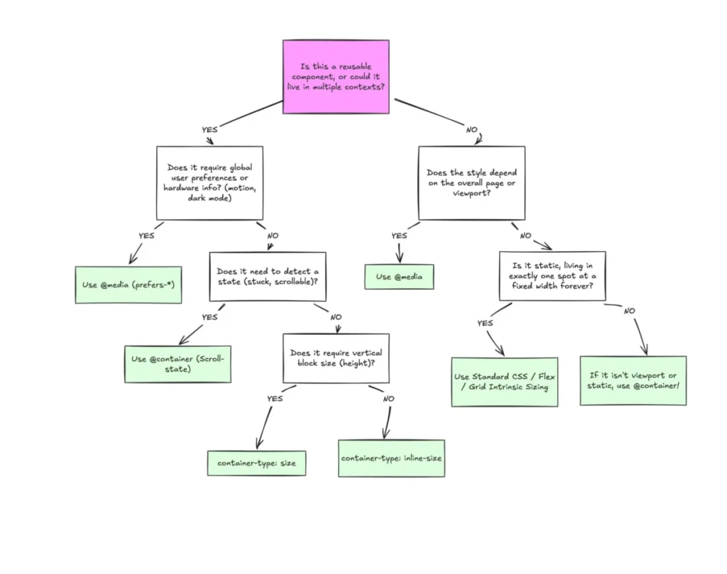
To understand the divergence, one must analyze the objective of each tool. A media query asks, "How wide is the browser window?" It is a macro-level tool designed for the page as a whole. A container query, conversely, asks, "How much space is available within this specific parent element?"
The syntax for container queries requires a two-step process: defining a container and then applying a query.

- Defining the Container: A parent element is assigned a
container-type, typicallyinline-size. - Applying the Query: The
@containerrule allows developers to apply styles based on the parent’s width, effectively decoupling the component’s internal logic from the global viewport dimensions.
This shift allows for the creation of "micro-layouts." For instance, a navigation menu that switches from a horizontal list to a hamburger menu does not necessarily need to trigger when the browser hits 768px. Instead, it should trigger when the sidebar holding the menu reaches a specific width. This logic ensures that components remain consistent regardless of where they are placed.
Technical Limitations and Best Practices
While container queries offer superior flexibility, they are not a direct, one-to-one replacement for media queries. Several technical nuances exist that developers must navigate:
- Self-Referential Restrictions: A container cannot query its own dimensions. Attempting to do so creates an infinite loop where the layout logic conflicts with the rendering engine. Consequently, a wrapper element is required to act as the container for the component itself.
- Size vs. Inline-Size: Querying the
sizeof a container (which includes both width and height) can inadvertently collapse a layout to zero height, as the browser calculates the container’s dimensions independently of its content. Developers are generally advised to stick toinline-sizeto avoid these layout regressions. - Custom Property Integration: Currently, container queries do not support the use of CSS variables (custom properties) within the query condition. Because custom properties rely on the DOM cascade, allowing them within a query could create circular dependencies that the browser cannot safely resolve.
Implications for Fluid Typography and Layout
One of the most promising applications of container queries is fluid typography. Previously, developers used vw (viewport width) units to scale text. This resulted in text that would scale regardless of whether it was in a 1,200px main column or a 200px sidebar, often leading to text that was either too large or illegibly small.
By utilizing container query units (cqi, cqw, cqb) in conjunction with the clamp() function, developers can now create typography that scales relative to the component. This ensures that a component’s content maintains visual hierarchy and readability, irrespective of the global viewport.

Furthermore, container queries provide a functional workaround for "Flexbox wrap detection." Because CSS lacks a native pseudo-class for detecting when flex items wrap to a new line, developers previously relied on JavaScript ResizeObserver APIs to adjust layouts. By wrapping flex items in a container, developers can trigger style changes when the items are forced to wrap, achieving reactive UI behavior entirely within CSS.
Strategic Outlook
The slow adoption of container queries reflects a broader inertia in web development, where legacy practices are often preserved to ensure cross-browser stability and team familiarity. However, the move toward "Component-Driven Development" makes the transition to container-based logic nearly inevitable.
The industry is currently in a transitional phase. Major design systems, including those used by large-scale enterprise applications, are beginning to incorporate container queries to reduce code complexity. By moving away from the "one-size-fits-all" approach of viewport-centric design, developers can produce more robust, maintainable, and truly modular web components.
The primary lesson for the development community is that while media queries remain an essential tool for macro-level page architecture, they are no longer the exclusive answer to responsiveness. As browsers continue to optimize the performance of container queries, the industry is expected to see a shift where component-level logic becomes the standard, significantly reducing the reliance on external JavaScript libraries and complex, global breakpoint management. For teams looking to future-proof their applications, shifting from global viewport thinking to localized container thinking is not merely a stylistic choice, but a requirement for the next generation of web design.