
Posted inGraphic Design
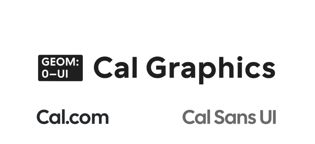
Cal Sans UI Free Font: A Variable Typeface with GEOM Axis
The digital design and open-source communities are abuzz with the release of Cal Sans UI, a groundbreaking variable typeface commissioned by Cal.com, the rapidly expanding open-source scheduling platform. Developed by…
