

Microinteractions, subtle yet profound elements of interaction design, are fundamentally reshaping how users engage with digital products, proving critical in fostering a user-friendly and highly engaging digital ecosystem. These often-overlooked details are no longer mere embellishments but strategic tools that define the success and user satisfaction of applications, websites, and platforms in an increasingly competitive digital landscape. This article delves into the core concept of microinteractions, elucidates their profound impact on the user experience, provides actionable tips for their effective incorporation into product designs, and showcases real-world examples illustrating their significant influence.
The Evolution of User Experience and the Rise of Microinteractions
The digital product landscape has undergone a profound transformation, evolving from rudimentary, static interfaces to sophisticated, dynamic environments. In this evolution, the user experience (UX) has moved from a secondary consideration to a primary driver of product adoption and retention. Early digital interfaces were largely functional, prioritizing task completion over user delight or intuitive interaction. However, as technology advanced and user expectations soared, designers recognized the need to imbue digital products with a sense of responsiveness, personality, and ease of use. This shift laid the groundwork for the emergence and widespread adoption of microinteractions.
The term "microinteraction" was popularized by interaction designer Dan Saffer in his seminal 2013 book, Microinteractions: Designing with Details. Saffer articulated how these seemingly minor moments—a toggle switch animation, a loading spinner, or a notification—collectively shape a user’s perception of a product. Before Saffer’s work, designers intuitively incorporated such elements, but his framework provided a lexicon and a structured approach to understanding and designing these crucial details. This formal recognition marked a turning point, elevating microinteractions from incidental effects to a deliberate and strategic component of UX design. Industry data consistently underscores the importance of a polished user experience; studies by Forrester Research suggest that a well-designed UX can increase customer conversion rates by up to 400%, while Gartner reports that poor UX is a significant contributor to user churn, with 70% of customers abandoning digital products due to unsatisfactory experiences. Microinteractions, by refining the minute details of interaction, play a pivotal role in countering this trend.
Defining Microinteractions: Small Details, Big Impact

At their core, microinteractions are small, single-purpose interactions that occur within a product as part of the broader user experience. Consider the gentle shake animation that signals an incorrect password entry in a login form, or the subtle red dot next to a message subject line, indicating a new, unread email. While these seemingly minor interactions might appear insignificant in isolation, their cumulative effect is profound, shaping the overall user experience, guiding users, and fostering a sense of engagement and satisfaction. The philosophy behind microinteractions truly embodies the adage "less is more," utilizing subtle cues and details to significantly enhance how individuals perceive and interact with an application, website, or any other digital experience. They act as a silent dialogue between the user and the system, providing immediate feedback and reinforcing the user’s actions.
Why Microinteractions Are Indispensable for User Experience
In today’s hyper-competitive digital marketplace, where users expect seamless and engaging experiences, microinteractions have become increasingly vital in UX design. They are not just about aesthetics; they are fundamental to functionality, usability, and brand perception. For businesses striving to differentiate themselves and offer superior services, microinteractions provide a powerful edge.
The importance of microinteractions for the user experience can be categorized into several key areas:
- User Guidance and Feedback: Microinteractions act as intuitive guides, informing users about the system’s status, validating their inputs, or indicating the success or failure of an action. This immediate feedback prevents frustration and helps users navigate complex processes effortlessly. For instance, a visual cue confirming an item has been added to a cart eliminates ambiguity.
- Enhanced Engagement and Delight: Beyond mere functionality, well-designed microinteractions inject personality and delight into a product. A whimsical animation during a loading state or a satisfying sound when a task is completed can create an emotional connection with the user, making the experience more enjoyable and memorable. This "spark of joy" contributes significantly to user retention.
- Improved Usability and Efficiency: By providing clear, concise feedback, microinteractions streamline workflows and reduce cognitive load. Users can quickly understand the consequences of their actions, allowing them to complete tasks more efficiently. This can be as simple as a button changing color upon hover or a confirmation message after a submission.
- Brand Personality and Differentiation: Microinteractions offer a unique opportunity to express a brand’s personality. The style, animation, and timing of these interactions can reinforce brand values, whether they are playful, sophisticated, or efficient. This distinctiveness helps a product stand out from competitors.
- Error Prevention and Recovery: By providing instant validation or subtle warnings, microinteractions can prevent users from making mistakes. In cases where errors occur, they offer clear, immediate feedback on how to rectify them, reducing user frustration and the likelihood of abandonment.
- Perceived Performance: Even if a background process takes a few seconds, a well-crafted loading animation can make the wait feel shorter and more pleasant, improving the perceived responsiveness of the application.
These are not minor considerations that UX designers or product developers can afford to overlook. Integrating thoughtful microinteractions can transform a product, mobile app, or website into a next-level application, fostering loyalty and winning over customers.
Deconstructing Microinteractions: Dan Saffer’s Framework

Dan Saffer’s seminal work, Microinteractions: Designing with Details, provides the definitive guide to understanding these intricate elements. Saffer systematically breaks down microinteractions into four fundamental components, each playing a crucial role in their overall effectiveness.
1. Triggers: The Initiation
Triggers are the catalysts that initiate a microinteraction. They can be either user-initiated, such as clicking a button, swiping an element, or typing into a field, or system-initiated, like a pop-up appearing after a user lands on a specific web page or a notification arriving based on a time-sensitive event. For example, once all required fields in a form are correctly completed, a previously disabled "Submit" button becomes enabled. Similarly, a "Join" or "Accept" button might become clickable only after a user finishes scrolling through and implicitly acknowledging a website’s terms and conditions. These triggers are the starting gun for the interaction.
2. Rules: The Structure
Once a trigger sets a microinteraction in motion, rules dictate what happens next. These rules define the parameters, sequence, and logic of the interaction. For instance, the rule governing a social media "like" might be: "If a user double-taps a post, display a heart graphic, increment the like count, and store the user’s like." Another rule could be that a particular animation plays only once per session or that a specific notification disappears after a set duration. These rules ensure predictability and consistency.
3. Feedback: The Response
Feedback is the critical communication layer where the system conveys the result of a microinteraction to the user. It is the sensory response—visual, auditory, or tactile—that confirms an action has been registered and processed. This is where the "magic" of microinteractions truly shines. If a user clicks a "Join" button for a public group on Facebook, the button might visually transform into a "Joined" button, simultaneously granting the user access to the group’s content. This immediate and clear feedback unequivocally indicates that the user’s action was successful and acknowledged by the system. Without feedback, users are left guessing, leading to frustration and uncertainty.
4. Loops and Modes: The Overall Experience
Loops and modes govern how microinteractions evolve or behave over time and in different contexts. They define the meta-rules of microinteractions, applying them across extended user journeys.
- Loops define how long a microinteraction lasts or how it repeats. A classic example is a loading spinner that continuously animates until a page fully loads. Another might be a recurring notification for an unread message until it’s opened.
- Modes are for infrequent or conditional actions that alter the system’s state or behavior. Switching from a light mode to a dark mode in an application, or toggling a setting that changes the display of content, are examples of mode microinteractions. They represent a distinct, temporary state that the user explicitly enters or exits.
Integrating the Components: A Practical Example
To illustrate these components in action, consider a user filling out an online contact form, entering their details, and then clicking "Submit."
- Trigger: The user clicking the "Submit" button.
- Rules: The system validates the input fields, processes the data, and sends it to the brand’s database. If validation fails, rules dictate showing specific error messages. If successful, it proceeds to the next step.
- Feedback: A success message appears ("Your message has been sent!"), perhaps accompanied by a subtle animation or a brief sound. This immediate visual confirmation lets the user know their action was successful.
- Loops and Modes: A loop might then appear, offering the option to "Send another message" or displaying a message like "While our team reviews your inquiry, why not explore our latest articles?" This keeps the user engaged and provides a clear next step, preventing an abrupt end to the interaction.
Understanding these four components is paramount for designers aiming to implement effective and impactful microinteractions in their product designs.
7 Best Practices for Implementing Microinteractions Effectively
To truly harness the power of microinteractions, their implementation must be strategic, purposeful, and enhance the overall UX design. Adhering to certain best practices ensures that these small details contribute positively rather than detracting from the user experience.
1. Define Clear Purpose
Before integrating any microinteraction, identify its specific goals and objectives. Every microinteraction should serve a clear purpose, whether it’s providing feedback, guiding the user, preventing errors, or adding delight. Avoid adding gratuitous animations or sounds that do not add value or, worse, create dissonance or discomfort. A microinteraction without purpose is merely decoration and can hinder usability.
2. Maintain User-Centeredness
Always design microinteractions with your target audience in mind. This necessitates thorough user research, including creating detailed user personas, conducting interviews, and analyzing user behavior. Tailor microinteractions to align with the needs, behaviors, and preferences of your users. A microinteraction that delights one demographic might confuse another. For instance, while a playful animation might resonate with a younger audience, a more subtle and efficient cue might be preferred by professionals using a productivity tool.

3. Ensure Consistency
Consistency is crucial for predictability and ease of use. Utilize similar styles, animations, and interaction patterns for related interactions throughout your product. This not only simplifies the design and development process but also helps users intuitively understand how different elements of the product function. Consistent feedback mechanisms build familiarity and comfort, making users more likely to engage confidently with your product. Adherence to a robust design system can greatly facilitate this.
4. Prioritize Simplicity
The "micro" in microinteraction is there for a reason. Keep these interactions simple, subtle, and unobtrusive. They should enhance the primary task, not overwhelm or distract the user from it. Overly complex, lengthy, or flashy animations can lead to user frustration and increase cognitive load. The goal is to provide just enough information or delight without drawing undue attention away from the main content or action.
5. Guarantee Accessibility
Microinteractions must be accessible to all users, including those with disabilities or those who rely on assistive technologies. This is a broad topic, encompassing several considerations. For example, use ARIA (Accessible Rich Internet Applications) attributes to convey success messages or state changes to screen readers. Ensure sufficient contrast between foreground and background elements, especially for color-coded feedback. Provide options for users to reduce motion or disable animations for those who might experience discomfort or seizures due to rapid movements. Support keyboard navigation for all interactive elements.
6. Optimize Performance
Microinteractions, especially animations, must be optimized for performance to avoid slowing down your product’s speed and responsiveness. Poorly implemented microinteractions can lead to jank, lag, or increased page load times, creating the perception of a slow or clunky interface. Utilize efficient coding practices, leverage hardware acceleration where possible, and test interactions across various devices and network conditions. A delightful microinteraction that causes performance issues ultimately harms the user experience.
7. Implement Rigorous Testing
Even the most experienced UX designers can misjudge the impact of a microinteraction. Comprehensive usability testing is indispensable for refining and optimizing these small details. Invest in usability testing platforms and invite real users to interact with your design solutions. Gather feedback on their actual experiences, noting areas of confusion, delight, or frustration. A/B testing different microinteraction designs can also provide data-driven insights into which approaches are most effective. Continuous testing ensures that microinteractions genuinely improve navigation, engagement, and other key user experience metrics.
Microinteractions in Action: Real-World UX Design Solutions

Observing microinteractions in leading digital products provides tangible insight into their effective application.
1. Reddit: Animation While Scrolling
Reddit’s "Recap" experience, a personalized summary for users, effectively leverages microinteractions. As a user scrolls down the page, subtle animations transition between different sections, creating a smooth, interactive, and visually pleasing journey. The carousel indicators (progress dots) on the right side of the screen also move in sync with the scroll, providing a clear sense of progression and system status without interrupting the flow. This enhances engagement and makes the recap feel like a personalized, unfolding story.
2. Pinterest: The "Save" Button
When a user saves a pin on Pinterest, the "Save" button undergoes a series of microinteractions. It transitions from red to black, and its text changes from "Save" to "Saved." Simultaneously, a small notification appears near the button, stating "Saved to [board name]" and offering an "Undo" option. This example perfectly illustrates several best practices:
- Feedback: Immediate visual and textual confirmation of the action.
- Purpose: Clearly communicates the success of the save and offers an escape hatch ("Undo").
- Consistency: The pattern of button change and notification is consistent across the platform.
3. Facebook Likes: Emotional Feedback
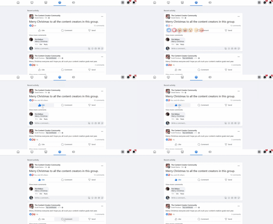
Facebook’s "Like" interaction is a classic example. When a user clicks "Like," the button changes color (typically blue) and often displays a subtle, bouncy animation. This simple change in color and slight movement provides clear, immediate feedback that the user’s action has been registered and has added their engagement to the post. The animation adds a touch of delight and reinforces the social aspect of the interaction.
4. TrustPulse: Exit-Intent Triggers
Microinteractions can also be powerful conversion tools. TrustPulse, a social proof notification platform, uses an exit-intent trigger. When a user scrolls through a page and then moves their mouse cursor to exit the browser window, a strategically timed exit-intent popup appears. The trigger here is the user’s behavior (intent to leave), and the outcome is an opt-in signup form, providing a last-chance opportunity to capture user interest and prevent abandonment. This shows how microinteractions can be tied directly to business objectives.
5. Form-Field Error Indication
Thoughtful microinteractions are crucial for identifying errors and guiding users to make corrections. For instance, if a user types an email address in an incorrect format, an instant, simple error message appears in red text below the field. This immediate visual feedback quickly draws the user’s attention to the error, clarifies what went wrong, and often suggests the correct format. This type of informative, yet unobtrusive communication makes the form-filling experience significantly smoother and less frustrating.

6. Canva: ToolTips and Loading Graphics
Canva, renowned for its user-friendly interface, integrates microinteractions extensively. When a user hovers over the "+" symbol on the canvas, a clear ToolTip appears, explaining its function. Additionally, when a new design requires loading time, a floating Canva logo animation appears. These simple additions enhance user understanding, provide continuous guidance, and reduce frustration across various touchpoints, especially for new users.
7. Google Docs: Checkmark Microinteractions
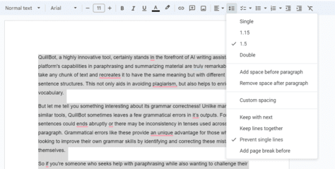
Google Docs offers a simple yet powerful microinteraction through its checkmark system. When a user selects a setting or option from a menu (e.g., a specific font style or alignment), a checkmark immediately appears next to that option. This clearly indicates which settings are currently active, preventing users from selecting the same option twice or guessing the current state. It contributes to a smoother and more intuitive user experience by making the system’s status transparent.
Broader Impact and Future Implications
Microinteractions are not merely a passing design trend; they are an enduring and increasingly sophisticated component of digital product design. Their strategic implementation yields significant returns on investment, fostering customer loyalty, enhancing brand perception, and directly impacting conversion rates. As digital interfaces become more immersive and intuitive, the role of microinteractions will only grow, extending into emerging technologies such as virtual reality (VR), augmented reality (AR), and voice user interfaces (VUIs). In these contexts, haptic feedback, spatial audio cues, and subtle visual indicators will become paramount for creating truly seamless and natural interactions.
However, the effective deployment of microinteractions is not without its challenges. Designers must navigate the fine line between adding value and over-designing, ensuring that animations remain performant and accessible, and that they align with the product’s overall strategic goals. Industry experts consistently emphasize that these subtle cues are no longer mere embellishments but fundamental building blocks of intuitive, human-centered design, bridging the gap between human intent and machine response.
Conclusion
Microinteractions are an essential, often invisible, thread woven into the fabric of any successful digital product. They subtly guide users through their journey, provide critical feedback, and significantly enhance the overall user experience. Moving beyond mere aesthetics, these small details facilitate a meaningful dialogue between the system and the user, making digital interactions feel more human, intuitive, and easy to understand.
As the examples illustrate, well-designed microinteractions not only add a spark of delight but also empower users, helping them understand how to effectively use a product while simultaneously reducing frustration across diverse touchpoints. Therefore, in the design and development of any new digital product, it is imperative to fully leverage the profound potential of microinteractions. These small, often nearly invisible details frequently make the most significant impact on a product’s user experience, distinguishing exceptional products from the merely functional.