
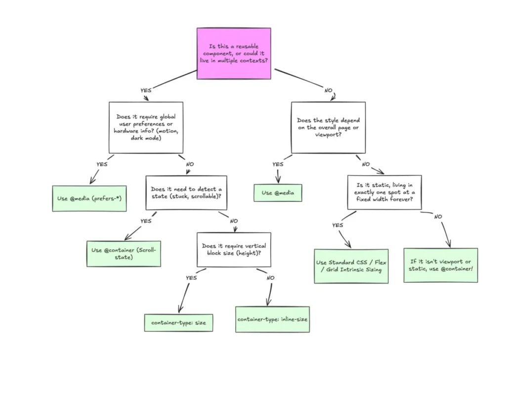

Despite broad browser support, CSS Container Queries remain one of the most underutilized and frequently misunderstood features in modern web development. While media queries have served as the backbone of responsive design for nearly two decades, the shift toward component-based architecture has revealed significant limitations in how developers manage layout logic. Recent industry surveys indicate that while awareness of container queries has reached 86% among professional developers, actual adoption lags at just over 41%. This discrepancy highlights a critical friction point: developers are struggling to move away from viewport-centric thinking in favor of context-aware design systems.
The Evolution of Responsive Design
To understand the current state of CSS, one must look back to the inception of responsive design. In 2010, Ethan Marcotte’s seminal article on responsive web design introduced the industry to the concept of flexible grids, fluid images, and, crucially, media queries. At that time, the primary challenge was ensuring websites looked consistent across a relatively small set of device categories—desktops, tablets, and smartphones. Media queries allowed developers to apply styles based on the viewport width, effectively treating the browser window as the sole authority for layout decisions.
For years, this served the industry well. However, as the web matured, the "viewport as a proxy" model began to show signs of strain. The rise of complex, modular design systems—where a single component like a "card" might be reused in a full-width main column, a narrow sidebar, or a dynamic grid—exposed a fundamental flaw: media queries are blind to the environment inside the browser. A component does not inherently know how much space it has; it only knows how wide the browser window is.

A Chronology of Adoption and Technical Hurdles
The request for container queries has appeared on the CSS Working Group’s wishlist since at least 2019. The industry recognized that developers needed a way to query the parent container’s size rather than the global viewport. When the CSS Container Queries specification finally achieved widespread implementation, it reached roughly 94% browser support. Despite this, integration has been slow.
The technical barrier is largely psychological. Because the syntax of @container so closely mirrors that of @media, many developers assume they function in the same way. The primary difference lies in the direction of the inquiry: media queries look outward toward the user’s screen, while container queries look inward toward the component’s immediate layout environment.
Supporting Data and Industry Trends
The 2025 State of CSS survey provides a sobering look at this adoption gap. While 86% of respondents confirmed they were aware of the feature, the 41.4% utilization rate suggests that many developers are either intimidated by the learning curve or fail to see an immediate use case in their current projects. This hesitation is further compounded by the existence of over 2,300 unique viewport sizes currently in use on the web. Relying solely on media queries to manage this level of fragmentation is, according to many frontend architects, mathematically unsustainable.
Industry experts, including noted CSS educator Kevin Powell, have argued that the failure to adopt container queries is a failure to modernize design logic. By continuing to rely on media queries for component-level adjustments, developers are creating "brittle" code that breaks when components are moved to different sections of a layout.

Technical Implications and Best Practices
The transition to container queries involves a fundamental change in how CSS is written. To utilize the feature, a developer must explicitly declare a container-type on a parent element:
.card-wrapper
  container-name: card-container;
  container-type: inline-size;


@container card-container (min-width: 450px)
  .card
    display: flex;
    flex-direction: row;
This approach allows the component to remain truly autonomous. The card will switch its layout based on the available space within the card-wrapper, regardless of whether that wrapper is in a 300px sidebar or a 1200px main content area. This is a departure from the "macro-layout" versus "micro-layout" approach, where macro-layouts (page structure) remain the domain of media queries, and micro-layouts (components) shift to container queries.
The Pitfalls of Misuse
One of the most significant risks in adopting container queries is the potential for developers to introduce infinite loops or layout instability. A common mistake is attempting to query a container on the same element that defines the container. For instance, an element cannot be both a container and a subject of a query based on its own size, as this creates a circular dependency. Developers must establish a clear parent-child hierarchy to prevent this.
Furthermore, querying the block (vertical) size of a container can lead to layout collapse if the container’s height is not explicitly defined. Because the browser calculates the container size without reference to its children, the height may resolve to zero. Consequently, best practices currently suggest a heavy preference for inline-size queries, which focus on horizontal constraints and avoid the common pitfalls associated with vertical sizing.

Future Perspectives
While container queries offer a powerful solution for responsive components, they are not a replacement for media queries. They represent an additional tool in the developer’s toolkit. Media queries remain the standard for macro-level adjustments, such as prefers-color-scheme for dark mode or overall page grid shifts.
The future of CSS development appears to be moving toward a more granular, context-aware approach. The emergence of container style queries—which allow developers to query the computed styles of a parent rather than just its dimensions—is currently in the experimental phase. If these features gain traction, they will likely further reduce the reliance on JavaScript-based layout observers, allowing CSS to handle increasingly complex state changes natively.
Conclusion
The slow adoption of container queries reflects a broader resistance to changing established workflows. However, the data is clear: the modern web is too fragmented for viewport-only responsiveness. By separating the logic of page-level structure from component-level behavior, developers can create more resilient, reusable, and maintainable systems. As browser support has stabilized and documentation has improved, the barrier to entry is no longer technical, but conceptual. The industry is currently at an inflection point where the transition from "media-query-only" workflows to "container-aware" architectures will likely define the next era of high-performance web development. Developers who embrace this shift will find themselves better equipped to handle the complexities of the multi-device, multi-context web.