
The landscape of modern typography is often dominated by the utilitarian requirements of screen readability and the geometric constraints of sans-serif minimalism. However, the recent emergence of Elfreth, a typeface family designed by James Hultquist-Todd of JTD Type, represents a significant departure from these trends. By reinterpreting the traditional blackletter—a category of type historically reserved for formal announcements, religious texts, or gothic aesthetic projects—Hultquist-Todd has introduced a versatile, expressive, and technically nuanced tool for contemporary graphic designers. The release of Elfreth serves as a case study in how historical calligraphic roots can be adapted for digital-first applications, challenging the long-held industry assumption that gothic styles are inherently archaic or overly ornamental.
Historical Context and the Evolution of Blackletter
Blackletter, or Fraktur and Textura scripts, traces its origins to the 12th-century transition from Carolingian minuscule. These dense, angular letterforms were engineered to save space on expensive parchment, allowing scribes to fit more text into a single line. For centuries, this style defined the visual identity of Western European printing, most notably in the Gutenberg Bible.
In the digital era, blackletter has largely been relegated to niche markets: heavy metal band logos, medieval-themed event posters, and academic heraldry. The prevailing design consensus has categorized these fonts as "display-only" assets—unsuitable for long-form reading or modern interface design. The introduction of Elfreth by JTD Type fundamentally disrupts this categorization by stripping away the rigid, austere ornamentation typically associated with the style and replacing it with a nuanced, modulated approach that prioritizes character legibility across a broad spectrum of weights.
Design Specifications and Technical Nuances
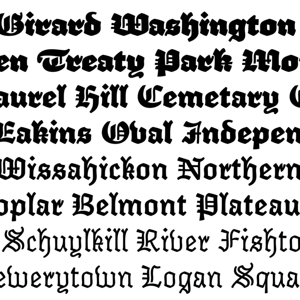
Elfreth is defined by its refusal to conform to the static expectations of its genre. The typeface family encompasses a wide range of weights, from a spare, typewriter-like light cut to a robust, high-impact heavy weight. According to technical specifications provided by JTD Type, the design achieves this versatility through a series of intentional distortions.
The character set features what designers call "typographic cowlicks"—small, irregular flourishes that break the uniformity of the stroke—and "dog’s ear" terminals that soften the harsh, diamond-shaped endings common in traditional blackletter. This approach is not merely aesthetic; it is a calculated effort to increase the white space within and around the glyphs. By modulating the "wows and wobbles" of the stroke weight, Hultquist-Todd has created a typeface that maintains its gothic structure while appearing far more approachable and "cuddly," as noted by industry critics.
The Chronology of Development
The development cycle for Elfreth reflects a shift in independent type design, where small foundries are increasingly prioritizing iterative testing over rapid, mass-market releases.
- Early Conceptualization (2018): James Hultquist-Todd began the foundational research into calligraphic nib pressure and its digital translation. The goal was to maintain the rhythm of a broad-edged pen while ensuring the vector paths remained clean for screen rendering.
- Beta Testing (2019): Initial drafts were circulated among a small group of typographers to test the behavior of the "flare" in various weights. Concerns regarding the legibility of the "heavy" cut were addressed by increasing the interior counter space of lowercase letters like ‘o’ and ‘e’.
- Final Release (2021): The official launch of Elfreth provided users with a comprehensive suite of OpenType features, including stylistic alternates and ligatures designed to mimic the fluid, rhythmic flow of human handwriting.
Comparative Analysis: The Modern Blackletter Market
To understand the significance of Elfreth, one must look at the current market share of display typefaces. Data from independent font marketplaces indicate that while sans-serif fonts occupy approximately 60% of commercial font purchases, there is a growing demand for "personality-driven" display fonts. This trend is driven by a saturation of generic, neutral design systems in corporate branding.

Elfreth functions as an "accent" font. Unlike traditional blackletter, which demands full control of a layout due to its density, Elfreth’s lightest weight allows it to be used in conjunction with body text, or as a standalone header in editorial design. By bridging the gap between the "stout" presence of heritage designs and the "spare" requirements of modern branding, Elfreth creates a new category of utility. It occupies a space similar to historical revivals like Cooper Black or specialized display serifs, yet maintains the structural heritage of the Gutenberg era.
Implications for Graphic Design and Brand Identity
The adoption of Elfreth in contemporary design portfolios signals a broader shift in visual communication. As brands seek to differentiate themselves in crowded digital spaces, they are increasingly looking toward "maximalist" typography. Elfreth provides a path toward this aesthetic without sacrificing professional design standards.
For branding agencies, the inclusion of such a typeface allows for a dual-tone communication strategy: a brand can utilize the lighter weights for secondary copy, providing a unique texture to the interface, while reserving the heavy, "cuddly" weights for key headlines. This reduces the need for expensive, custom-commissioned logotypes, as the family itself provides enough character to define a brand’s visual identity.
Furthermore, the technical implementation of Elfreth—specifically its responsiveness to varying display resolutions—demonstrates that gothic-derived styles are no longer "too dense" for mobile web use. The industry’s move toward high-density displays (Retina screens) has mitigated the traditional concerns regarding ink trap failure and stroke blurring, making Elfreth a viable candidate for high-end web design.
Expert Perspectives
Industry observers have noted that Elfreth represents a "maturation" of the independent type foundry model. Grant Hutchinson, a long-time observer of the typographic arts and member of the Society of Typographic Aficionados, highlights that Elfreth’s success lies in its ability to respect the "bones" of historical calligraphy while discarding the "baggage" of religious or ultra-conservative visual history.
This sentiment is echoed by broader design discourse, which suggests that the future of type design lies in "cross-pollination"—the act of taking a forgotten, rigid style and infusing it with the logic of contemporary interface design. Hultquist-Todd’s work suggests that the blackletter category is not a closed chapter of history, but rather an under-utilized resource that, when handled with technical precision, can serve the needs of a modern audience.
Conclusion: The Future of Niche Typefaces
The release and subsequent reception of Elfreth serve as a reminder that the evolution of typography is not linear. Innovation often occurs by looking backward and identifying which elements of historical styles were discarded prematurely due to technical limitations. By proving that blackletter can be "perky," "subtle," and "spare," Elfreth has effectively expanded the vocabulary available to digital designers.
As the industry moves forward, the success of such typefaces will likely encourage other designers to revisit neglected categories. Whether this marks a full-scale renaissance of blackletter remains to be seen; however, the immediate impact on editorial design, identity branding, and digital illustration is undeniable. Elfreth stands as a testament to the fact that with enough technical rigor and creative intent, any typographic tradition can be reclaimed for the present day.