
Jim Parkinson, the legendary lettering artist and type designer whose work shaped the visual identity of modern American media, has passed away in Oakland, California, following a protracted battle with Alzheimer’s disease. He was 83. His death marks the end of a prolific career that spanned over five decades, leaving an indelible mark on the landscape of graphic design, publishing, and typography. He is survived by his wife, Dorothy A. Yule, a noted book artist who provided devoted care to Parkinson during his final years.
A Life Defined by Letterforms
Born in Oakland on October 23, 1941, Parkinson’s trajectory toward becoming one of the 20th century’s most influential typographers began in his childhood. His early inspiration was rooted in his immediate environment; he grew up across the street from Abraham Lincoln Paulsen, a local figure known as the "Wizard Penman." Paulsen’s ability to perform intricate calligraphic feats—including writing the Gettysburg Address in reverse and upside down using only the numeral "2"—ignited a fascination in young Parkinson that would dictate his professional life.
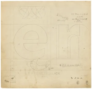
Parkinson did not merely view letters as functional symbols; he treated them as structural, historical, and aesthetic entities. During his formative years, he obsessively collected lettering manuals and correspondence-school textbooks, many of which were already relics of a bygone era of design. By internalizing these historical styles, he developed a signature ability to synthesize traditional techniques with modern commercial demands, a skill that would eventually make him the "go-to" designer for art directors across the United States.
Chronology of a Prolific Career
Parkinson’s professional path was characterized by a rapid ascent followed by a long, sustained period of industry dominance. After graduating from the California College of Arts and Crafts in 1963, he moved to Kansas City, Missouri, to join the creative team at Hallmark Cards. While the company initially assigned him to general illustration, it quickly became apparent that his true aptitude lay in the precise, technical, and artistic demands of the lettering department.

- 1963: Graduates from the California College of Arts and Crafts.
- 1963–1960s: Joins the lettering department at Hallmark Cards, refining his craft and discovering his niche.
- 1970s: Returns to the San Francisco Bay Area to launch a career as a freelance lettering artist, a venture that would span more than half a century.
- 1970s–2020s: Becomes a cornerstone of the magazine and newspaper industry, redrawing mastheads and creating custom typefaces for publications including Rolling Stone and the Los Angeles Times.
- 2025: Passes away in Oakland, California, leaving behind a vast archive of work to be preserved by the Letterform Archive.
The Architect of Modern Mastheads
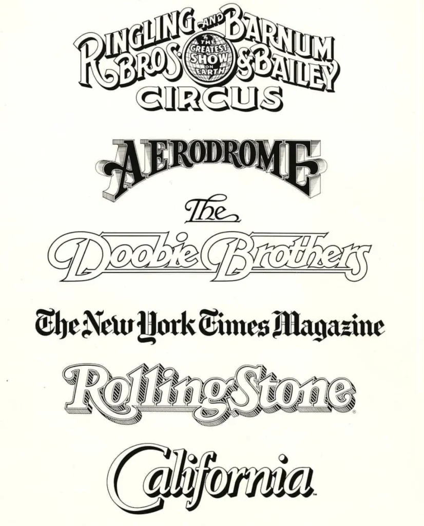
The impact of Parkinson’s work is perhaps best measured by his ubiquity. His hand-lettered logos and custom typefaces have appeared on the covers of thousands of magazines and newspapers, serving as the visual "face" of news and culture. His portfolio includes iconic wordmarks for Rolling Stone and the Los Angeles Times, as well as a diverse array of logos for entities as varied as the Doobie Brothers and the Ringling Bros. and Barnum & Bailey Circus.
In the pre-digital era of print media, Parkinson was essential to the visual refresh of major publications. When art directors sought to update a brand or capture a specific tone, they often turned to him to hand-render custom letterforms that conveyed both character and legibility. His ability to adapt his style—from elegant serif headlines to bold, display-heavy logos—made him a rare talent capable of maintaining a distinct personal "voice" while serving the disparate needs of his clients.
Beyond Typography: Fine Art and Preservation
While Parkinson is primarily celebrated for his typographic contributions, his later years were defined by a dedication to the fine arts. He developed a specific interest in documenting the fading history of American neon signage. Traveling throughout the American West, he captured the textures of peeling paint, broken glass, and weathered metal, translating these observations into large-scale paintings. These works were not merely decorative; they were an extension of his lifelong obsession with how letters exist within the physical environment, particularly in the context of urban decay and historical commercial signage.
His peers and colleagues, including Stephen Coles of the Letterform Archive, have frequently noted that Parkinson’s professional brilliance was matched only by his accessibility. He was known for maintaining an open-door policy, welcoming designers, students, and enthusiasts into his home to view his extensive personal collection of ephemera and original artwork. This generosity of spirit ensured that his expertise was passed on to a new generation of typographers.
Professional Legacy and Academic Impact
The breadth of Parkinson’s work has prompted a reevaluation of the role of the individual lettering artist in an increasingly automated design world. In an age where digital fonts are generated by algorithms, Parkinson’s career stands as a testament to the necessity of the human touch. His work for the Los Angeles Times, for instance, required a deep understanding of historical nuance and mechanical constraint—qualities that many modern designers argue are being lost.

In 2027, the Letterform Archive is scheduled to publish Parkinson’s memoir, a work that promises to provide a firsthand account of the transition from manual lettering to the digital revolution. This publication will serve as a primary source for future historians of design, offering insight into the collaborative process between artists, art directors, and printers during the golden age of print journalism.
Tributes and Future Considerations
The design community has reacted to the news of Parkinson’s passing with an outpouring of tributes, highlighting his humility and his adherence to the adage: "Take your work seriously, but never yourself." This philosophy was not merely a personal mantra but a professional standard that allowed him to work effectively with diverse teams for decades.
The Alzheimer’s Association has been identified by the family as the preferred recipient for memorial donations. Furthermore, a formal memorial service is being planned for the autumn. As the design world mourns the loss of one of its most prolific contributors, the focus shifts toward the preservation of his archives. Through his website and the upcoming memoir, the mechanisms of his creative process will remain available for study, ensuring that his influence continues to inform the practice of lettering long after his passing.
His death serves as a poignant reminder of the fragility of the human element in an era defined by rapid technological change. Jim Parkinson’s life was defined by the steady, deliberate act of drawing letters—a craft that, through his hands, became a foundational element of the visual history of the American experience. Whether on the newsstand, on an album cover, or in the pages of a newspaper, his work remains a permanent fixture of our collective visual memory.