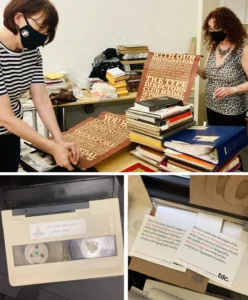

The typeface Almost, designed by Jérôme Knebusch, represents a significant development in contemporary digital type design, bridging the gap between historical fifteenth-century printing aesthetics and modern, functional typography. The typeface, which earned a Certificate of Excellence in the Type Directors Club’s (TDC) twenty-third annual Typeface Design Competition in 2020, stands as a testament to the intersection of rigorous historical research and innovative software engineering. Its development is inextricably linked to the Gotico-Antiqua research program at the Atelier National de Recherche Typographique (ANRT) in Nancy, France—an initiative dedicated to exploring the transitional period of European printing when the rigid blackletter scripts of the Middle Ages began to soften into the humanist roman forms of the Renaissance.
The Genesis of Almost and the Gotico-Antiqua Context
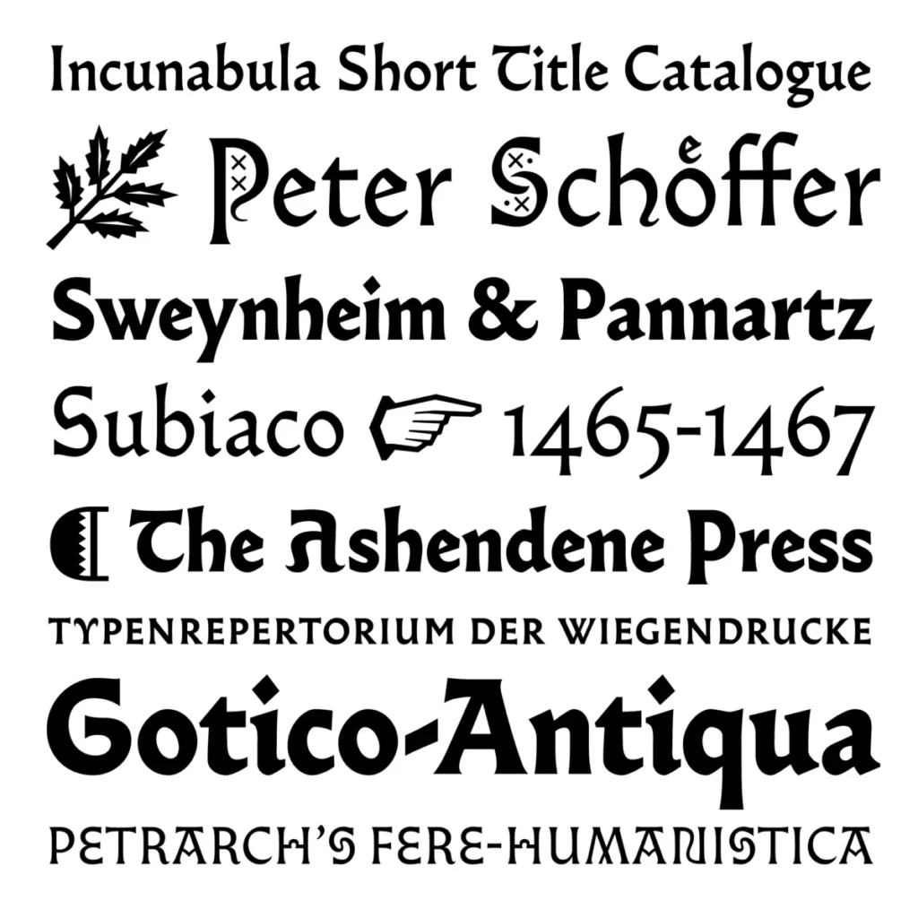
The Gotico-Antiqua movement, often referred to as the "hybrid" period of type design, emerged in the mid-fifteenth century as printers sought to balance the readability of the humanist hand with the familiarity of traditional gothic structures. Jérôme Knebusch’s Almost is not a direct revival of any single historical source; rather, it is a creative interpretation of the spirit of this era.
By the late 1450s, following the introduction of movable type by Johannes Gutenberg, the evolution of letterforms underwent a rapid transformation. Printers in Germany and Italy began experimenting with "round gothic" or "semi-gothic" styles, which possessed the verticality of blackletter but utilized the open counters and structural clarity of the roman alphabet. Knebusch’s research at the ANRT focused on these technical shifts, providing the intellectual framework for Almost. The typeface serves as a modern conduit for these historically dense forms, translating the nuances of early metal-type punch-cutting into a versatile digital family suitable for contemporary editorial and digital environments.
Design Philosophy and Technical Execution
One of the defining features of Almost is its departure from standard classification systems. In the field of typography, typefaces are typically categorized into broad groups such as Serif, Sans-serif, Slab-serif, or Script. Almost defies this binary by incorporating elements of both gothic and roman traditions, allowing the designer to move fluidly between a more traditional, calligraphic feel and a cleaner, modern aesthetic.
The technical architecture of the family is designed for maximum efficiency. Unlike sprawling digital families that require the installation of dozens of individual font files, Knebusch streamlined the Almost system. Only two base fonts—Almost Roman and Almost Gothic—are provided as primary files. The variation within the family is handled through sophisticated OpenType features. This approach reduces the burden on the end-user, who can toggle between stylistic variations without the need to swap entire font files, ensuring that document color and vertical metrics remain consistent throughout a project.
The glyphs were crafted with a focus on geometric rigor and optical balance. The strokes exhibit a precision that makes them highly legible at small sizes, while the subtle, graceful terminals allow the typeface to function as an expressive display face for headlines. The consistency of metrics across the varying styles is a critical design choice, allowing for seamless substitution during the design process, a feature highly prized by book designers and layout artists who require stability in their typesetting.
Chronology of Recognition and Industry Impact
The trajectory of Almost from a research project to a commercially available typeface is marked by a series of critical milestones:

- 2017–2018: Initial development phase conducted within the ANRT Gotico-Antiqua research program.
- 2019: Refinement of the character set and OpenType implementation to ensure multi-functional performance.
- 2020: Almost is officially released, garnering immediate attention for its technical ingenuity.
- 2020 (December): The typeface is recognized by the Type Directors Club (TDC) in its twenty-third annual Typeface Design Competition, receiving a Certificate of Excellence.
- 2021 (January): Formal review by industry experts highlights the typeface’s role in bridging historical research with modern usability.
The TDC recognition is particularly significant. As one of the most prestigious global forums for typography, the TDC competition evaluates entries based on design, execution, and cultural relevance. The jury’s selection of Almost underscores a broader trend in the design community toward honoring "scholar-designers"—individuals who do not merely create aesthetically pleasing fonts but who conduct deep historical inquiry to inform their work.
Analysis of Modern Typeface Utility
The rise of typefaces like Almost reflects a shift in the typography market. As the tools for digital design become more accessible, there is an increasing demand for "workhorse" fonts that offer unique character without sacrificing readability. Almost occupies a niche that is particularly valuable for editorial design. Because it shares characteristics with fifteenth-century printing, it carries an inherent sense of authority and intellectual weight. Yet, because it is stripped of the "archaic" baggage of a strict historical revival, it feels modern and fresh in digital layouts.
From a technical standpoint, the reliance on OpenType stylistic sets is a trend that is becoming standard in professional-grade typography. By minimizing the number of base files, designers like Knebusch are addressing a common complaint among layout professionals: font menu fatigue. The ability to maintain identical metrics across variants is not merely a convenience; it is a necessity for complex editorial work where changing a font style should not cause text to reflow or alter the grid of a page.
The Role of Research-Led Design
The success of the Almost typeface highlights the growing importance of academic-style research in the commercial design sector. The ANRT in Nancy has become a hub for this intersection, providing resources for designers to study archives that are often inaccessible to the public. By institutionalizing this research, the program has enabled designers to move beyond superficial mimicry of historical styles and toward a deeper understanding of the "why" behind the stroke.
Knebusch’s methodology suggests that the future of type design lies in this hybrid space. As digital screens continue to dominate the landscape of communication, the need for typefaces that can handle both the high-resolution requirements of print and the technical limitations of pixel-based display is paramount. Almost manages this by balancing the high contrast and rhythmic quality of its historical influences with the modular, logical structure required for modern software.
Implications for the Future of Typography
The impact of Almost on the industry is measured not just by its sales or its awards, but by the conversation it has sparked regarding the role of tradition in innovation. By demonstrating that one can be deeply respectful of the past without being limited by it, Knebusch has provided a template for future designers. The typeface serves as a case study in how to translate the nuances of humanism—the hand of the scribe, the pressure of the punch, the grain of the paper—into a digital format that feels alive and relevant.
Furthermore, the integration of Almost into the design community’s workflow signals a move away from the hyper-minimalist trends that dominated the early 2010s. As designers seek more character and texture in their work, fonts that possess a distinct historical DNA are likely to remain in high demand. Almost is a pioneer in this regard, proving that technical precision and historical curiosity are not mutually exclusive but are, in fact, complementary forces that drive the evolution of visual communication.
As the industry continues to evolve, the legacy of projects like the Gotico-Antiqua research program will be measured by the number of designers who, like Knebusch, choose to look back to the origins of the printing press to build the tools for the next century of digital publishing. Almost is more than just a set of characters; it is a manifestation of the ongoing dialogue between the history of the written word and the technological future of the screen. Its presence in the field serves as a reminder that the most compelling design work often comes from the deepest study of the past, refined through the rigorous application of modern technical standards.