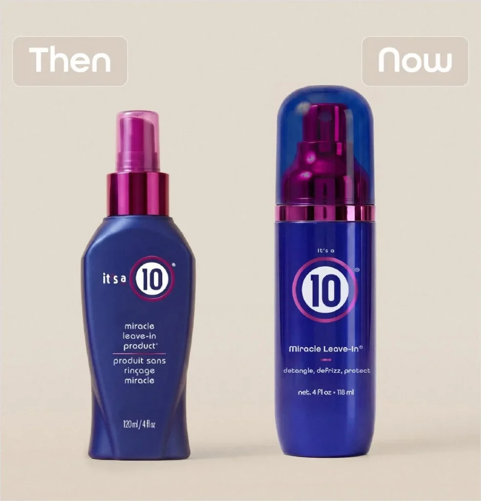

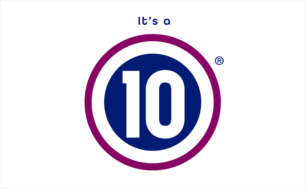
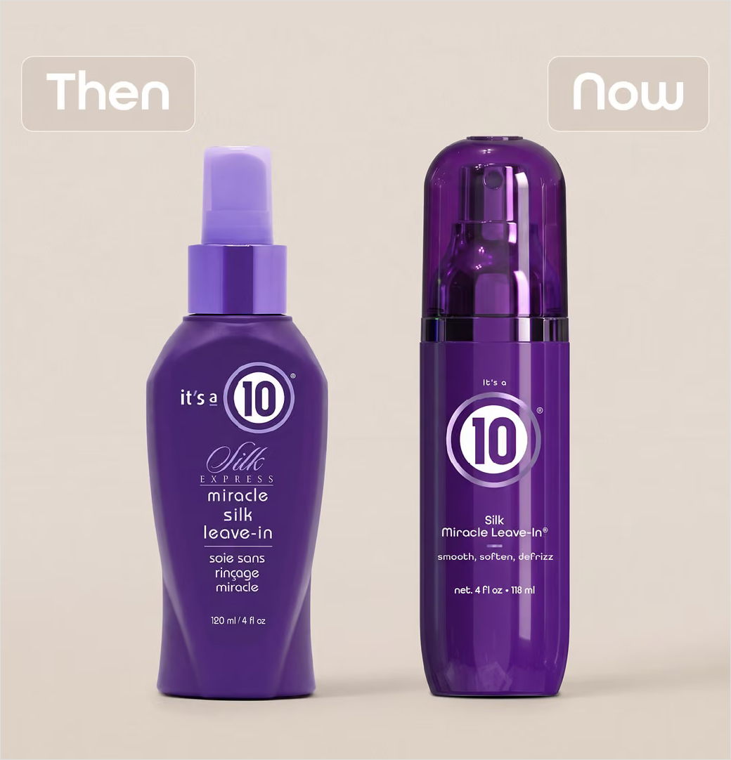
Popular American professional haircare brand It’s a 10 has officially launched its first comprehensive brand overhaul in its two-decade history. Rolled out under the strategic marketing banner "New Era. Same 10," the multi-faceted corporate refresh encompasses a modernized logo design alongside a completely reimagined packaging architecture. The large-scale redesign touches more than 80 distinct products within the company’s extensive portfolio, marking a significant milestone for the independent beauty enterprise as it positions itself for future market expansion and consumer demographics.
The aesthetic evolution comes at a time when the beauty industry is experiencing rapid shifts in consumer expectations, sustainability demands, and visual storytelling. Rather than abandoning the core equity that built its reputation over the last twenty years, the brand’s leadership has opted for a measured evolution, ensuring that the visual identities on retail shelves reflect modern design sensibilities while maintaining the trusted formulations consumers have relied on for generations.
A Vision for Modern Beauty: Leadership Perspectives
The driving force behind the extensive rebrand is Carolyn Aronson, a veteran hair stylist who serves as the founder, Chief Executive Officer, and sole owner of It’s a 10 Haircare. Operating without outside corporate investors or private equity backing, Aronson has maintained complete creative and financial autonomy over the company since its inception, a rarity in the modern beauty landscape.
In statements accompanying the official rollout, Aronson emphasized that the transition is not a departure from the company’s foundational values, but rather an enhancement of its market presence.
"This isn’t a reinvention of who we are—it’s an evolution of how we show up," Aronson explained. She further elaborated on the strategic necessity of the updates, noting that the new visual language captures the current state of the beauty sector while anticipating upcoming industry trajectories. "What we’re introducing is a more modern, elevated expression of the brand that reflects where beauty is today and where we’re headed next. It’s a new era, but it’s the same 10: honouring our heritage while creating a stronger foundation for future innovation and growth."
Corporate communications from the brand echo this sentiment, stating publicly that the updated visual identity bridges the gap between contemporary design standards and the high-performance product efficacy that has secured the company’s loyal customer base over the past twenty years.
Chronology and Scope of the 20-Year Evolution
Founded in the mid-2000s, It’s a 10 Haircare steadily built its reputation on multi-benefit, salon-quality hair treatments designed to simplify daily hair routines. Over the course of twenty years, the company expanded from a single flagship product into a comprehensive catalog distributed across professional salons, major beauty supply chains, and mass-market retailers throughout the United States and international territories.
The timeline leading up to the "New Era. Same 10" campaign represents the most intensive period of internal restructuring and product development in the company’s history:
- Foundation and Early Growth: The brand launched with its signature multi-action formula, establishing a direct-to-salon model that quickly gained traction among professional stylists and everyday consumers alike.
- Decade of Expansion: Throughout the 2010s, the company systematically introduced specialized lines targeting specific hair concerns, growing its SKU count to encompass dozens of shampoos, conditioners, treatments, and styling aids.
- The 2026 Rebranding Initiative: Throughout the current calendar year, It’s a 10 undertook the massive logistical challenge of redesigning, manufacturing, and distributing new packaging for more than 80 individual products simultaneously.
- Official Public Launch: The new logo, packaging, and the "New Era. Same 10" marketing campaign formally debuted to the public, backed by digital media pushes and in-salon promotional materials.
Portfolio Expansion: New Formulations and Specialized Collections
In tandem with the aesthetic redesign, It’s a 10 Haircare has leveraged the rebrand to introduce several entirely new product lines and formulations designed to capture broader market segments. The product expansion addresses rising consumer demand for targeted haircare solutions, particularly concerning texture management, hydration, and professional styling performance.
Among the newly introduced standalone products are:
- Miracle Styling Foam: Formulated to provide flexible hold, volume, and humidity resistance without leaving a stiff or sticky residue.
- Keratin Hair Mask: An intensive conditioning treatment designed to rebuild strength, smooth the hair cuticle, and restore moisture balance to damaged or chemically treated hair.
- Volumizing Glaze: Engineered to add lift at the root and all-over body while maintaining touchable softness and natural shine.
In addition to these individual releases, the American haircare company has rolled out four distinct new product collections. These specialized lines are tailored to specific hair types and care regimens:
- Glossing Collection: Focused on enhancing light reflection, smoothing frizz, and imparting a high-shine finish to dull or lackluster hair.
- Curly Collection: Formulated to define, hydrate, and manage the unique structural needs of wavy, curly, and coily hair textures.
- Intense Hydration Collection: Designed for dry, brittle, or coarse hair, utilizing deep-moisturizing agents to restore lipid balance and elasticity.
- Texture Collection: Created to help users achieve piecey, undone looks, beach waves, and controlled styling versatility with a modern matte or satin finish.
Market Dominance and the Flagship Miracle Leave-In
While the introduction of new collections demonstrates forward momentum, the bedrock of the company’s financial success remains its legendary flagship product: the Miracle Leave-In.
Industry data and corporate disclosures highlight the staggering scale at which the Miracle Leave-In moves through the retail pipeline. In the United States alone, the product reportedly sells upwards of 11 million bottles annually. When broken down into smaller time increments, this sales velocity translates to approximately one bottle sold every three seconds. This exceptional turnover positions the Miracle Leave-In as one of the most commercially successful single-item offerings in the modern professional haircare sector.
The immense popularity of this flagship product provided the financial stability and brand recognition necessary to execute a comprehensive, cross-portfolio rebrand of more than 80 items in a single year—a logistical feat that few independent beauty brands attempt without external financial backing.
Design Analysis: Bridging Heritage and Contemporary Minimalism
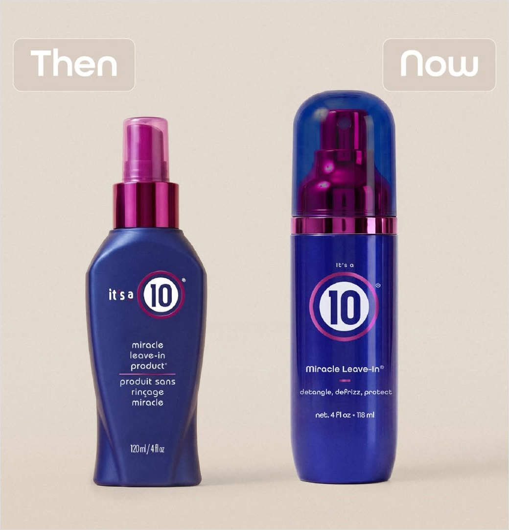
The new logo and packaging design language reflect broader aesthetic trends currently sweeping the beauty and personal care industries. Over recent years, consumer preferences have shifted away from overly complex, text-heavy packaging toward cleaner, more minimalist designs that utilize sophisticated typography, elevated color palettes, and sustainable materials.
In the case of It’s a 10, the updated visual identity streamlines the typography of the brand name, ensuring high legibility across digital e-commerce thumbnails, social media platforms, and physical retail shelves. The packaging retains key brand color signatures that long-standing consumers recognize immediately, ensuring brand equity is not lost during the transition. However, the overall silhouette, labeling hierarchy, and finish of the bottles and tubes have been refined to project a more luxurious, modern aesthetic.
Design experts note that updating a brand with such a deeply entrenched visual history carries inherent risks. Drastic departures can alienate loyal consumers who associate a specific look with product efficacy. By framing the update as an evolution rather than a revolution, and by maintaining the exact formulations inside the bottles, It’s a 10 has mitigated the risk of consumer confusion while successfully signaling a fresh, contemporary chapter for the enterprise.
Broader Industry Implications and Future Outlook
The successful execution of the It’s a 10 rebrand offers several key insights into the current state of the independent beauty market.
First, it underscores the viability of independent ownership in an industry increasingly dominated by massive multinational conglomerates. Because Carolyn Aronson retains sole ownership of the company, strategic decisions—such as overhauling an entire catalog of 80-plus products simultaneously—can be executed with speed and singular vision, free from the bureaucratic delays often associated with publicly traded corporate boards.
Second, the simultaneous pairing of a visual rebrand with aggressive product innovation demonstrates how mature brands can capture new market share. Rather than relying solely on the nostalgia of its 20-year history, It’s a 10 is actively courting younger demographics and consumers with specialized hair needs through the introduction of curly, glossing, and hydration-focused collections.
As the beauty landscape continues to evolve in response to digital-first marketing, changing consumer demographics, and heightened expectations for product transparency and performance, It’s a 10 Haircare’s calculated pivot serves as a notable case study in brand longevity. By honoring its foundational strengths while boldly updating its visual presentation, the company has established a robust framework designed to support its next twenty years of commercial growth in the highly competitive global beauty market.