
The Erosion of Craft in the Digital Era
The contemporary publishing industry faces a paradox: while digital technology has lowered the barrier to entry for book production, it has simultaneously contributed to the erosion of long-standing typographic traditions. For centuries, the "codex"—the physical book—served as the primary vessel for human thought, requiring a synthesis of editorial, printing, and design expertise. However, as the industry shifted toward electronic publishing and high-speed, automated production, the role of the specialized typographer has been increasingly marginalized.
Typography, historically a discipline deeply rooted in the literary arts, is now frequently relegated to a sub-category of graphic design. This shift has arguably diluted the visceral, tactile experience of reading. As digital platforms prioritize speed and "transmedia" flexibility, they often ignore the nuanced requirements of text presentation that have been refined over 570 years of printing history. Argetsinger’s work serves as a formal rebuttal to this trend, asserting that the printed codex remains the preeminent and default medium for the serious presentation of text.
Chronology and Contextualization of the Work
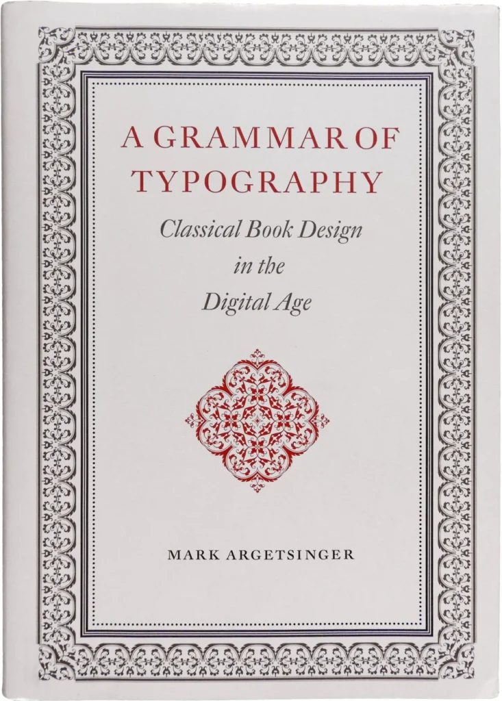
Mark Argetsinger’s text functions as a comprehensive, albeit academically heavy, manual for the modern designer. The structure of the book itself is a testament to his thesis, employing a historical, "neoclassical" aesthetic that demands patience and deliberate engagement.
- 1450s–1800s: The historical period Argetsinger draws upon for his "classical" standards, focusing on the baroque and neoclassical eras as the pinnacle of typographic form.
- 2020: The publication of A Grammar of Typography by David R. Godine, marking a high-water mark for scholarly, physically dense book design.
- 2022: Critical discourse surrounding the book, such as the review by Joshua Langman, highlighted both the necessity of Argetsinger’s mission and the limitations of his rigid, historically bound approach.
The book is divided into two primary sections: 135 pages of philosophical and historical foundation, followed by 64 pages dedicated to practical, technical instruction. This distribution has drawn criticism from industry observers who note that the target audience—likely already familiar with digital typesetting—would have benefited from a more significant focus on the application of classical principles within modern software environments.
Technical Analysis and Editorial Challenges
Despite its ambitions, A Grammar of Typography faces challenges regarding its execution. While the volume is physically imposing and aesthetically consistent with the baroque era, it suffers from several editorial inconsistencies. Statistical analysis of the text reveals an error rate of approximately one typo every two pages, a notable shortcoming for a manual dedicated to the precision of the printed word.
Specific technical inaccuracies have also been identified by industry experts. For instance, the misidentification of Garamond Premier as Adobe Garamond and a misinterpretation of a Zapfino specimen as "kerning" rather than a "ligature" have raised questions about the book’s role as an instructional authority. Furthermore, the design choices—such as the use of oversized running heads and the reliance on asterisks for section breaks—occasionally clash with the author’s own stated aversion to "expression from poverty" in design.

A Narrow Definition of "Classical"
A central point of contention in the book is Argetsinger’s interpretation of the term "classical." By focusing almost exclusively on the baroque and neoclassical periods, the book ignores significant developments in typography from the late 20th and early 21st centuries.
Critics argue that this approach creates a "historically bound" rather than "historically informed" framework. The absence of modern, rigorously engineered serif faces—such as those designed by Mário Feliciano or Cristobal Henestrosa—suggests that Argetsinger views the evolution of type design as having concluded in the mid-20th century. By excluding these contemporary advancements, the book risks alienating designers who seek to synthesize the structural logic of the past with the aesthetic possibilities of the present.
Implications for the Future of Publishing
The implications of Argetsinger’s work extend beyond the aesthetics of page layout; they touch upon the future of the codex as a cultural artifact. In an era of increasing digital ethereality, the demand for physical books that function as meticulously crafted objects is growing. This "materiality" is seen by many as a vital defense against the transient nature of digital content.
Industry experts suggest that the future of the field lies in a pluralistic approach. The works of figures such as Richard Eckersley, Robert Bringhurst, and Rich Hendel illustrate that it is possible to respect historical conventions while simultaneously embracing the fractured, experimental spirit of the postmodern age. Argetsinger’s insistence on a singular, static aesthetic may limit the book’s utility for designers working with a broader range of contemporary texts, including those from antiquity that do not necessarily align with the ornate, baroque style he favors.
Conclusion: A Necessary, If Imperfect, Guide
Ultimately, A Grammar of Typography is an essential, albeit frustrating, addition to the canon of typographic literature. Its value lies in its unapologetic defense of the book as a vital vessel for human thought and a product of skilled labor. In a commercial environment where speed and cost-efficiency often supersede craft, Argetsinger’s commitment to the sanctity of the printed page is both timely and inspiring.
While the work may be hampered by its narrow aesthetic focus and editorial oversights, it succeeds in sparking a necessary conversation about the role of the designer in an age of digital saturation. For those seeking to preserve the integrity of the codex, the book provides a robust, if rigid, framework. However, the next generation of typographers will likely need to augment Argetsinger’s lessons with a more inclusive understanding of typographic history and a willingness to adapt classical structural logic to the evolving, diverse needs of 21st-century literature.
The book remains a monument to the belief that the physical book is not merely a container for information, but an object of beauty, culture, and enduring importance. Whether it serves as a definitive manual or a point of departure for further inquiry, it demands the attention of anyone committed to the future of the written word.