
The landscape of contemporary digital typography is frequently defined by the tension between historical preservation and modern accessibility. Among the various historical classifications, blackletter—a script that dominated Western European manuscript and print culture from the 12th to the 17th centuries—is often treated with a degree of trepidation by modern designers. It is frequently relegated to narrow applications such as formal academic diplomas, memorial markers, or niche branding projects associated with heavy metal music. However, the release of Elfreth, a typeface family designed by James Hultquist-Todd of JTD Type, serves as a notable case study in how historical vernacular can be reinterpreted for contemporary utility.
The Evolution of the Blackletter Genre
Blackletter, also known as Gothic script or Textura, is characterized by its high-contrast, condensed, and angular forms. Historically, these letterforms were developed to save space on expensive parchment, allowing scribes to fit more characters per line. As the printing press gained prominence, blackletter became the standard for early European incunabula, most famously utilized by Johannes Gutenberg.
By the 19th and 20th centuries, however, the genre saw a sharp decline in legibility-focused contexts as humanist and transitional typefaces became the standard. When blackletter did appear, it was often tied to nationalistic identity or gothic romanticism. The design challenge for any modern foundry attempting to revive the genre is to extract the structural integrity of the gothic tradition while stripping away the cultural baggage that limits its application in modern digital design.
Design Analysis: The Architecture of Elfreth
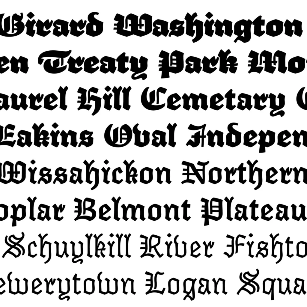
James Hultquist-Todd’s Elfreth represents a departure from the rigid, vertical discipline typically associated with blackletter. In a technical review of the font family, it is evident that the designer has prioritized a modulated approach to weight and stroke. Rather than adhering to the strictly vertical, "picket-fence" texture of traditional Fraktur or Textura, Elfreth introduces a degree of fluidity that allows it to function in a wider array of visual environments.
One of the defining characteristics of Elfreth is its range of weights. The lightest cut of the typeface utilizes a sparse, almost minimalist stroke construction that retains the geometric skeleton of a gothic letterform while adopting the negative space typically found in modern sans-serif or monospaced designs. Conversely, the heavier weights exhibit a bold, rounded quality—often described by design critics as having a "cuddly" aesthetic—that brings to mind the soft, high-contrast curves of mid-century display faces like Cooper Black.
The typeface incorporates several nuanced design elements:

- Terminals: The terminals, often referred to as "dog’s ears," are intentionally perky and rounded, softening the otherwise aggressive nature of the gothic stroke.
- Modulation: The subtle "wows and wobbles" in the stroke width suggest a calligraphic origin, lending the typeface a humanistic warmth that is often absent in strictly digital, algorithmic revivals.
- Flared Nudges: These small, stylistic flourishes provide a bridge between the historical source material and the requirements of modern screen-based readability.
A Shift in Functional Application
The traditional utility of blackletter has historically been limited to "graduations and gravestones." This perception is a significant hurdle for any designer attempting to integrate the genre into editorial, branding, or web-based content. Elfreth attempts to break this cycle by offering a versatility that allows it to act as both a headline display face and, in its lighter variations, a unique textural element in block text.
From an analytical perspective, Elfreth functions effectively because it respects the "bones" of the historical genre while subverting the expectations of the viewer. By moving away from the harsh, high-contrast extremes of 16th-century print, the typeface becomes accessible. It acts as a stylistic bridge, allowing designers to evoke the prestige and historical weight of gothic scripts without the perceived burden of austerity.
Market Context and Industry Reception
The release of Elfreth in the early 2020s aligns with a broader trend in digital type design: the "warm-up" of geometric and historical forms. As the design industry moves away from the stark, purely functionalist aesthetics that dominated the early 2010s, there is a renewed interest in typefaces that possess "personality" or "quirk."
Industry data from various independent type foundries suggests that boutique, high-personality typefaces have seen a resurgence in popularity among creative agencies looking to differentiate their branding efforts. While sans-serif typefaces remain the industry standard for UI/UX design, display typefaces like Elfreth are increasingly finding a home in editorial design, packaging, and digital branding where visual "texture" is valued over pure functional minimalism.
Implications for Future Type Development
The success of Elfreth suggests several implications for the future of typographic revivals:
- De-contextualization: Future blackletter designs are likely to continue the trend of stripping away historical, political, or religious associations to focus on pure structural aesthetics.
- Weight Versatility: The inclusion of extreme light and heavy weights in a single family is becoming a standard expectation. This allows for a more cohesive visual system in complex design projects.
- Humanistic Infusion: Even in styles historically defined by rigid, mechanical tools, the inclusion of "calligraphic nudges" and organic imperfections is proving to be a key driver of consumer and designer adoption.
Conclusion: The Modernity of Tradition
Grant Hutchinson, a noted observer of the typographic landscape, has highlighted that the appeal of Elfreth lies in its ability to reconcile conflicting aesthetic traits. To describe a blackletter face as "spare" or "affable" is to acknowledge a significant shift in how we perceive historical scripts.
Ultimately, Elfreth serves as a successful example of how type designers can engage with historical archives without becoming prisoners of them. By isolating the core structural beauty of the gothic form and refining the nuances of its execution, James Hultquist-Todd has provided a tool that functions as effectively in a modern branding package as it might have in a 15th-century manuscript. As the industry continues to explore the boundaries between historical legacy and contemporary utility, such typefaces will likely remain essential components of the designer’s toolkit, proving that even the most rigid historical conventions can be made to feel fresh, modern, and surprisingly approachable. The typeface is a testament to the fact that when the "bones" of a design are sound, the stylistic expression can be as varied and evolving as the cultural landscape it inhabits.