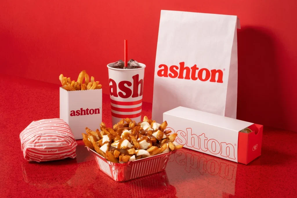

Ashton, Canada’s pioneering poutine chain, established in 1969, has undergone a significant brand and experiential overhaul, aiming to modernize its image and attract a new generation of diners. The strategic repositioning, spearheaded by new owners Émilie Adam and Jean-Christophe Lirette, who took the helm in 2022, seeks to address declining sales, an aging customer base, and the need for a more contemporary appeal for potential employees. This ambitious initiative, executed in collaboration with the renowned branding agency LG2, has already demonstrated remarkable success in its initial phase, with a flagship location experiencing a substantial surge in traffic and sales.
The genesis of Ashton’s decline can be traced back to decades of stagnant branding and a lack of investment in its physical spaces. While its commitment to serving the iconic Quebecois dish since its inception made it a beloved institution, its visual identity and restaurant ambiance remained frozen in time. This presented a critical challenge for Adam and Lirette, who inherited a brand with 23 existing locations and aspirations for significant expansion. The core issues were clear: stagnant sales figures, outdated restaurant aesthetics, an increasingly older demographic, and difficulty in attracting younger talent, a vital component for any forward-thinking hospitality business. Recognizing that the brand’s image and overall customer experience were intrinsically linked to its future viability, the new leadership team prioritized a comprehensive revitalization.
A Strategic Partnership for Brand Rejuvenation
To tackle these multifaceted challenges, Ashton partnered with LG2, a leading creative agency known for its innovative brand strategies. The agency’s mandate was to reimagine Ashton’s entire brand experience, focusing on a flagship restaurant as a pilot for the broader chain. The overarching goal was to simplify the brand’s essence, making it more cohesive and adaptable for potential export, thereby expanding its market reach beyond its Quebec origins.

LG2’s approach was rooted in striking a delicate balance between honoring Ashton’s rich history and infusing it with contemporary relevance. The revitalization sought to capture the essence of nostalgia while presenting it in a fresh, appealing manner. This involved a meticulous redesign of numerous elements, aiming to streamline the brand’s identity and create an immersive, modern dining experience that still paid homage to its roots.
A Nostalgic Yet Modern Aesthetic
The revamped brand experience skillfully weaves together modernity with traditions deeply embedded in Ashton’s half-century legacy. In a deliberate nod to the vibrant culture of snack bars, the design integrates classic diner aesthetics with a sophisticated, modern twist. This fusion is evident in various aspects of the brand’s visual and sensory presentation.
A custom typographic signature was developed to emphasize the generous and indulgent nature of Ashton’s signature dishes, reflecting the hearty appeal of poutine and other comfort foods. The chain’s iconic red color, a long-standing brand identifier, was thoughtfully updated to feel more contemporary while retaining its strong recognition.
A palpable sense of nostalgia is evoked through the new brand merchandise. This collection features illustrations that draw inspiration from Ashton’s earliest logos, directly connecting contemporary consumers with the brand’s heritage. This strategy aims to foster an emotional connection by reminding long-time patrons of their fond memories associated with Ashton while introducing the brand’s history to a new audience.

The color palette employed in the new branding is rich and inviting. Prominent curved edges are a recurring design motif, softening the overall aesthetic and contributing to a more welcoming atmosphere. A distinctive triple red line, a direct homage to the chain’s iconic neon lighting that once illuminated its establishments, now serves as a unifying graphic element across all brand touchpoints. This visual thread can be observed on everything from new food packaging and signage to subtle details like the stripes on branded socks, ensuring brand consistency and reinforcing the nostalgic theme.
Reimagining the Physical Space: A Localized Atmosphere
Beyond the visual branding, the physical transformation of the restaurants was paramount. The design concept was completely overhauled to cultivate an atmosphere as comforting and inviting as the food itself. This holistic transformation extends from the exterior façade to the intricate details within the dining space.
Key design elements echo Ashton’s origins, particularly its first 1969 food truck. The pervasive use of curves, the reintroduction of stylized neon lighting, and the distinctive red tin roof are all deliberate callbacks to this foundational element of the brand’s history. These architectural and decorative choices aim to create an immediate sense of familiarity and warmth for existing customers, while offering a unique and engaging environment for newcomers.
Within the dining room, a monochrome red border is strategically employed, guiding the eye and unifying the space. The iconic banquettes, a cherished feature of Ashton’s dining experience, remain a prominent focal point, positioned centrally to encourage communal dining and reinforce the brand’s established seating style. This design approach is not only aesthetically pleasing but also highly practical. The layout has been engineered for ease of reproduction, ensuring that this revitalized concept can be efficiently rolled out across the chain’s other locations in the coming years, facilitating a consistent brand experience nationwide.

The Impact of Revitalization: Tangible Results
The success of Ashton’s revitalization initiative is not merely anecdotal; it is supported by compelling data demonstrating a significant positive impact on the business. The strategic changes implemented at the flagship location have yielded immediate and impressive results, underscoring the effectiveness of the brand overhaul.
Within a mere 30 days of the renovated location’s launch, Ashton witnessed a dramatic increase in customer engagement and financial performance. Traffic at the first renovated location surged by an impressive 35%, indicating a strong appeal to both returning and new customers. This heightened footfall translated directly into increased revenue, with sales at the same location climbing by 34%.
Furthermore, the digital presence of Ashton experienced a substantial boost. Visits to the Ashton website saw a remarkable 40% increase in the same 30-day period. This growth in online traffic suggests that the revitalized brand identity and experience are resonating with consumers, driving them to seek more information and engage with the brand digitally, which is crucial for modern marketing and customer acquisition strategies.
A Recipe for Success: Loyalty and New Appeal
The numbers paint a clear picture: Ashton has successfully discovered a potent formula for both securing the loyalty of its long-standing patrons and attracting a new demographic of food enthusiasts. The brand has managed to strike a chord with consumers who appreciate authenticity and heritage, while simultaneously appealing to those seeking a retro-inspired yet contemporary dining experience.

This carefully crafted blend of the old and the new positions Ashton advantageously in the competitive culinary landscape. By embracing its past while boldly stepping into the future, the chain has not only revitalized its image but also laid a strong foundation for sustained growth and expansion. The revitalization is more than just a cosmetic update; it represents a strategic redefinition of the Ashton experience, designed to ensure its enduring relevance and success for years to come.
The implications of this successful revitalization extend beyond Ashton itself. It serves as a compelling case study for other heritage brands that may be facing similar challenges of an aging image and declining customer base. The strategic integration of nostalgia, modern design principles, and a focus on customer experience can be a powerful engine for rejuvenation. The measurable increases in traffic, sales, and website engagement offer concrete evidence of the ROI of investing in comprehensive brand and experiential redesign.
The partnership with LG2 highlights the critical role of expert creative agencies in navigating complex brand transformations. Their ability to understand a brand’s core identity, identify its weaknesses, and develop innovative solutions that resonate with target audiences is invaluable. The success of Ashton’s rebranding is a testament to this collaborative synergy.
Looking ahead, the replicable nature of the design elements, particularly the restaurant layout and the consistent application of the graphic system, suggests a scalable strategy for further expansion. This ensures that as Ashton grows, its revitalized identity will remain cohesive and impactful across all its outlets. The brand’s ability to attract younger workers, a key objective, is also likely to be enhanced by the more modern and appealing work environment created by the redesign.

In essence, Ashton’s journey from a dated establishment to a revitalized culinary destination demonstrates the power of strategic adaptation. By honoring its rich past while embracing a contemporary vision, Ashton has not only preserved its legacy but has also crafted a vibrant future, proving that even the most established brands can reinvent themselves to thrive in a dynamic market. The iconic red continues to symbolize not just poutine, but a renewed commitment to culinary excellence and a fresh, inviting experience for all.