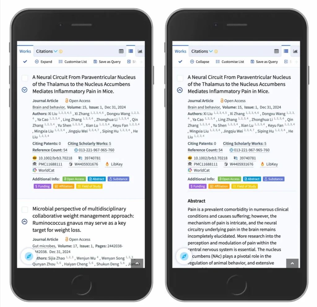

The design of user interfaces requires a precise balance between aesthetic minimalism and functional clarity. Among the most common UI patterns, the accordion—a vertically stacking list of headers that reveal or hide associated content—serves as a primary tool for managing information density. Recent usability research conducted by the Nielsen Norman Group (NN/g) has shed light on the cognitive impact of icon selection within these components, revealing that the choice of a visual signifier fundamentally alters user behavior and expectations. As digital platforms prioritize streamlined mobile experiences, understanding the implications of these micro-interactions is no longer merely a stylistic preference; it is a critical component of user experience (UX) architecture.
The Evolution of Accordion Usability
Accordions became a staple of web design as developers sought to optimize screen real estate on mobile devices. By consolidating large volumes of content into collapsible sections, designers could prevent information overload. However, the lack of a standardized universal language for these components has led to significant fragmentation in design. For years, developers have experimented with various symbols—plus signs, chevrons, arrows, and custom glyphs—to indicate interactivity.
A chronological review of web design patterns shows that in the early 2010s, the "plus/minus" toggle was the industry standard, largely influenced by desktop operating systems. As the web transitioned to mobile-first frameworks, designers began adopting the "caret" or "chevron" to mimic the hierarchical navigation seen in native mobile applications. This shift was intended to provide a more intuitive "drill-down" experience. Yet, without clear standards, many platforms implemented these icons inconsistently, leading to a phenomenon known as "interaction fatigue," where users struggle to predict whether a tap will navigate to a new page or simply expand a section.

Data-Driven Findings on User Expectations
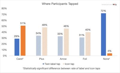
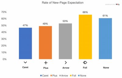
The comprehensive study by the Nielsen Norman Group analyzed how users interpret various visual cues. The data suggests that user behavior is highly susceptible to the presence, or absence, of an icon. When no icon is present, the vast majority of users assume the text label is a standard hyperlink leading to a new page. This is the most reliable expectation; it aligns with decades of web convention where underlined text or isolated labels denote navigation.
When an icon is added, the "hit area" of the interaction changes. The research found that users are almost equally likely to tap on the icon as they are the text label. This creates a dual-purpose target area. When designers use ambiguous icons—such as right-facing arrows that might imply "next page" rather than "expand"—the cognitive load increases. The study explicitly notes that "split menus," where a label leads to one destination and the icon leads to another, are particularly harmful to usability. These patterns often result in user error, where a visitor accidentally navigates away from a page when they intended only to view a sub-section of a menu.
The Case Against Split-Button Navigation
A significant finding in the current design landscape is the inherent failure of split-button patterns in navigation menus. In a split-button configuration, the text label is often designated as a link to a parent category, while an adjacent icon is intended to trigger an accordion expansion. User testing reveals that this creates a high rate of friction. Participants frequently expressed frustration when trying to open a menu, only to find themselves redirected to a "category overview" page instead.
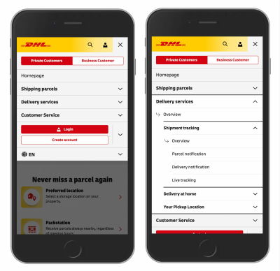
The recommendation from usability experts is to unify the interaction. If a parent page is necessary, it should be included as an item within the expanded menu, labeled clearly as "Overview" or "All [Category Name]." This removes the ambiguity of the tap target and adheres to the principle of "predictable interaction." By removing the expectation that the header itself must act as both a link and a toggle, developers can significantly reduce bounce rates and improve user retention within complex navigation structures.

The Supremacy of the Caret
Among the various icons tested—including arrows, triangles, and plus signs—the caret (the chevron) emerged as the most reliable signifier for expansion and collapse. Unlike the plus sign, which carries multiple meanings (e.g., "add to cart," "zoom in," or "save"), the caret is contextually tethered to the concept of vertical expansion.
The semantic load of the caret is lower because it mirrors the physical action of opening a drawer. Data shows that when a caret is used, users are more likely to correctly identify the interaction as an accordion. Furthermore, the animation of a caret rotating from a "down" position to an "up" or "side" position provides immediate visual feedback, confirming the change in state. This, combined with the simplicity of the icon, makes it the safest choice for developers aiming to comply with accessibility standards and universal design expectations.
Broader Implications for Web Accessibility
The implications of these findings extend beyond mere aesthetics; they touch upon the core tenets of web accessibility. For users with cognitive impairments or those navigating via screen readers, the predictability of a UI element is paramount. When an interface uses standard, clearly understood icons, the path to information is shortened. Conversely, when icons are "overloaded"—assigned multiple or unconventional meanings—it creates a barrier for users who rely on consistent patterns to navigate the web.
Furthermore, the research highlights a "less is more" philosophy. The analysis suggests that designers should refrain from using arrows to point to links. If a text string is a link, standard industry practice dictates that it should be underlined or styled to signal its destination, rather than decorated with an icon that might be mistaken for an expander. This minimalist approach does not sacrifice functionality; rather, it cleans the visual field, allowing the user to focus on content hierarchy rather than guessing the function of a button.
Industry Response and Future Standards
Major enterprise organizations have begun to pivot toward these findings. Companies like DHL and various academic research portals have overhauled their navigation menus to eliminate split-button configurations in favor of simplified, single-action headers. These organizations report that by removing unnecessary "noise"—such as extra arrows or complex, multi-state icons—they have seen a measurable improvement in the speed at which users find specific content.
The broader lesson for the development community is that innovation in UI should not come at the cost of intuition. While it is tempting to create unique, branded icons for navigation, the data indicates that users favor familiar, standardized signals. The "caret" is not just a design choice; it is a communication tool that bridges the gap between the developer’s intent and the user’s need.

Conclusion: A Simplified Path Forward
To create a high-functioning digital experience, developers should adhere to three core principles derived from current research. First, if a label is a link, provide clear text-based signals like underlining; avoid attaching non-navigational icons to these links. Second, abandon the split-button pattern entirely to avoid user confusion. Third, when implementing an accordion, use the standard caret icon, and ensure that the entire area—both the label and the icon—functions as a cohesive, single-action trigger.
As the web continues to evolve, the demand for accessible, frictionless design will only grow. By prioritizing evidence-based practices over decorative trends, the design community can ensure that the web remains a place where information is easily discoverable, regardless of the device or the user’s level of technical expertise. The goal is a transparent interface, one where the architecture disappears, leaving only the content for the user to engage with seamlessly. Through the application of these findings, designers can build more resilient, intuitive, and effective digital ecosystems.