
The landscape of British Columbia’s craft brewing industry has experienced a significant transformation over the last decade, evolving from a localized hobbyist scene into a cornerstone of the provincial tourism and hospitality economy. Nestled in the historic town of Hope, British Columbia—a location internationally recognized as the filming site for the 1982 action classic Rambo: First Blood—Mountainview Brewing Co. represents the modern intersection of industrial heritage and artisanal production. By repurposing a former mechanic garage, the brewery has established itself as both a vital community hub for local residents and a strategic waypoint for travelers navigating the mountain passes connecting the Lower Mainland to the B.C. Interior.

The Genesis of a Brewery in Hope
The establishment of Mountainview Brewing Co. was predicated on a specific market need: the lack of a dedicated craft space in a town that serves as a critical junction for the Trans-Canada Highway. When the brewery first conceived its business model, the founders sought to bridge the gap between "crushable" staples—approachable, high-volume beers—and experimental, limited-batch offerings that appeal to the discerning craft beer enthusiast.
The conversion of the mechanic garage was not merely a logistical choice but a thematic one. The industrial aesthetic of the space serves as the foundation for the brand’s identity. The transition from automotive repair to beer production mirrors a broader trend in North American urban renewal, where post-industrial spaces are rehabilitated to serve as centers for social engagement and local economic stimulation.

Crafting a Comprehensive Brand Identity
To differentiate itself in a crowded market, Mountainview Brewing Co. collaborated with the creative agency Memory to develop a holistic brand ecosystem. This project moved beyond simple logo design, encompassing a multi-faceted approach to visual identity, brand voice, and physical environment design.
The design strategy focused on consistency across all touchpoints, a critical factor for emerging breweries aiming to build brand loyalty in a highly competitive sector. The scope of work included the development of:

- Wayfinding and Signage: Ensuring the brewery was visible and welcoming to both foot traffic and highway travelers.
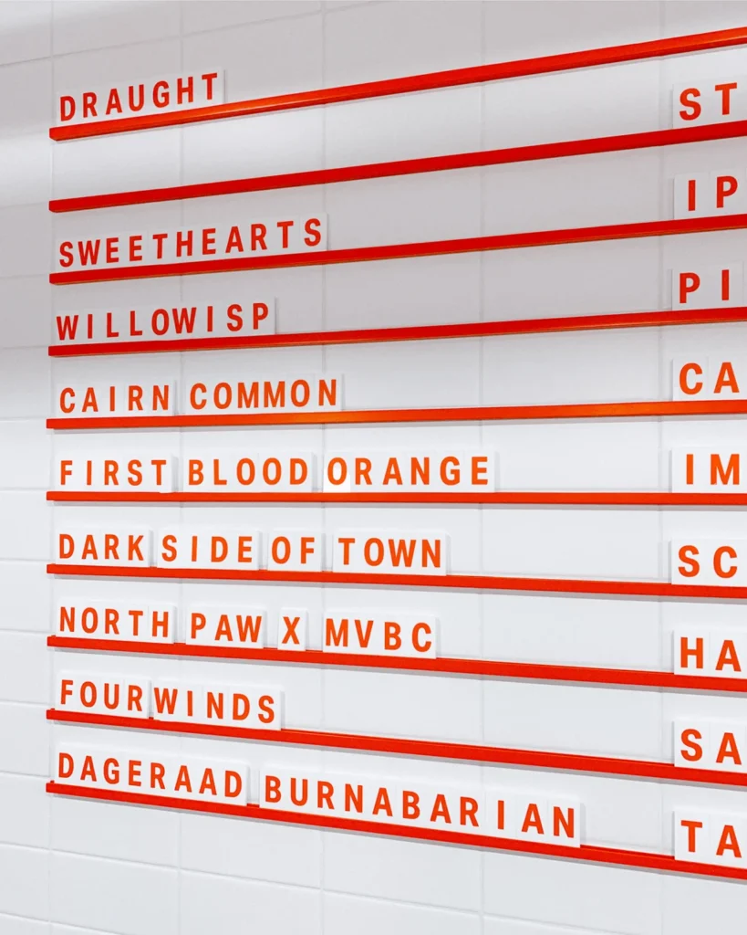
- Flexible Menu Systems: Allowing for the rapid rotation of seasonal beers and food pairings.
- Custom Tasting Flight Trays: Enhancing the consumer experience during on-site sampling.
- Packaging Design: Creating shelf-stable, visually striking cans that communicate the brewery’s aesthetic at retail outlets.
- Interior Collateral: Merchandising and small-scale branding elements that reinforce the "mountain-industrial" ethos.
Central to this visual identity is the selection of Aktiv Grotesk, a typeface designed by Dalton Maag. The choice of a modern, clean, and highly legible sans-serif font suggests a brand that values precision and clarity, balancing the ruggedness of the brewery’s location with the sophistication of its brewing process.
Chronology of Brand Implementation
The development of the brand identity followed a structured, multi-phase timeline that aligned with the physical construction of the brewery:

- Phase I: Brand Architecture (Initial Planning): Defining the core values, tone of voice, and visual pillars. The goal was to establish a brand that felt established yet approachable.
- Phase II: Environmental Design (Structural Integration): Integrating the signage and wayfinding into the architectural plans of the converted garage.
- Phase III: Product Rollout (Packaging and Collateral): Developing the physical assets—cans, coasters, and menus—required for the grand opening.
- Phase IV: Sustained Brand Management: Iterative design updates to maintain the brand’s relevancy as the beer menu expanded into more experimental territories.
Industry Context and Economic Impact
The craft brewing sector in British Columbia contributes significantly to the provincial GDP. According to recent data from the B.C. Craft Brewers Guild, the industry has seen exponential growth in the number of active licenses over the last twenty years. For small towns like Hope, the presence of a destination brewery acts as an "anchor tenant" for tourism.
When travelers stop in Hope, they are often at a critical point in their journey through the Cascade mountains. By providing a high-quality, locally produced product, Mountainview Brewing is able to capture a demographic of "transient tourism" that would otherwise bypass the town entirely. This strategy of leveraging local geography—emphasizing the "mountain view"—has proven to be a highly effective marketing tool, connecting the product directly to the experience of the region.

Design Strategy: The Psychology of the Aesthetic
The use of the Aktiv Grotesk typeface serves an important function in the brewery’s broader communications strategy. In a market often saturated with overly ornate or "grunge-style" brewery branding, the decision to opt for a clean, modernist aesthetic signals a commitment to quality and professionalism.
The physical collateral—such as the custom tasting flight trays and carefully curated menus—demonstrates a commitment to the "Third Place" theory. This sociological concept suggests that individuals need a social environment outside of home (the first place) and work (the second place). By investing in interior design and high-end merchandising, Mountainview has successfully positioned itself as a primary third place for the residents of Hope.

Official Perspectives and Market Reception
While the brewery remains a private enterprise, the reception of its branding has been noted within the design community. Agencies like Memory emphasize that a cohesive brand suite does more than look good—it increases the perceived value of the product. When a consumer picks up a can, the quality of the label design and the consistency of the typography act as a "proxy for quality" for the liquid inside.
Furthermore, the operational flexibility of the menu system allows the brewery to react to changing consumer preferences in real-time. By managing the production of these items in-house or through controlled design systems, the brewery avoids the pitfalls of "design drift," where a brand slowly loses its visual integrity over time due to inconsistent marketing materials.

Broader Implications for Rural Craft Brewing
The Mountainview Brewing case study offers a blueprint for how rural businesses can compete with larger urban craft breweries. By investing in professional brand development, these businesses can punch above their weight class, attracting a wider audience and commanding higher price points for their products.
The integration of the "Rambo" legacy with the modern, clean design aesthetic of the brewery creates a unique narrative hook. It allows the brand to simultaneously lean into the rugged, adventurous history of Hope while maintaining a contemporary, upscale identity that appeals to modern consumers who value design and craft quality.

Future Outlook
As the craft brewing industry in Canada faces challenges related to supply chain costs and market saturation, the importance of strong, flexible branding will only increase. For Mountainview Brewing Co., the path forward appears to be rooted in the balance between the "staple" beers that keep the lights on and the "experimental" batches that keep the brand culturally relevant.
The success of their branding strategy—characterized by the deliberate use of typography, structural design, and environmental signage—underscores a shift in the industry toward treating breweries not just as manufacturing plants, but as lifestyle brands. By effectively documenting their journey through these design assets, the brewery has secured its place in the competitive landscape of the Pacific Northwest, ensuring that it remains a notable stop for both locals and travelers for years to come.

Through the meticulous application of a consistent visual language, Mountainview Brewing Co. has demonstrated that a well-executed brand identity is just as essential as the brewing equipment itself. As they continue to operate within the shadows of the Cascade foothills, their story serves as a reminder of the power of design in transforming industrial spaces into centers of community and commerce.