

Located in the rugged, picturesque landscape of Hope, British Columbia, Mountainview Brewing Co. has emerged as a significant player in the region’s burgeoning craft beer scene. Nestled in the shadows of the Cascade foothills—an area internationally recognized for its dramatic scenery and its cinematic history as the filming location for the 1982 cult classic Rambo: First Blood—the brewery has successfully transformed a repurposed mechanic’s garage into a cultural hub. By marrying industrial heritage with modern design, Mountainview Brewing Co. serves as both a communal gathering space for the local population and a strategic waypoint for travelers navigating the mountain passes of the Pacific Northwest.

The establishment of Mountainview Brewing Co. is a case study in the successful integration of localized branding and architectural revitalization. By converting a site once dedicated to automotive repair into a hospitality destination, the brewery has preserved a piece of the town’s functional history while pivoting toward the modern consumer demand for artisanal, high-quality, and locally produced craft beverages.
Chronology and Development of the Brand
The development of Mountainview Brewing Co. was not merely a matter of brewing beer; it required a comprehensive strategic approach to identity, visual communication, and user experience. From its inception, the brewery owners engaged with creative partners to ensure that every facet of the business—from the signage on the exterior to the custom-designed tasting flight trays—was cohesive.

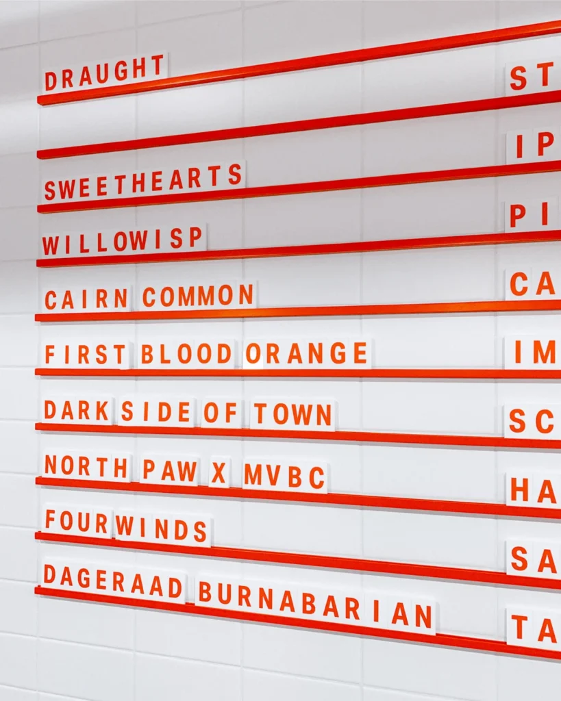
The branding phase involved the creation of a robust visual identity and a distinct brand voice that speaks to the spirit of the Cascade foothills. The project, led by the creative firm Memory, focused on developing a versatile brand suite. This suite encompasses wayfinding signage, flexible menu systems designed to accommodate an evolving tap list, and high-quality merchandise that acts as a physical manifestation of the brewery’s ethos.
The aesthetic choice of the typeface Aktiv Grotesk, designed by Dalton Maag, provides a clean, modern, and highly legible foundation for the brand’s visual communications. This choice reflects a broader trend in the craft beverage industry: moving away from overly ornate, traditional beer branding toward a minimalist, functional, and contemporary look that appeals to a design-conscious demographic.

Supporting Data and Industry Context
The craft brewery industry in British Columbia has seen exponential growth over the past decade. According to data from the BC Ale Trail, there are now over 200 craft breweries operating across the province. This saturation requires new entrants like Mountainview to differentiate themselves not just through the quality of their beer, but through a total brand experience.
The economic impact of these breweries extends beyond the sale of beer. Many, like Mountainview, serve as anchors for local tourism. Hope, BC, which traditionally relies on the transit of highway travelers moving between the Lower Mainland and the interior of the province, has benefited from the diversification of its local economy. By providing a "last stop" for travelers before the arduous mountain climbs, Mountainview captures a specific market segment—the "destination tourist" who values local, high-quality experiences over mass-market alternatives.

The tap list at Mountainview reflects a balanced business model. It incorporates "crushable" staples—approachable, high-volume beers that appeal to a wide range of palates—alongside experimental, seasonal batches that cater to the "craft enthusiast" demographic. This dual-track production strategy is a common, yet essential, tactic for maintaining consistent revenue while building brand prestige within the competitive craft beer market.
Design Philosophy and Execution
The design of the brewery’s internal and external collateral is a masterclass in cohesive environmental branding. The signage and wayfinding systems were engineered not only for aesthetic appeal but for practical navigation within a space that was not originally designed for hospitality.

The menu systems, which are inherently fluid due to the nature of rotating seasonal beer taps, were designed to be flexible, allowing staff to update offerings without compromising the visual integrity of the brand. This level of attention to detail extends to the physical interactions a customer has with the brand, such as the tactile experience of the custom-designed beer tasting trays. By investing in custom hardware, the brewery reinforces its commitment to the "craft" aspect of its business, signaling to the customer that the attention to detail in the beer is mirrored in the environment in which it is served.
Packaging, too, has been a central pillar of the brewery’s growth. With the rise of the "off-sales" market, the design of the cans is often the first point of contact for a consumer who may never step foot inside the physical brewery. The packaging design employs the same minimalist, bold aesthetic seen throughout the brand, ensuring brand recognition on retail shelves where hundreds of competitors vie for the consumer’s attention.

Official Perspectives and Market Position
While official statements from the founders emphasize a commitment to community, the underlying market strategy is clear: the professionalization of the brand is a direct response to the heightened expectations of the modern craft beer drinker.
"Our approach was to ensure that the physical space and the digital presence were entirely aligned with the quality of the product inside the glass," noted a representative involved in the branding process. This philosophy suggests that for a brewery in a smaller, regional market like Hope, the brand is the primary vehicle for long-term sustainability.

The decision to lean into the history of the location—specifically the legacy of the town’s association with iconic 1980s cinema—while simultaneously utilizing a typeface as modern as Aktiv Grotesk, creates a unique tension. It positions the brand as something that is both rooted in the soil of the Cascades and forward-looking in its pursuit of craft excellence.
Broader Impact and Implications
The case of Mountainview Brewing Co. highlights several critical shifts in the hospitality industry:

- Adaptive Reuse: The trend of transforming industrial or automotive spaces into craft breweries has become a staple of urban and semi-urban regeneration. These spaces offer inherent character that new construction cannot replicate, though they present unique challenges in plumbing, electrical, and flow-of-movement design.
- Strategic Wayfinding: As regional tourism becomes more competitive, the physical presentation of a business—its signage, its menus, its packaging—has become as important as the product itself. In a saturated market, design is a competitive advantage.
- Community-Centric Growth: By serving as a "third space"—a location outside of the home and the workplace—the brewery has integrated itself into the fabric of Hope, BC. This community buy-in is a vital defense against economic downturns, as local patronage provides a stable revenue baseline that is less susceptible to the fluctuations of seasonal tourism.
As the industry moves forward, the success of breweries like Mountainview will likely depend on their ability to maintain this equilibrium. The balance between maintaining a "local" feel while operating with the efficiency and aesthetic polish of a larger enterprise is the hallmark of the next generation of successful craft breweries.
The collaboration between the brewery and its design partners illustrates that professional branding is not an elective luxury but a fundamental requirement for long-term viability in the contemporary craft sector. By investing in a comprehensive, well-executed visual identity from day one, Mountainview Brewing Co. has ensured that its brand can scale with its ambitions, providing a blueprint for other regional breweries looking to make a lasting impact in their respective communities. As it stands, the brewery remains a definitive example of how careful planning, architectural sensitivity, and a commitment to high-quality design can turn a small-town mechanic’s garage into a landmark destination.