
Despite broad browser support, CSS container queries remain a significantly underutilized feature in modern web development, often misunderstood as a direct replacement for legacy media queries. While media queries have served as the cornerstone of responsive web design for nearly two decades, the introduction of container queries represents a fundamental shift in how developers approach component-based architecture. With current industry data indicating that less than half of professional developers have integrated this technology into their workflows, the web development community is currently navigating a transition from viewport-dependent design to context-aware, component-centric layouts.
The Evolution of Responsive Design
The concept of responsive design was popularized in 2010 by Ethan Marcotte, who introduced the idea of fluid grids, flexible images, and media queries. For years, the viewport—the visible area of a user’s browser—served as the only reliable proxy for determining a device’s capabilities. Media queries allowed developers to apply CSS rules based on the width, height, and orientation of the browser window. This "macro-layout" approach effectively enabled the transition from desktop-only sites to mobile-friendly interfaces.
However, as the web matured, the "macro" approach began to show its limitations. The rise of component-based frameworks—such as React, Vue, and Angular—shifted the focus of development toward modular, reusable pieces of UI. A card component, for instance, might be designed to look one way in a main content area, but that same component might break or appear cramped when dropped into a narrow sidebar. Because media queries only track the browser’s total width, they remain "blind" to the specific constraints of the container in which a component lives.
Industry Adoption and Technical Hurdles
The current state of adoption, as highlighted in the 2025 State of CSS survey, reveals a distinct gap between awareness and implementation. While approximately 86% of developers are aware of the container queries specification, only 41.4% have actively deployed them in production environments. This discrepancy is largely attributed to the initial learning curve and the misconception that container queries are merely "media queries for elements."
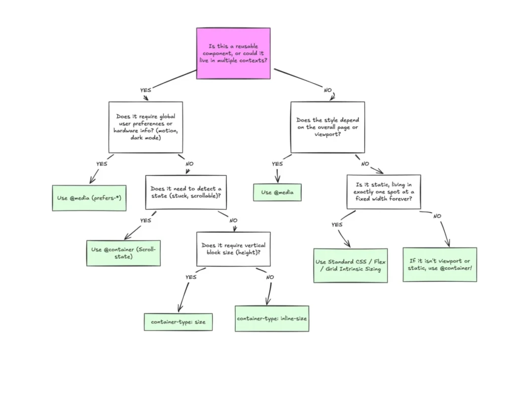
Technically, the transition requires a shift in how developers think about the Document Object Model (DOM). In a media query workflow, the code asks: "How wide is the screen?" In a container query workflow, the code asks: "How much space is available to me in this specific parent container?" This distinction is critical. When a developer registers a container using container-type: inline-size and container-name, they are delegating layout responsibility to the component itself rather than the global viewport.
Comparative Analysis: Media vs. Container Queries
The following table summarizes the functional differences between these two methodologies:
| Feature | Media Queries (@media) | Container Queries (@container) |
|---|---|---|
| Reference Point | Browser Viewport | Parent Container |
| Primary Use Case | Global Page Layouts | Reusable UI Components |
| Context Awareness | None (Blind to internal layout) | High (Responsive to parent bounds) |
| State Sensitivity | Viewport width/height/OS settings | Internal container size |
The implications of this shift are profound. By using container queries, developers can create "self-contained" components that possess their own internal logic. A navigation menu, for example, can switch from a horizontal list to a hamburger menu once its specific parent container reaches a certain threshold, regardless of whether that container is inside a mobile phone screen or a large desktop dashboard.

Overcoming Implementation Challenges
Despite their utility, container queries introduce new complexities, particularly regarding "infinite loops" and layout stability. A common error occurs when a developer attempts to query a component based on its own dimensions, which creates a circular dependency. CSS specifications dictate that a container cannot query its own size directly; instead, developers must implement a parent-child wrapper structure.
Furthermore, querying the block (vertical) size of a container can lead to layout collapse if not handled with explicit height declarations. Because the browser calculates the container’s dimensions independently of its contents, an unconstrained container will default to a height of zero. These challenges underscore why developers must be intentional about when to use which tool. Industry best practices suggest reserving media queries for top-level page structures—such as main headers, footers, and grid systems—while utilizing container queries for modular elements like cards, widgets, and form groups.
Future-Proofing the Modern Web
The necessity for container queries is reinforced by the sheer fragmentation of devices. With over 2,300 unique viewport sizes currently in circulation, it is mathematically impossible to write media queries that account for every possible screen configuration. Component-based logic, by contrast, relies on the physical availability of space, which is a constant regardless of the device.
Looking ahead, the evolution of container style queries—a related but distinct experimental feature—promises to allow developers to query the computed styles of an element rather than just its dimensions. This could eventually allow for components that change their aesthetic based on their state, such as changing a button’s color when it is placed inside a specific themed container.

Broader Implications for Web Development
The transition to container queries is more than a technical upgrade; it is a shift in design philosophy. As the web continues to move away from rigid, page-level design toward flexible, application-like interfaces, the need for components that can "reason" about their own environment becomes paramount.
Critics of the slow adoption rate argue that the CSS specification itself has become increasingly complex, making it difficult for developers to keep pace. However, proponents argue that the efficiency gained by reducing the need for JavaScript-based resize observers—which were previously required to achieve similar functionality—far outweighs the initial learning investment. By reducing dependency on JavaScript to track layout changes, container queries contribute to more performant, stable, and accessible web experiences.
Conclusion
The data is clear: while media queries will continue to hold their place in the foundational layout of websites, they are no longer sufficient as the sole mechanism for responsive design. As developers continue to build increasingly complex UI systems, the adoption of container queries will likely become a standard requirement for professional front-end development. Understanding the difference between these two technologies is not merely a matter of syntax, but a crucial step in building a more modular, scalable, and resilient web. By delegating responsibility to the component container, developers can finally move past the limitations of the viewport and embrace a truly fluid, context-aware future for web design.