
The evolution of responsive web design has reached a significant inflection point with the standardization of CSS Container Queries, yet industry adoption remains surprisingly stagnant. Despite achieving approximately 94% browser compatibility across all modern platforms, developers continue to rely heavily on legacy viewport-based media queries. Recent data from the 2025 State of CSS survey reveals a profound disconnect: while 86% of web developers are aware of container query technology, fewer than 42% have implemented them in production environments. This lag in adoption persists even as the need for truly modular, context-aware components becomes critical in an ecosystem featuring over 2,300 unique viewport sizes.
The Architectural Shift in Responsive Design
For over a decade, responsive web design was synonymous with media queries. Introduced in the early 2010s, media queries allowed developers to apply CSS rules based on the width, height, or orientation of the browser’s viewport. This "macro" approach to layout worked well when websites were primarily monolithic, page-based structures. By defining breakpoints—typically at 768px or 1024px—designers could ensure that a desktop site transformed into a mobile-friendly version.
However, as the web matured into an application-heavy environment, the limitations of the viewport-only model became apparent. A card component designed for a three-column desktop grid often breaks when dropped into a narrow sidebar or a complex dashboard widget. Because media queries only track the browser window, they cannot recognize that a component has been allocated a limited space within a larger container. This forced developers to rely on complex, often brittle workarounds involving JavaScript-based resize observers or deeply nested, redundant CSS classes.

A Chronology of Component-Driven CSS
The industry’s desire for container-based styling was officially documented as early as 2019, when it topped the CSS-Tricks "CSS Wishlist." The W3C Working Group recognized that the "proxy" nature of the viewport was insufficient for modern, modular design systems.
Following years of development and browser engine testing, Container Queries were finally integrated into the CSS Containment Module Level 3 specification. Browsers began shipping support in 2022 and 2023, marking the most significant change to the CSS layout engine since the introduction of Flexbox and Grid. Despite this, the transition has been slow. At the 2026 SmashingConf in Amsterdam, industry experts noted that the "terrible" adoption rate of container queries stems from a fundamental misunderstanding: developers often view container queries as a direct replacement for media queries rather than a complementary, distinct tool for component-level logic.
Technical Distinction: Macro vs. Micro Layouts
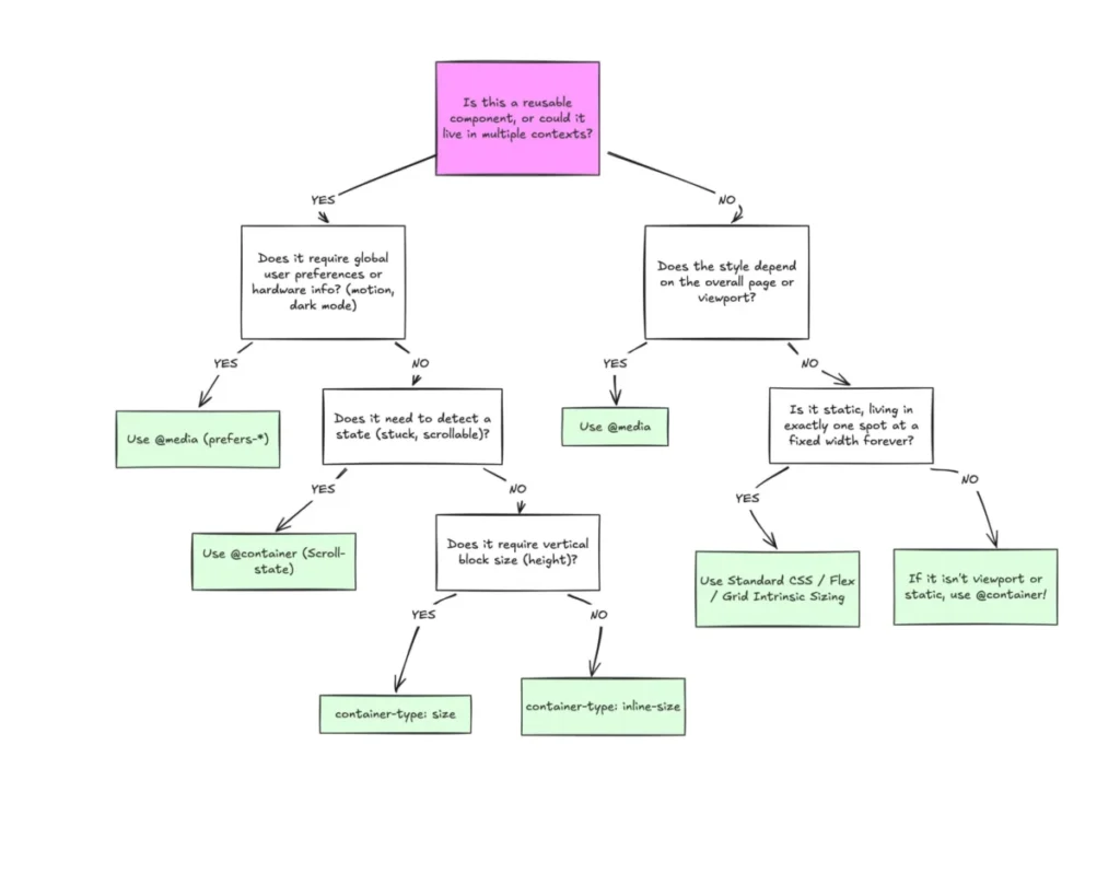
The primary technical hurdle for adoption is the confusion between "macro" and "micro" layouts. Macro layouts—such as the global header, footer, and major grid structure of an entire application—remain the appropriate domain for media queries. These elements are inherently tied to the size of the user’s screen.
Conversely, micro layouts, which include individual cards, navigation modules, and form groups, are candidates for container queries. By setting a container-type: inline-size on a parent element, developers can instruct the browser to monitor the available horizontal space for that specific component. When the container reaches a certain threshold, it triggers styles regardless of the device’s screen size. This enables a "self-contained" component that behaves optimally whether it is displayed in a narrow sidebar or a full-width main content area.

Supporting Data and Implementation Challenges
The technical implementation of container queries requires a paradigm shift in how developers structure their DOM. Unlike media queries, which can target any element based on global constants, container queries require a clear parent-child relationship. A common pitfall is attempting to make a component query itself; as the browser cannot process a loop where a container’s size depends on its own internal styling, developers must wrap components in a dedicated container element.
Furthermore, querying a container’s "block" (vertical) size—container-type: size—can lead to unexpected layout collapses. Because the browser calculates the container’s dimensions independent of its contents, an undefined height will default to 0px, effectively rendering the component invisible. Experts advise utilizing inline-size as the default approach to avoid these rendering issues, a best practice that remains under-communicated in current documentation.
Broader Industry Implications
The reliance on media queries in an era of component-based development has led to significant technical debt. As noted in the 2025 State of CSS findings, the fragmented nature of modern devices means that relying on fixed pixel widths for responsive behavior is no longer sustainable. By shifting the "source of truth" for layout from the browser window to the container, developers can reduce the reliance on external JavaScript libraries that monitor element resizing.
Fluid typography serves as a prime example of this transition. Traditionally, developers used vw units to scale fonts based on the viewport. However, when a component is moved to a constrained container, this scaling often results in illegible text. By using container query units—cqi (container query inline-size)—and the CSS clamp() function, developers can create truly fluid typography that respects the bounds of its immediate environment.

Future Outlook and Strategic Adoption
As the web continues to move toward a more modular architecture, the case for container queries will become unavoidable. Organizations that prioritize design system maintenance and performance will find that container queries offer a more robust, declarative way to handle responsiveness.
While concerns regarding support for older browsers or complex CSS variable integration remain, the current 94% coverage rate effectively removes the barrier to entry for most enterprise-grade applications. The industry is now entering a period of education. Moving forward, the focus will likely shift toward training developers to discern when a layout requirement is global—necessitating a media query—or local—necessitating a container query.
The path toward a more efficient, responsive web lies not in abandoning the tools of the past, but in refining their use. By restricting media queries to the macro level and embracing container queries for the component-level micro-interactions, developers can build interfaces that are more resilient, maintainable, and adaptable to the evolving landscape of digital hardware. The technology is stable, the browser support is widespread, and the architecture is ready. All that remains is the adoption of a new mental model for the next generation of web design.