
The digital landscape has been revolutionized by "ZERO," a groundbreaking interactive web experience that serves as a demo for what appears to be a new educational initiative, Zero University. Developed over four months, this ambitious project redefines web interaction and performance, delivering a rich 3D narrative that critically examines the traditional degree path while running seamlessly on a wide range of devices, from high-end desktops to budget Android phones. Its innovative approach to user engagement, asset optimization, and real-time graphics sets a new benchmark for immersive web content.
Unveiling the "ZERO" Experience: A New Paradigm in Web Interaction
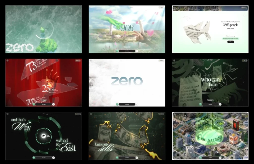
Upon arrival at the project’s website, visitors are met not with a conventional "enter" button, but with a blank canvas and a prompt to "draw a zero." This seemingly simple interaction is the gateway to the experience. As a user completes the circle, a mesmerizing frost effect emanates from the stroke, gradually revealing the full narrative. This novel entry mechanism, which was a key factor in securing the project, serves a dual purpose: it immediately captures the visitor’s attention with an unexpected and visually rewarding interaction, while also subtly reinforcing the "ZERO" brand identity.
The technical elegance behind this initial gesture check is deceptively simple, measuring just three core parameters: total signed angle, roundness, and closure. The system ensures the drawn shape approximates a true circle, not merely a scribble, before initiating the frost shader. This immediate feedback loop, where user input directly triggers a captivating visual response, creates an instant sense of agency and wonder, a critical element in drawing users into the deeper narrative. The frost effect itself is not merely decorative; it’s a sophisticated visual cue that signals the transition from a passive loading state to an active, unfolding story.
The Narrative Unfolds: Challenging Traditional Paths
Beyond its technical prowess, "ZERO" delivers a compelling narrative structured as a single continuous scroll, divided into six distinct stages interconnected by five interactive gates. The story is a direct challenge to the conventional academic journey, urging users to reconsider the value proposition of a traditional degree. This subversive theme resonates with a growing global discourse around the efficacy and cost of higher education.

The experience commences with a vivid depiction of the idealized degree path: diligent study, academic achievement, and the promise of a top-tier career. However, this illusion is abruptly shattered at the first interactive gate, a dramatic moment where the screen appears to crack and splinter. This visual metaphor gives way to the second stage, revealing stark unemployment statistics scattered across the broken glass—a sobering reality check for many graduates.
Stage three intensifies the critique, portraying the academic degree as merely another piece of paper. Scenes of money burning and certificates being shredded underscore the narrative’s central argument, culminating in a transition through a tunnel shaped like the distinct ZERO logo. This journey through the symbolic "ZERO" represents a departure from the old paradigm. Stage four lifts the user above the clouds, unveiling a sprawling cityscape constructed from the headquarters of real-world companies, symbolizing a new landscape of opportunity. The narrative culminates in stage five, where control is handed over to the user through an interactive city map, allowing for free exploration and self-directed discovery. This progression from passive observation to active participation reinforces the project’s core message of empowerment and alternative pathways.
Architectural Foundations: A Single Scroll Value Drives All
A pivotal architectural decision for "ZERO" was to eschew the browser’s native scroll mechanism entirely. Instead of relying on traditional ScrollTrigger libraries or an oversized scrolling DOM, the development team implemented a custom virtual scroll system. Wheel and touch inputs update a single virtual scroll value, which then smoothly eases towards its target. This singular value acts as the master conductor for the entire experience, orchestrating asset loading, animations, shader timings, text displays, and UI overlays.
This monolithic control system offers several advantages. It ensures precise synchronization across all visual and interactive elements, eliminating potential desynchronization issues that can plague complex web experiences relying on disparate triggers. Each stage and interaction is encapsulated as a self-contained segment, complete with its own lifecycle hooks for building Three.js objects, scrubbing local progress, handling idle motion, and tearing down resources. This modular approach significantly improved codebase maintainability, especially during later development phases, and streamlined debugging. Jumping to any stage dynamically replays the lifecycle of preceding segments, guaranteeing that the experience is always initialized in a consistent state, as if the user had naturally progressed through it. This meticulous architectural choice underscores the team’s commitment to both performance and a fluid user experience.
Mastering 3D Web Performance: From Gigabytes to Megabytes
The project’s most formidable challenge, consuming a significant portion of the four-month development cycle, was the meticulous preparation and optimization of 3D assets. The initial source files, originating from production Blender scenes, comprised uncompressed geometry, 8K textures, baked animations, and a staggering total of over a gigabyte of data. Transforming this massive dataset into a web-ready, high-performance experience under 10MB, while maintaining 60 frames per second (fps) even on budget Android devices, was an extraordinary feat of engineering.

The first month was dedicated to strategically determining the optimal format for each asset. All geometry was shipped with DRACO compression, leveraging self-hosted decoders. A crucial lesson learned here was the vulnerability of relying on external CDNs for decoders; slowdowns on common CDN providers (like gstatic or unpkg) could lead to catastrophic decoding failures, even if the assets themselves were hosted locally. By bundling Draco and KTX2/Basis transcoders within the project’s public vendor directory, the team ensured pipeline resilience and performance independence.
Textures, traditionally a major bottleneck for web performance, received particular attention. While a PNG might be small on disk, it fully decompresses in GPU memory, with a 2048×2048 texture consuming around 16MB of VRAM regardless of its file size. The solution lay in KTX2 with ETC1S compression, which keeps textures compressed on the GPU, drastically reducing memory footprint and accelerating upload times.
To overcome the challenge of locally previewing lossy ETC1S compression, the team developed a custom compression previewer integrated into their internal dashboard. This invaluable tool allowed for side-by-side comparisons of compressed and uncompressed images and videos, enabling fine-tuned ETC1S settings for individual assets. Heavier compression could be applied where visual degradation was imperceptible, while hero assets retained higher quality. This granular control over compression was a simple yet profoundly impactful innovation, rarely discussed in mainstream WebGL workflows, and played a critical role in the final build’s efficiency.
Further optimization involved consolidating related textures into shared atlases. For example, all hand textures were packed into a single 4×4 atlas, with individual meshes referencing their sections via UV offsets and scaling. This technique was consistently applied across the project, reducing over fifty individual images into approximately a dozen atlases, and replacing many gradient backgrounds with concise GLSL code. These efforts collectively reduced early builds from 35-40MB to under 10MB, with the interactive world map intelligently isolated into its own loading group to prevent it from impeding the initial user experience.
The Stutter You Don’t See Coming: Optimizing Texture Uploads
Reducing download size is only one facet of web performance; the actual upload of compressed textures to the GPU, which occurs on the main thread, can introduce significant latency. A large texture upload can block rendering for 50ms or more, causing noticeable frame drops if it happens during active scrolling. To mitigate this "invisible stutter," the team employed a multi-pronged strategy:
- Prioritized Upload Queue: Textures are loaded into an upload queue but only transferred to the GPU when idle time is available, leveraging
requestIdleCallback. This prevents main thread blocking during critical rendering phases. - Synchronous Flushing during Transitions: During known transition points, such as after the initial loader or between interactive gates, the upload queue is synchronously flushed. This ensures all necessary textures are pre-emptively on the GPU before they are needed on screen, preventing "first-time upload" hitches during dynamic interactions.
These techniques ensured that even with a stream of complex visual assets, the user experience remained fluid and responsive, a testament to the meticulous planning behind the project’s performance architecture.

Dynamic Adaptation: The Adaptive Quality Manager
Recognizing the vast spectrum of user devices, "ZERO" incorporates an adaptive quality manager that continuously monitors rendering performance. This system tracks frame times using a rolling buffer, dynamically adjusting the quality tier. If rendering performance dips below a threshold (e.g., average frame time exceeding 22ms, equating to less than 45fps), the quality is automatically downgraded. Conversely, if performance improves and stabilizes (e.g., average frame time below 12ms, exceeding 83fps), the quality scales back up. A cooldown mechanism prevents rapid, jarring switches between quality levels.
These quality tiers subtly impact visual polish rather than altering the core experience. Adjustments include pixel ratio, blur samples, coin geometry detail, and text resolution, ensuring that the narrative remains consistent whether viewed on a flagship smartphone or a budget device. Targeted optimizations were also implemented, such as temporarily lowering pixel ratio and disabling blur/frost effects during the demanding glass shatter interaction, effectively masking the performance cost within the visual dynamism of the gesture itself. This adaptive strategy was fine-tuned through extensive profiling on a budget Android device, methodically eliminating frame spikes, including a particularly stubborn 157ms culprit.
The Art of the Shader: Crafting Visual Fidelity
The visual richness of "ZERO" is largely attributable to its sophisticated shader pipeline. Each frame is constructed through a series of post-processing passes applied sequentially, including a base 3D scene render, procedural background, the dynamic frost and melt effect, depth-of-field (tier-gated for performance), and a final grain and tone mapping pass. Specialized passes for glass, text, and shatter effects are lazily initialized and pre-warmed during idle times, preventing them from impacting the critical loading path.
Custom shaders are at the heart of the project’s most memorable visual moments:
- The Frost Unlock: This effect utilizes a ping-pong buffer with four passes (horizontal, vertical, and two diagonals). Each pass expands the drawn stroke by propagating the brightest neighboring pixels, creating an octagonal growth pattern modulated by a frost texture for a natural, crystalline appearance. The stroke’s centroid then becomes the origin point for a radial melt effect.
- Lighting the Hands Without Lights: To achieve realistic lighting on skinned meshes without the computational cost of real-time lights, the team baked lighting into textures. Two texture slots are used, with the incoming slot updated for each keyframe and smoothly crossfaded, creating seamless lighting transitions. Premultiplied alpha blending ensures no dark halos appear around transparent edges.
- Burning Money: This effect employs a noise-driven distance field to progressively dissolve each bill. Just before an area burns, a thin, glowing HDR ember rim appears, followed by the charred surface. Early fragment discarding is used to optimize performance for the expensive FBM function.
- Shredding Certificates: Each vertex stores a strip index, allowing individual strips to separate and fall independently with their own rotation as a "shred front" moves across the certificate. Lighting normals are analytically generated from the animation’s wave function, eliminating the need for a separate normal map.
- The Tunnel: Generated by extruding the ZERO logo’s cross-section, the tunnel features a brightness pulse that travels along its world-space Z coordinate, maintaining a seamless effect even as sections repeat.
- Text that Pulls into Focus: Narrative text uses a seven-tap hexagonal blur. The blur radius is driven by the reveal progress, allowing text to gradually sharpen into view rather than appearing abruptly. This blur is skipped entirely when no text is visible, avoiding unnecessary rendering costs.
A critical debugging lesson learned during shader development was the importance of explicit highp float precision for many shaders. Mobile GPUs, particularly Adreno and Mali, often treat mediump as a true 16-bit float, leading to unexpected visual bugs (e.g., identical certificate strip movement, banding in burn effects) that were absent on desktop. This underscored the necessity of early and continuous testing on real mobile devices.

Interaction Design: Beyond Visuals
The interaction design for "ZERO" was crafted from the ground up, translating static images and videos into dynamic, responsive gates. Most interactive gates employ a configurable "press and hold" system. A shared configuration defines the prompt’s appearance and the hold duration, while each gate implements its unique visuals through a set of custom hooks.
During a hold interaction, the entire frame subtly shifts to a dark red hue. When a dramatic event occurs, such as the glass shattering, the color snaps back within approximately 200ms, creating a powerful visual impact that makes the shards feel like they are breaking away the darkness. The synchronization of audio is also meticulously handled, with shatter sounds tied to the first rendered frame rather than a fixed timer. This prevents audio from playing prematurely on slower devices, ensuring a perfectly synchronized sensory experience.
The Payoff: An Interactive World
The culmination of the narrative is a final launch sequence that transports the user into an open sky. As stage four progresses, clouds part to reveal a sprawling city below, with Zero University’s tower prominently at its center. A halo appearing above the tower serves as the final interactive gate, leading into the project’s ultimate payoff: an interactive map.
In stage five, users gain full control to pan, zoom, and explore the intricately rendered city. Each marker on the map reveals a card detailing roles, scenarios, and tools, accompanied by a "Join Beta" button. The persistent join bar transforms into a waitlist signup. After being guided through a powerful and provocative narrative, users are empowered to explore the world of "ZERO" for themselves, reinforcing the project’s theme of self-directed discovery and challenging established norms.
Key Lessons and Future Implications

The development of "ZERO" offers profound lessons for the future of interactive web development. Foremost among them is the paramount importance of asset preparation and GPU upload optimization. Tools like the custom compression previewer, the strategic use of self-hosted decoders, the intelligent upload queue, and the adaptive quality manager, while not the most glamorous components of the pipeline, proved absolutely critical. They were the bridge that transformed over a gigabyte of source assets into a sub-10MB experience that runs flawlessly on a diverse range of devices, including budget smartphones. This project emphatically demonstrates that a truly polished, high-performance web experience hinges as much on meticulous resource management as it does on sophisticated rendering techniques.
The role of artificial intelligence (AI) in the project also provides valuable insights. AI proved to be an invaluable accelerator for generating initial code versions and prototypes, including the proof of concept that secured the project. However, the subsequent, and more time-consuming, phases of development underscored the irreplaceable value of human expertise. Refining interactions, enhancing visual fidelity, rigorous performance profiling, and making the hundreds of nuanced decisions that only become apparent through real-device testing—these remained firmly within the domain of human engineering judgment and creative iteration. "ZERO" stands as a testament to a synergistic approach, where AI augments rapid prototyping, but human ingenuity and meticulous craftsmanship remain indispensable for delivering a truly exceptional and polished interactive experience. This project not only pushes the boundaries of web technology but also sparks a vital conversation about the future of education itself.
Credits
(As per original article, team members would be listed here if provided in a structured way beyond a general mention.)
- The development team behind Zero University.
- Atul Khola’s team for the initial concept.