

The month of March 2026 has concluded with a significant wave of updates across leading web browsers, introducing a suite of powerful new features and refinements that promise to enhance developer capabilities and elevate user experiences. This period saw major stable releases from Chrome, Firefox, and Safari, alongside promising advancements previewed in their respective beta channels, signaling a robust and continuously evolving landscape for web development. These updates underscore a collective industry push towards more declarative, performant, and accessible web applications, addressing long-standing developer requests and pushing the boundaries of what is achievable natively on the web platform.
A Month of Major Stable Releases Across Chrome, Firefox, and Safari
The core of this month’s advancements stems from the stable releases of Chrome 146, Firefox 149, and Safari 26.4. Each browser brought unique contributions to the platform, yet a common thread of improving component-level control, animation capabilities, and fundamental language features can be observed. This synchronized progress is a testament to ongoing collaboration within the web standards community, leading to a more consistent and powerful development environment across the ecosystem. These releases represent the culmination of extensive development cycles, rigorous testing, and cross-browser consensus, ensuring that the new functionalities are robust and ready for widespread adoption by the global developer community.
Enhancing Responsive Design with Advanced CSS Capabilities
One of the most anticipated categories of updates revolves around CSS, providing developers with more sophisticated tools for responsive design and layout management. These features enable a more modular approach to styling, allowing components to adapt intelligently to their surroundings rather than relying solely on viewport dimensions, which has long been a limiting factor in truly flexible design systems.
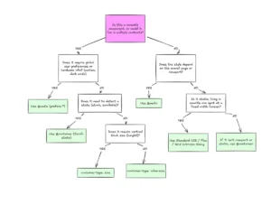
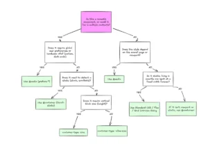
Optional Container Query Conditions (Firefox 149, Safari 26.4):
A significant step forward in responsive design arrived with Firefox 149 and Safari 26.4, both of which now support name-only @container queries without specified conditions. This enhancement allows developers to target and style elements based solely on the name of their parent container, effectively decoupling component styling from the global viewport. Prior to this, container queries typically required conditions related to a container’s size (e.g., min-width, max-height) or style to trigger specific rule sets. The introduction of name-only queries offers an unprecedented level of flexibility, making it simpler to apply distinct styles to components when they reside within a particular named container, regardless of that container’s specific dimensions or the overall viewport size.

This capability is particularly transformative for component-driven architectures, which dominate modern web development. Individual UI elements, such as a "product card" or a "user profile widget," can now inherently adapt their appearance and layout based on their contextual placement within a layout structure. For instance, a "card" component might display a compact layout when placed in a "sidebar" container but expand to a more detailed presentation when situated within a "main content" container, even if both containers might temporarily occupy similar pixel widths. This eliminates the need for complex, often fragile, class-based solutions or JavaScript interventions that were previously required to manage context-specific styling. The move towards more powerful container queries has been a long-standing request from the web development community, aiming to bring the modularity and reusability of component design to the forefront of CSS capabilities. Industry experts anticipate this feature will significantly streamline the development of adaptable and maintainable user interfaces, leading to more robust and scalable design systems that are easier to manage across large projects.
Grid Lanes (display: grid-lanes) (Safari 26.4):
Safari 26.4 introduced robust support for display: grid-lanes, a new value for the display property that enables masonry-style layouts natively in CSS. Masonry layouts, characterized by items of varying heights arranged without gaps in a visually appealing, staggered pattern, have long been a popular design pattern, especially for image galleries, portfolios, news feeds, and content dashboards. Historically, achieving this effect required complex JavaScript libraries to calculate and reposition elements dynamically, or intricate CSS hacks involving multi-column layouts or absolute positioning, none of which offered a truly native, performant, or semantic solution. The native implementation of grid-lanes simplifies this process dramatically, allowing developers to create visually appealing, dynamic layouts with minimal code and inherent browser optimization.
This feature integrates seamlessly with the existing CSS Grid layout module, providing an intuitive way to manage the flow and placement of content within a grid container. The performance benefits of a native CSS solution over JavaScript-based alternatives are substantial, as the browser can optimize rendering more efficiently, leading to smoother scrolling and faster initial load times. This development marks a significant milestone in CSS layout capabilities, fulfilling a critical need for designers and developers looking to create rich, content-rich web experiences without compromising on performance or complexity. It empowers creators to build more engaging visual narratives and dynamic content presentations directly within the browser’s rendering engine, enhancing the overall aesthetic and functional quality of web pages.
Math Functions in sizes Attribute (Safari 26.4):
Another impactful update from Safari 26.4 is the addition of support for min(), max(), and clamp() CSS math functions within the sizes attribute of <img> elements. The sizes attribute is crucial for responsive image loading, allowing browsers to select the most appropriate image source from a srcset based on the image’s rendered width in the layout. By enabling math functions within sizes, developers gain unprecedented flexibility in defining how an image’s size should be calculated dynamically, adapting to complex layout scenarios without resorting to fixed values or JavaScript.
For example, sizes="(min(90vw, 1200px))" could instruct the browser that the image should occupy 90% of the viewport width, but never exceed 1200 pixels, ensuring it doesn’t become excessively large on very wide screens. Similarly, clamp(200px, 50vw, 800px) could ensure an image is always between 200px and 800px wide, scaling with the viewport in between. This level of granular control ensures that images are loaded at optimal resolutions, directly improving page load times and reducing bandwidth consumption, especially on high-resolution displays or varying device sizes. This enhancement not only contributes to better performance and a smoother user experience but also simplifies the code required for complex responsive image strategies, moving more of this