
Mountainview Brewing Co., strategically situated in the picturesque foothills of the Cascade Mountains in Hope, British Columbia, has recently launched a comprehensive and meticulously crafted brand identity. This initiative aims to solidify its position as a vital hub for both the local community and the transient highway traveler, offering a diverse array of craft beers in a setting steeped in local lore, famously known as the filming location for the iconic 1982 film "Rambo: First Blood." The brewery, housed within a converted mechanic garage, has embraced its dual role as a community gathering space and a welcoming stop for those venturing into the mountainous terrain.

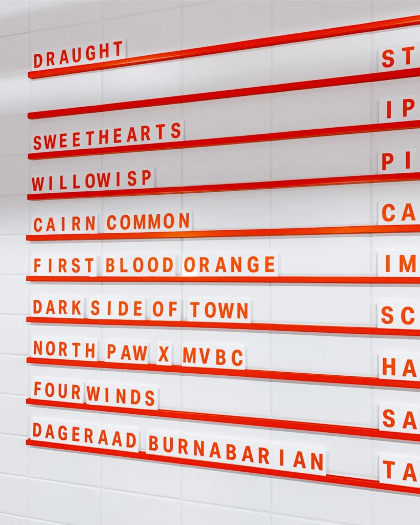
The development of this robust brand identity was undertaken in close collaboration with Mountainview Brewing Co. from its inception. The project involved the creation of an in-depth visual identity and a distinct brand voice, alongside the design and production management of a complete brand suite. This suite encompasses a range of essential elements, including brewery signage and wayfinding systems, adaptable menu structures, bespoke tasting flight trays, distinctive packaging for their brews, and an assortment of interior collateral and merchandise designed to enhance the customer experience. The chosen typeface for this branding endeavor is Aktiv Grotesk, a versatile and modern sans-serif font designed by Dalton Maag, known for its clarity and readability across various applications.
Genesis of a Brewery: From Mechanic Garage to Craft Beer Haven
The story of Mountainview Brewing Co. is one of transformation and community integration. The decision to establish a craft brewery in Hope, BC, a town that draws both local residents and tourists, was a deliberate one. Hope’s unique geographical position, nestled between major highways and at the gateway to stunning mountain landscapes, presents a distinct opportunity for a business catering to diverse clientele. The building itself, a former mechanic garage, speaks to the brewery’s grounded origins and its commitment to a hands-on, authentic approach to brewing.

The brewery’s operational philosophy centers on offering a "long tap list of crushable staples and experimental craft beers alike." This dual focus ensures broad appeal, from seasoned craft beer enthusiasts seeking novel flavors to casual drinkers looking for reliable, well-made brews. The "crushable staples" likely refer to accessible lagers, pale ales, and session beers designed for easy drinking, while the "experimental craft beers" suggest a commitment to innovation, potentially including sour ales, barrel-aged creations, or unique hop combinations. This strategy is crucial for a business serving both locals who frequent the establishment regularly and travelers who may be visiting for the first time, potentially making a single, memorable stop.
A Cohesive Brand Experience: Visual Identity and Voice
The development of Mountainview Brewing Co.’s brand identity was a holistic process, aiming to create a unified and memorable experience across all touchpoints. The visual identity, designed to reflect the brewery’s location and ethos, likely draws inspiration from the surrounding natural beauty of the Cascade foothills. This could manifest in color palettes, imagery, and graphic elements that evoke the ruggedness of the mountains, the clarity of pristine waterways, or the warmth of a community gathering place.

The brand voice, developed in tandem with the visual elements, would further articulate the brewery’s personality. It is likely crafted to be approachable, knowledgeable, and perhaps a touch adventurous, mirroring the spirit of craft brewing and the appeal of its mountainous setting. This voice would permeate all written communications, from menu descriptions and social media posts to signage and promotional materials.
The Brand Suite: Tangible Elements of Identity
The comprehensive brand suite designed for Mountainview Brewing Co. is a testament to the importance of consistent branding in the hospitality sector.

-
Brewery Signage and Wayfinding: Clear and attractive signage is paramount for any establishment, especially one catering to travelers. The signage would not only identify the brewery but also guide visitors within the premises, ensuring a seamless and intuitive experience. The design likely incorporates elements that are both visually appealing and functional, reflecting the brand’s aesthetic.
-
Flexible Menu Systems: In the dynamic world of craft brewing, where tap lists can change frequently, flexible menu systems are essential. This could include digital displays, well-designed printed menus that are easily updated, or modular components that allow for quick revisions. The design of these menus would also contribute to the overall brand narrative, presenting beer selections in an appealing and informative manner.

-
Custom Tasting Flight Trays: Tasting flights are a popular way for patrons to sample a variety of beers. Custom-designed trays not only serve a practical purpose but also act as a branded experience. These trays might incorporate unique designs, materials, or even thematic elements that enhance the tasting journey.
-
Packaging: For a brewery, packaging is a critical touchpoint. This includes cans, bottles, and potentially growlers. The design of this packaging would be a direct representation of the brand, communicating its quality, character, and appeal to consumers both in the taproom and potentially in off-premise retail settings. The imagery and typography on the cans would be crucial for shelf appeal and brand recognition.

-
Interior Collateral and Merchandise: Beyond the core offerings, interior collateral such as coasters, tap handles, and wall art, along with merchandise like t-shirts and glassware, all contribute to the immersive brand experience. These items serve as ambassadors for the brand, extending its reach and reinforcing its identity in the minds of customers.
The Role of Aktiv Grotesk
The selection of Aktiv Grotesk as the primary typeface is a strategic choice that underpins the brand’s overall aesthetic and functionality. Aktiv Grotesk, developed by Dalton Maag, is a geometric sans-serif typeface known for its clean lines, open counters, and excellent legibility. Its design is rooted in modernist principles, making it both contemporary and timeless.

In the context of Mountainview Brewing Co., Aktiv Grotesk likely serves multiple purposes:
- Readability: For menus, signage, and packaging, clear and easily readable text is non-negotiable. Aktiv Grotesk’s open forms and balanced letterforms ensure that information is accessible even at a glance, which is particularly important for highway travelers who may be making quick decisions.
- Versatility: The typeface offers a range of weights and styles, allowing for flexibility in hierarchical typographic design. This means it can be used for headlines, body text, and call-to-actions with consistent visual harmony.
- Modernity and Approachability: While modern, Aktiv Grotesk avoids being overly stark or sterile. Its slightly softened geometric forms can lend a sense of approachability and friendliness, aligning well with the welcoming atmosphere of a craft brewery.
- Connection to the Brand Narrative: The typeface’s clean, unfussy nature can complement branding that aims to convey authenticity and a focus on quality, without unnecessary embellishment. It suggests a brand that is confident and straightforward.
The typeface’s origin from Dalton Maag, a renowned type foundry, also lends a professional and considered touch to the brand’s foundation. This attention to detail in typography signals a commitment to quality that extends throughout the brewery’s operations and offerings.

Community Engagement and Traveler Appeal
Mountainview Brewing Co.’s strategy to cater to both the local community and highway travelers is a smart approach to maximizing its market reach. For the local community, the brewery offers a reliable and inviting space for socializing, relaxation, and enjoying locally crafted beverages. By establishing a strong brand identity and a consistent quality of product, Mountainview can foster loyalty and become a cornerstone of the Hope town experience.
For highway travelers, the brewery presents an attractive and convenient destination. Situated on a major route, it offers a welcome respite from long drives. The "Rambo: First Blood" connection adds a unique point of interest, potentially drawing in film enthusiasts and tourists seeking a taste of local history and culture. The comprehensive branding ensures that even first-time visitors will encounter a professional, appealing, and memorable establishment. The clear signage and wayfinding are particularly critical for this demographic, ensuring easy identification and access.

The Broader Landscape of Craft Brewing and Branding
The success of Mountainview Brewing Co.’s branding initiative can be viewed within the broader context of the craft brewing industry. In a highly competitive market, a strong and cohesive brand identity is no longer a luxury but a necessity. Consumers are increasingly drawn to brands that offer not just a quality product, but also an authentic story, a unique experience, and a consistent visual and emotional connection.
The investment in professional brand development, from visual design to typography, signals a commitment to long-term growth and market positioning. This approach helps breweries stand out from the crowd, build brand recognition, and cultivate customer loyalty. The trend towards experiential retail further emphasizes the importance of a well-defined brand that translates into every aspect of the customer journey, from the first impression of the exterior signage to the final sip of a craft beer from a branded glass.

The choice of Aktiv Grotesk by Dalton Maag is also indicative of a growing trend among businesses to leverage high-quality, well-designed typefaces to enhance their brand’s perception. Professional typography contributes to a sense of sophistication and trustworthiness, aligning with the aspirations of many craft breweries aiming to be perceived as artisanal and premium.
Looking Ahead: The Future of Mountainview Brewing Co.
With a thoroughly developed brand identity now in place, Mountainview Brewing Co. is well-positioned for continued success. The synergy between its prime location, its commitment to a diverse beer selection, and its meticulously crafted brand experience is poised to make it a prominent fixture in the Hope, BC, landscape. The brewery’s ability to resonate with both its local patrons and the transient traveler will be key to its sustained growth and its contribution to the vibrant craft beverage scene in British Columbia. The foundational work in branding provides a solid platform for future expansion, potential new product lines, and ongoing engagement with its growing customer base.