
Despite broad browser support, container queries remain one of the most underutilized and frequently misunderstood advancements in modern front-end development. While media queries have served as the cornerstone of responsive design for over a decade, their reliance on the viewport as a proxy for layout logic is increasingly viewed as a technical bottleneck. Container queries offer a paradigm shift by allowing components to adapt to their immediate parent container rather than the browser window, yet adoption remains sluggish. Recent industry data from the 2025 State of CSS survey indicates that while 86% of developers are aware of this feature, only 41.4% have integrated it into their production workflows.
A Decade of Technical Evolution
The concept of container-based responsiveness was not an overnight development; it was the result of years of advocacy from the web standards community. Since the inception of the Responsive Web Design (RWD) movement pioneered by Ethan Marcotte in 2010, developers relied exclusively on media queries to manage layout shifts. By the late 2010s, however, the rise of component-based architecture—driven by frameworks like React, Vue, and Web Components—highlighted a glaring deficiency in CSS. Components were designed to be reusable, but their internal styling remained tethered to the global viewport.
In 2019, the CSS Working Group and various industry leaders formally prioritized "Container Queries" as a top-tier request on the CSS Wishlist. The technical hurdle was significant: browser engines had to re-architect how they handled layout cycles to prevent infinite loops, where a component’s size change could trigger a layout update that, in turn, changed the component’s size. By 2023, major browser engines including Chrome, Firefox, and Safari reached parity, bringing global support to approximately 94%. Despite this, the transition from legacy media-query logic to container-aware architecture has been hampered by a lack of institutional knowledge and a misunderstanding of the feature’s underlying mechanics.

The Fundamental Conflict: Viewport vs. Container
To understand why adoption lags, one must first recognize the fundamental difference in the query targets. Media queries, defined by the @media rule, are inherently "outward-looking." They ask the browser to report the width of the device screen or the browser window. This worked efficiently for single-page applications where the entire layout was monolithic. However, in modern, modular design systems, a "Card" component might appear in a narrow sidebar, a wide hero section, or a dense grid.
If a developer applies a media query to force a horizontal layout for a card at 1024 pixels, that card will attempt to expand horizontally even if it is trapped in a 300-pixel-wide sidebar. This results in visual deformation, text overflow, and layout collapse. Container queries solve this by enabling an "inward-looking" approach. By defining a container using the container-type: inline-size property, developers can instruct the browser to monitor the specific parent element. The component then independently decides its layout based on the space it occupies, rather than the device it resides on.
Chronology and Industry Reception
The slow uptake of container queries was a focal point during the 2026 SmashingConf in Amsterdam. Industry analyst Kevin Powell characterized the adoption rate as "terrible," noting that the industry has been slow to move away from "macro-layout" thinking—designing for the page—toward "micro-layout" thinking, which focuses on the autonomy of individual UI pieces.
The resistance is partly rooted in the perception that container queries are merely a syntax variation of media queries. Because both use an at-rule structure, developers often attempt to use them interchangeably. However, the logic requirements differ significantly. For instance, media queries do not require a parent-child relationship; they query the global state. Container queries, conversely, require the declaration of a container ancestor. This shift necessitates a move away from traditional CSS patterns where global styles dominate, forcing developers to rethink how they structure their HTML markup to support proper containment.

Data-Driven Design and the Fragmentation Problem
The necessity for container queries is underscored by the extreme fragmentation of device sizes. Recent studies by the Viewport.fyi project identified over 2,300 unique viewport sizes currently in use across the modern web. Relying on hard-coded breakpoints at 768px or 1024px is no longer a viable strategy for maintaining high-quality UI across a global user base.
By leveraging container query units (such as cqi or cqw), developers can create fluid typography and scalable components that adjust dynamically to their environment. For example, using the clamp() function in tandem with container query units allows text to resize based on the width of its parent element, ensuring legibility regardless of whether the component is placed in a small widget or a large display panel.
Addressing Implementation Caveats
While the benefits are clear, the technical implementation of container queries requires precision. One of the most common mistakes is the attempt to query a container from within itself, which results in an infinite calculation loop. Browsers, by design, will ignore such rules to maintain stability. The correct architectural pattern requires an explicit wrapper or parent element.
Furthermore, developers must be cautious when using container-type: size. This property forces the container to ignore its contents when calculating its own dimensions, which can lead to the "zero-height collapse" issue if an explicit height or aspect ratio is not provided. Additionally, container queries currently do not support custom properties for breakpoint values. Because custom properties are dynamic and dependent on the cascade, allowing them within a container query could lead to recursive layout instability. Consequently, developers must use hard-coded pixel or relative values within the queries for the foreseeable future.

Broader Implications for Web Architecture
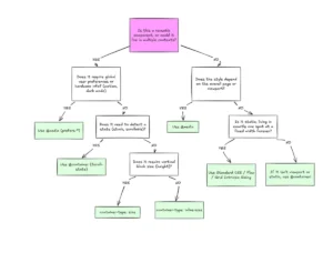
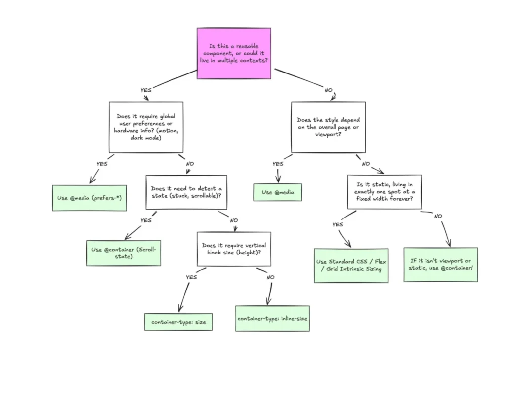
The shift toward container-aware design is indicative of a broader maturation in web development. As the industry moves toward more complex, highly modular applications, the limitations of the "global" approach to CSS become increasingly apparent. Container queries do not replace media queries; they complement them. Media queries remain the optimal tool for global layout concerns, such as page orientation, printing, or system-level preferences like prefers-color-scheme.
The future of responsive design lies in the separation of concerns: macro-layouts managed by the viewport, and micro-layouts managed by the container. By embracing this distinction, organizations can build more resilient, maintainable design systems. The current 41.4% usage rate is expected to climb as design systems and component libraries, such as those used in large-scale enterprise applications, begin to mandate container-based patterns to resolve long-standing issues with component reusability. Ultimately, the transition to container queries represents a move toward a more modular and context-aware web, where the content and its container define the interface, rather than the arbitrary constraints of the user’s screen.