
Despite broad browser support, CSS container queries remain a significantly underutilized feature in modern web development, frequently misunderstood as a direct, interchangeable alternative to the legacy media query system. While media queries have served as the cornerstone of responsive design since the early 2010s, the introduction of container queries represents a fundamental shift in how web components adapt to their environment. Recent data from the 2025 State of CSS survey indicates that while 86% of developers are aware of the technology, only 41.4% have actively implemented it in their workflows. This gap between awareness and adoption highlights a broader industry struggle to transition from viewport-centric design to context-aware, component-based architectures.
The Evolution of Responsive Design
The history of responsive web design is largely defined by the viewport. When the concept was popularized by Ethan Marcotte in 2010, the primary challenge was ensuring content rendered correctly across a nascent ecosystem of mobile devices, tablets, and desktop screens. Media queries, which allow developers to apply CSS rules based on the width or height of the browser window, became the standard solution for this "macro-layout" problem.
However, as the complexity of web applications grew, so did the limitations of the viewport-based approach. A component—such as a product card or a navigation sidebar—often needs to exist in multiple contexts across a single application. Under the legacy model, if a component is placed in a narrow sidebar on a large desktop monitor, a media query remains blind to the lack of available horizontal space, often resulting in broken layouts or visual cramping. The industry recognized this limitation years ago, with container queries appearing on various CSS "wishlists" as early as 2019. Despite the specification reaching 94% browser compatibility today, the industry has been slow to migrate away from the familiar, albeit limited, media query syntax.

Technical Distinction: Viewport vs. Container
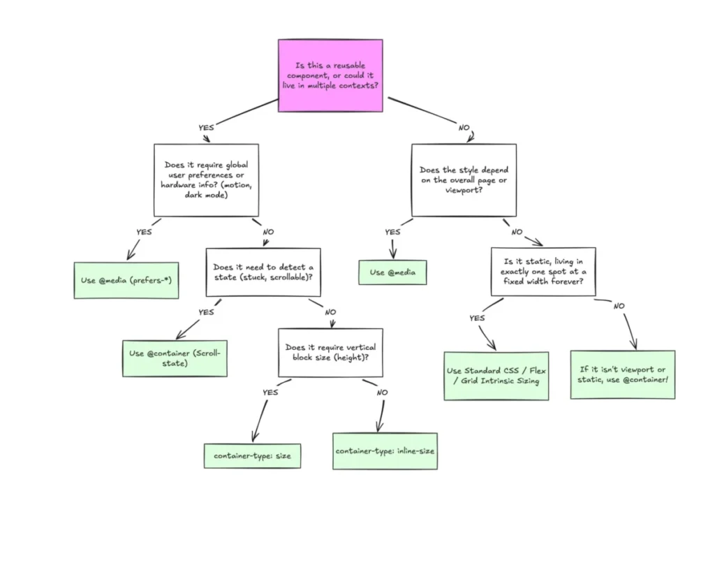
The fundamental difference between these two technologies lies in the frame of reference. Media queries are outward-looking; they ask the browser, "What is the width of the entire screen?" Conversely, container queries are inward-looking. They allow a specific element to act as a container, enabling its children to respond based on the space available within that specific parent, regardless of the overall viewport dimensions.
Technically, the implementation involves defining a container-type (such as inline-size) and a container-name on a wrapper element. Once defined, developers can use the @container rule to trigger style changes. This allows for true modularity. For instance, a component can be designed to display in a vertical, stack-based format when constrained to 300 pixels, and shift to a horizontal, grid-based layout when its container expands to 450 pixels or more. This logic functions independently of whether the user is on a mobile device or a high-resolution desktop.
Data and Developer Sentiment
The persistent reliance on media queries is not merely a matter of habit; it is a symptom of how current design systems are documented. Many developers view responsiveness as a top-down requirement dictated by the total screen size. However, the modern web is increasingly fragmented. With over 2,300 unique viewport sizes currently in circulation, attempting to account for every possible device width via media queries is an inefficient, if not impossible, task.
At the SmashingConf Amsterdam 2026, industry experts noted that the low adoption rate of container queries is a critical bottleneck in the quest for truly fluid design. The consensus among lead maintainers of major design systems is that the industry is currently in a "transitional malaise," where developers understand the what of the technology but remain hesitant to refactor legacy codebases that rely on the established, albeit rigid, media query breakpoints.

Addressing Implementation Caveats
While container queries offer a more precise control mechanism, they are not without technical nuances that can lead to bugs if ignored. A common pitfall is the attempt to query a container’s size on the same element that defines it, which creates an infinite loop. To function correctly, developers must establish a clear parent-child hierarchy where the container and the target element are distinct nodes in the DOM.
Furthermore, querying block-size (vertical height) on a container can lead to layout collapse if the container’s height is not explicitly defined. Because the browser calculates the container’s dimensions independently of its contents, an undefined height defaults to zero, potentially causing content to vanish or overlap. Furthermore, unlike media queries, container queries currently cannot accept CSS custom properties (variables) directly. This is a design choice by the CSS Working Group to prevent complex cascading issues where a query could inadvertently trigger a change in the very variable it is measuring.
Broader Implications for Web Architecture
The shift toward container queries marks a move toward "micro-layouts." In this paradigm, developers treat individual components as independent applications. This has profound implications for design systems, such as those used by enterprise-level e-commerce or SaaS platforms. By decoupling a component’s responsiveness from the page-level viewport, developers can create truly "portable" code. A button, a card, or a form widget can be moved from a wide main content area to a narrow sidebar without requiring a single line of custom CSS overrides.
The long-term impact of this shift will likely be a reduction in the sheer volume of CSS code required to maintain modern sites. As components become self-sufficient, the need for complex, global media query "breakpoint files" decreases. This leads to more maintainable, performant, and scalable stylesheets.

Future Outlook
As the web continues to evolve, the distinction between macro and micro layouts will become even more pronounced. Media queries will likely remain the standard for global site-wide changes—such as shifting from a light theme to a dark theme or adjusting the main navigation for mobile devices—but container queries will become the standard for the content components that populate those pages.
The transition requires a shift in mindset. Developers must stop asking, "How does this look on a tablet?" and start asking, "How much space does this component have to breathe in its current environment?" By embracing this context-aware logic, the development community can move toward a more resilient web, one where components are no longer victims of the viewport but masters of their own layout. While the current 41.4% adoption rate is modest, the trajectory of modern CSS development suggests that container queries will eventually become the default, effectively relegating media queries to their proper, more specialized role in web architecture.