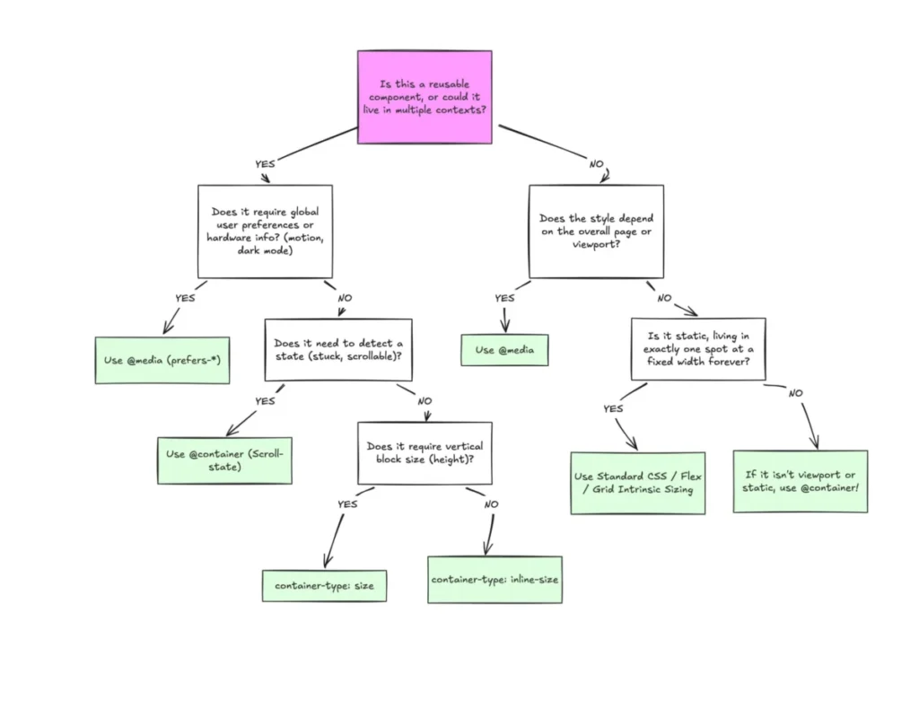

Despite broad browser support, CSS Container Queries remain one of the most underutilized and frequently misunderstood advancements in modern front-end web development. While media queries have served as the cornerstone of responsive design for nearly two decades, the evolution of the web into a component-based ecosystem has rendered them increasingly insufficient for managing complex, modular layouts. By allowing developers to style elements based on the dimensions of their parent containers rather than the overall browser viewport, container queries provide a more accurate, localized approach to design. However, despite a 94% global browser compatibility rate, adoption remains sluggish, with many developers failing to grasp the fundamental distinction between "macro" page-level layout and "micro" component-level adaptation.
The Historical Context of Responsive Design
To understand why container queries are a paradigm shift, one must look at the origin of responsive web design (RWD). Introduced by Ethan Marcotte in 2010, the concept was revolutionary: it allowed a single codebase to adapt to various screen sizes, from mobile phones to desktops. The primary tool for this was the CSS media query, which queries the browser’s viewport width to apply specific styles.
For years, this served as the industry standard. However, the rise of component-driven architecture—championed by frameworks like React, Vue, and Web Components—changed the landscape. In this modern era, developers build small, isolated pieces of an interface, such as cards, navigation bars, or widgets, that are designed to be reused across different parts of a website. When a single "card" component is placed in a narrow sidebar on one page and a wide, multi-column grid on another, the media query fails. It only knows how wide the entire browser window is, not how much space the specific card occupies. This leads to layouts that are either rigid, unresponsive, or reliant on complex, error-prone JavaScript calculations.
Adoption Trends and Statistical Discrepancies
The transition from viewport-based logic to container-based logic has been slower than industry experts anticipated. According to the 2025 State of CSS survey, while 86% of developers are aware of the container query feature, only 41.4% have integrated it into their production workflows. This gap between awareness and implementation is a point of concern for design engineers.
At the 2026 SmashingConf in Amsterdam, industry expert Kevin Powell emphasized that the adoption of container queries has been "terrible" compared to other CSS features that gain rapid traction. The delay in adoption is largely attributed to a cognitive bias: because the syntax of container queries looks nearly identical to that of media queries, developers often assume they serve the same purpose. This leads to a common trap where developers try to replace all media queries with container queries, failing to recognize that each serves a distinct role in the document flow.
Defining the Divide: Macro vs. Micro Layouts
The primary technical distinction lies in the intended scope of the layout. Media queries are designed for "macro" layouts—the overall structure of the page. They are the correct tool for determining if a site should display a desktop navigation bar or a mobile-friendly "hamburger" menu, as these elements are fundamentally tied to the browser window. They also manage global preferences, such as light versus dark mode, or specific device capabilities like touch input.
Conversely, container queries excel at "micro" layouts. A micro layout focuses on the individual component’s environment. By using the container-type property, a developer can define a parent element as a container, allowing its descendants to react to its specific width. This enables a component to change its orientation from a vertical list to a horizontal row if it finds itself in a wider parent container, regardless of whether the user is viewing the site on a smartphone or a 4K monitor. This shift from "viewport-aware" to "context-aware" design is critical for the future of fluid, resilient web interfaces.

Technical Hurdles and Best Practices
The transition to container queries is not without its technical caveats. A common point of friction is the "infinite loop" phenomenon. Because a container cannot query its own properties, developers must ensure that the container and the elements being modified are separated in the DOM. Attempting to apply a container query to an element that also contains the styles being queried will result in a recursive failure, as the browser cannot resolve the layout in a stable state.
Furthermore, querying a container’s "size" (its block or vertical height) can cause layout collapse if not managed correctly. Unlike the viewport, which always has a defined height, a container’s height is often dictated by its content. If a developer sets container-type: size without defining a explicit height, the container may collapse to 0px, effectively hiding all internal content. Best practices dictate that developers should favor inline-size (horizontal width) unless vertical dimension querying is strictly necessary.
Another limitation is the inability to use CSS custom properties (variables) within the query conditions. Because CSS variables cascade through the DOM, they can create circular dependencies if allowed in media or container queries. This requires developers to use hard-coded pixel values or established design tokens rather than dynamic variables, a limitation that has sparked ongoing debate within the W3C CSS Working Group.
The Future of Fluid Interfaces
Despite these challenges, the implications for the web are profound. As the number of unique device and viewport sizes continues to proliferate—with over 2,300 unique screen sizes currently recorded—the "breakpoint" method of design is becoming unsustainable. Relying on fixed widths like 768px or 1024px to define how a component looks is an arbitrary exercise that ignores the reality of modern, flexible layouts.

By leveraging fluid units such as cqi (container query inline size) alongside CSS clamp() functions, developers can create typography and spacing that scale naturally with the component’s container. This results in interfaces that feel more organic and less prone to the "cramping" that occurs when a complex component is forced into a narrow space designed for a simpler layout.
Strategic Implications for Developers
The industry is currently at an inflection point. The standard for responsive design is shifting from "page-centric" to "component-centric." For organizations, this means that the return on investment for adopting container queries is significant; it reduces the need for "hacky" CSS overrides and simplifies the maintenance of complex design systems.
Moving forward, the successful web architect will distinguish between these two tools: using media queries to govern the high-level architecture of the page and using container queries to empower individual components to manage their own responsiveness. As the browser support for more advanced features like container style queries continues to develop, the ability to write context-aware, modular CSS will likely become the defining skill of a senior front-end engineer. The goal is no longer to fit a page to a screen, but to build components that are capable of thriving in any environment they are placed in.