
Since its inception in 1969, Ashton has stood as a cornerstone of Quebec’s culinary identity, famously pioneering the commercialization of poutine. Founded by Ashton Leblond as a humble food truck, the chain grew into a regional powerhouse with 23 locations. However, by the early 2020s, the brand found itself at a crossroads. Despite its deep-rooted history, the company faced the classic "legacy trap": a loyal but aging customer base, stagnant sales, and an outdated physical environment that failed to resonate with a younger, digital-native workforce and consumer demographic. The brand was frozen in time, and the need for a comprehensive evolution became an existential necessity for its survival in a competitive fast-food market.
The strategic pivot began in 2022 when Émily Adam and Jean-Christophe Lirette acquired the chain from its founder. The new ownership team recognized that preserving the legacy of Ashton required more than minor cosmetic adjustments; it necessitated a full-scale revitalization of the brand’s visual identity, customer experience, and operational philosophy. To lead this ambitious transformation, the owners partnered with the renowned creative agency LG2.

A Chronology of the Transformation
The roadmap for Ashton’s revival was structured to honor its origins while ensuring long-term scalability. The transition process can be categorized into four key phases:
- Strategic Audit (Early 2022): Upon taking the reins, Adam and Lirette conducted an extensive review of the company’s 23 locations. The data revealed a critical decline in traffic among younger demographics and operational inefficiencies that hindered expansion.
- Creative Conceptualization (Mid-2022 to 2023): LG2 was brought on to bridge the gap between "nostalgic comfort" and "modern convenience." The design team focused on creating a flexible, exportable brand system that could be applied across all future locations.
- Flagship Pilot (Late 2023 to Early 2024): The team selected a flagship location to serve as the blueprint for the brand’s new aesthetic. This involved a complete interior and exterior overhaul, incorporating elements from the original 1969 food truck.
- Market Re-entry and Optimization (2024): Following the launch of the flagship site, the brand began rolling out its new packaging, digital touchpoints, and merchandise, accompanied by a marketing campaign designed to signal a "new era" for the chain.
Redefining the Visual Identity
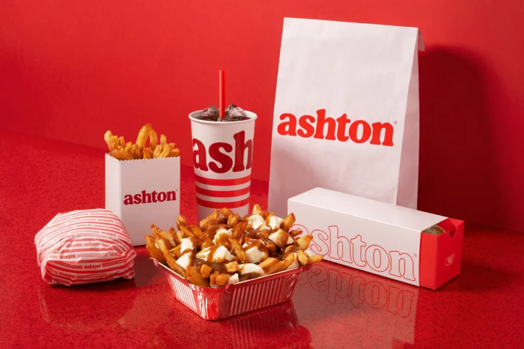
The rebranding exercise was rooted in a concept described as "modern nostalgia." LG2’s design philosophy for Ashton centered on stripping away unnecessary clutter while elevating the brand’s core heritage. The primary visual change was the modernization of the company’s signature red. By deepening the tone and refining the typography to be more generous and fluid, the agency aimed to communicate the indulgence associated with a classic poutine.
One of the most significant design choices was the implementation of a "triple red line" graphic system. Inspired by the neon lighting that characterized the original 1969 mobile unit, this motif now serves as a unifying element across all customer touchpoints. Whether it is a line on a food container or a striped detail on staff uniforms, the visual language is consistent, professional, and highly recognizable.

Beyond graphics, the physical architecture of the restaurants was completely overhauled. The new design language emphasizes organic, curved edges, moving away from the rigid, utilitarian structures of the late 20th century. By integrating classic "snack bar" tropes—such as red tin roofing and custom neon signage—the architects successfully reclaimed the brand’s history without making the spaces feel dated. This approach ensures that while the restaurants are optimized for modern throughput and efficiency, they maintain the soul of a traditional Quebecois diner.
Data-Driven Success: The First 30 Days
The results of the pilot project, released shortly after the launch, provided empirical evidence that the brand’s strategy was sound. Within the first 30 days of operation at the renovated flagship location, the metrics were overwhelmingly positive.
- Foot Traffic: The restaurant saw a 35% increase in physical visits compared to the period prior to the renovation. This confirmed that the modernized aesthetic was successfully attracting a new cohort of customers who had previously bypassed the chain.
- Revenue Growth: Sales figures at the location rose by 34%, suggesting that the updated environment not only drew more people through the door but also improved the average transaction value.
- Digital Engagement: Perhaps the most telling metric for long-term sustainability was the 40% surge in traffic to the official Ashton website. This indicates that the rebrand succeeded in making the brand "discoverable" and relevant in a digital-first ecosystem.
Strategic Implications and Industry Context
The Ashton case study offers significant insights into the challenges faced by legacy quick-service restaurants (QSRs). Many brands in the food and beverage industry struggle to balance the "heritage factor" with the need for modern relevance. Often, companies pivot too far toward minimalism, alienating their core demographic, or they refuse to change, eventually fading into obscurity.

By choosing to lean into their history rather than run from it, the new ownership team at Ashton has provided a masterclass in brand revitalization. By analyzing the "secret sauce" of their success, several key takeaways emerge for the broader hospitality sector:
- The Importance of Scalability: The redesign was not just for one location; it was engineered to be "exportable." This means the new furniture, lighting layouts, and signage systems are modular and can be implemented in the remaining 22 locations with minimal friction. This is a vital consideration for any chain looking to expand its footprint or franchise model.
- Human-Centric Design: By focusing on the comfort of the dining room—retaining the iconic banquettes while updating the surrounding environment—the design team acknowledged that the "experience" is just as important as the product. For a comfort food chain like Ashton, the physical environment acts as a secondary product that reinforces the brand promise.
- Targeting the Younger Demographic: The inclusion of branded merchandise (such as socks featuring the new logo) is a calculated move to build "lifestyle brand" status. By turning the logo into a symbol that customers want to wear or share on social media, Ashton is effectively converting its customer base into brand ambassadors.
Looking Ahead: The Future of the Chain
As the brand moves forward, the primary challenge for Adam and Lirette will be maintaining this momentum across the entire network of 23 locations. The success of the pilot program provides a template, but the execution of that template across diverse real estate footprints will require rigorous operational discipline.
Industry analysts suggest that if Ashton continues to see similar growth patterns across its other locations, the chain will be well-positioned to consider further expansion—potentially outside of its traditional strongholds. By successfully updating its image, the brand has effectively insulated itself against the threat of younger, trendier competitors, proving that a brand with 55 years of history can remain competitive if it is willing to evolve.

Ultimately, the revitalization of Ashton is a testament to the power of thoughtful design. By respecting the past while aggressively optimizing for the future, the team has not only secured the brand’s place in Quebec’s culinary history but has also set the stage for its next half-century of growth. The transition from a local institution to a modernized, exportable brand is, for the owners, only the beginning. With a solid foundation, a clear visual identity, and proven sales data, Ashton is no longer just a restaurant serving poutine; it is a revitalized cultural asset in the Canadian fast-food landscape.