
The Australian frozen food landscape, a market segment projected to reach significant valuation milestones by 2028 due to shifting consumer demands for convenience, has seen a pivotal development in brand positioning. The Dinner Ladies, a prominent player in the pre-prepared meal delivery sector, has officially launched a comprehensive visual and verbal rebrand. This initiative, spearheaded by the design agency Universal Favourite, aims to modernize the company’s identity while honoring its seventeen-year heritage as a boutique, family-focused culinary service. The transition marks a departure from traditional "mumsy" marketing tropes common in the food industry, moving instead toward a bold, irreverent, and highly functional design language designed to resonate with time-poor, modern Australian households.

A Legacy of Convenience: The Origins and Growth of The Dinner Ladies
Founded in 2007, The Dinner Ladies began as a modest operation run by two entrepreneurs in a Sydney backyard shed. The business was born from a recognition of a pervasive social pain point: the "dinner time chaos" experienced by working parents and busy families who prioritized home-cooked nutrition but lacked the time for daily preparation.

Over the past seventeen years, the company has scaled from a localized service to a significant national provider of ready-to-heat meals. This growth trajectory has necessitated constant operational expansion, moving from backyard production to industrial-scale kitchens. However, as the brand expanded, its visual identity became fragmented through various iterations, leading to a dilution of the core values that initially propelled the brand to success. The recent rebrand represents an attempt to synthesize the brand’s history—including its original, hand-drawn aesthetic—with the requirements of a high-growth, modern e-commerce business.

The Strategic Necessity of Rebranding in an Oversaturated Market
The Australian meal delivery sector has become increasingly crowded, with numerous competitors vying for market share through promises of health, speed, and premium ingredients. Industry analysts note that the sector has become "oversaturated," characterized by a homogenization of marketing messaging. Many brands utilize identical visual cues—often focusing on overly clinical photography or generic, soft-focus lifestyle imagery that lacks distinct personality.

By commissioning a total overhaul, The Dinner Ladies sought to differentiate themselves by rejecting the "same-same" messaging prevalent in the industry. The decision to invest in a new identity was not merely aesthetic but a tactical business maneuver to ensure the brand remains competitive against agile startups and established supermarket chains. The objective was to create a "no-nonsense" identity that reflects the reality of the consumer experience: a need for high-quality, comfort-driven meals that provide a tangible solution to the stress of daily domestic routines.

The Rebranding Process: A Multi-Disciplinary Approach
The collaboration between The Dinner Ladies and Universal Favourite involved a deep immersion into the brand’s history. The design team conducted an extensive audit, reviewing everything from early napkin-sketched logos to current digital assets. This research phase was critical in identifying the "attitudinal punch" that had defined the company’s early years but had been lost in recent iterations.

Technical Refinements and Design Philosophy
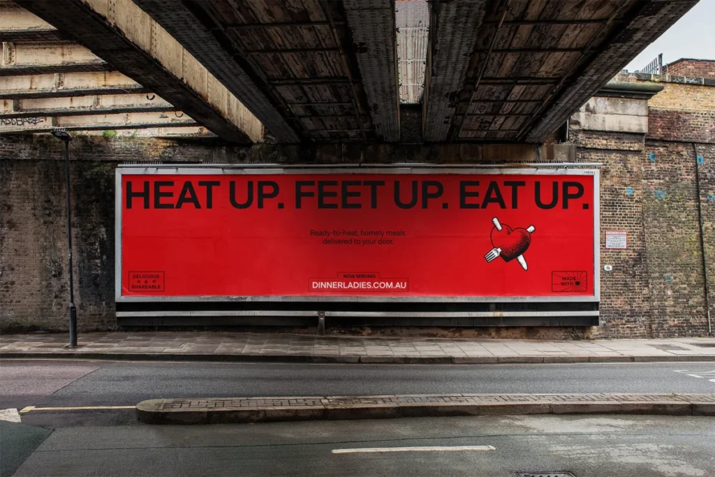
The primary focus of the visual overhaul was the logo. Designers chose to decouple the existing heart icon from the brand’s script wordmark. This separation allows for greater flexibility across various digital touchpoints, including mobile apps, social media, and packaging. To ensure the brand’s "trad-tattoo-esque" roots remained visible, illustrator Jake Foreman was commissioned to re-render the logo, utilizing gritty, stippled textures that lend the brand a tactile, authentic feel.

The color palette was similarly refined. While the brand’s signature red was retained—leveraging existing consumer recognition—it was updated with a more vibrant, modern tone. This hero color is now supported by a secondary palette of warm, retro-inspired hues. These colors were chosen specifically for their functionality in digital environments, ensuring high visibility and contrast on screens.

Typography also played a central role in the rebrand. The agency selected "Denim" by the Displaay Type Foundry, utilizing the "Wide" variant for high-impact headers and the regular cut for legibility in body copy. This combination allows the brand to maintain a professional, clean look while retaining the flexibility to be "cheeky" or "bold" when required.

Verbal Identity and Tone of Voice
A critical component of the project was the development of a new verbal identity, managed in collaboration with copywriter Cat Wall. The brand’s previous messaging had occasionally veered into patronizing, gendered stereotypes. The new tone of voice is designed to be "charming, rebellious, and bull-free." It prioritizes directness, acknowledging the realities of modern life without the over-sincerity that often defines the sector. By focusing on "food from the heart" with a side of irreverence, the brand aims to build a more authentic rapport with customers who appreciate a brand that speaks to them as equals rather than as a target demographic.

Operational Impact: Packaging and Consumer Experience
The packaging design was overhauled with a specific focus on the end-user experience. Because these meals are typically stored in freezers and retrieved in moments of high stress or limited time, the new packaging utilizes a sophisticated color-coded system. This allows customers to distinguish between different protein groups—such as beef, chicken, or vegetarian options—at a glance. This functional design upgrade is expected to reduce the cognitive load on the consumer, reinforcing the brand’s core promise of "taking the pressure off."

Industry Context and Broader Market Implications
The rebrand of The Dinner Ladies arrives at a time when the meal-kit and frozen-meal sector is under intense pressure to demonstrate value. Recent economic data suggests that Australian consumers are increasingly cost-conscious, leading to a greater demand for convenience solutions that provide genuine quality.

The strategy adopted by The Dinner Ladies—relying on a strong, personality-driven identity—is reflective of a broader trend in direct-to-consumer (DTC) marketing. As customer acquisition costs (CAC) rise across digital advertising platforms, brands are increasingly turning to brand equity and customer loyalty to maintain growth. By creating a visual identity that is instantly recognizable and emotionally resonant, The Dinner Ladies are positioning themselves not just as a commodity, but as a lifestyle solution.

Future Outlook
The successful implementation of this rebrand provides The Dinner Ladies with a scalable platform for future expansion. By reconciling their heritage with a modern design system, the company has established a foundation that can accommodate new product lines and geographic growth without losing the "backyard shed" soul that has served as their competitive advantage for nearly two decades.

"The Dinner Ladies now have a brand that not only celebrates their seventeen-year legacy but gives them the tools for future decades of success," stated a representative for the design team at Universal Favourite. As the company continues to navigate the competitive landscape of Australian food delivery, the emphasis on a "no-BS" attitude and high-quality, comfort-focused product, supported by this robust visual system, positions them as a formidable, modern challenger in the food industry.

The integration of the new brand identity, which includes updated delivery van graphics, website interfaces, and print collateral, is currently underway. While the full impact on market share remains to be seen in quarterly performance reports, the early reception of the design shift suggests a successful pivot towards a more mature, yet distinctively rebellious, market presence. For a company that began by simply trying to fill freezers and bellies, the shift represents a significant evolution into a national brand ready to compete at the highest level of the Australian culinary market.