
The design community is mourning the loss of Jim Parkinson, an iconic lettering artist, typographer, and painter who passed away on June 26, 2025, at his home in Oakland, California. Parkinson, whose career spanned more than five decades, died following a long struggle with Alzheimer’s disease. He is survived by his wife, book artist Dorothy A. Yule, who served as both his life partner since 2010 and his primary caregiver during the final years of his life. Parkinson’s departure marks the end of an era in American graphic design, leaving behind a visual legacy that defined the mastheads of some of the nation’s most prominent publications and the identities of world-famous musical acts and cultural institutions.
A Life Formed by Letters
Born on October 23, 1941, in Oakland, California, Parkinson’s fascination with letterforms began in his youth. His proximity to Abraham Lincoln Paulsen, the renowned “Wizard Penman” who famously demonstrated his skill by writing the Gettysburg Address in reverse and upside down using only the numeral 2, sparked an early and enduring passion for the craft. This early exposure instilled in Parkinson a reverence for the historical nuances of typography. Throughout his formative years, he obsessively collected antique lettering manuals and correspondence-school textbooks, teaching himself the intricacies of historical styles—a practice that would define his professional methodology.
Parkinson formally refined his skills at the California College of Arts and Crafts, graduating in 1963. Shortly after, he moved to Kansas City to join the creative team at Hallmark Cards. It was during this period that Parkinson realized his true calling. While initially tasked with illustrative duties, he quickly migrated to the company’s lettering department, where his ability to render virtually any alphabet or logo style by hand became apparent. This pivot toward specialized lettering would prove to be the most significant decision of his career, setting him on a trajectory that would eventually lead him back to Oakland to establish a freelance practice that would dominate the industry for over fifty years.
A Chronology of a Prolific Career
Parkinson’s body of work is a masterclass in versatility and historical synthesis. His career can be segmented into several distinct phases, each contributing to the evolution of American visual culture:

- 1963–1968: The Hallmark Years: Parkinson honed his technical discipline, moving away from illustration and solidifying his identity as a lettering artist.
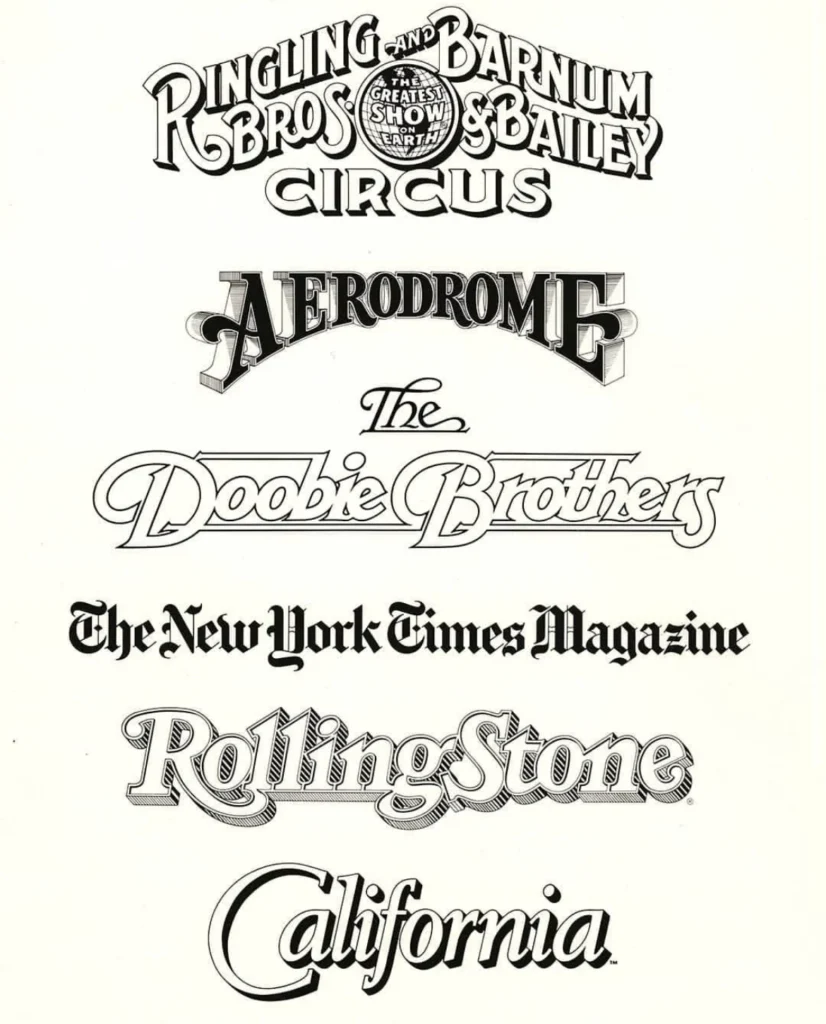
- 1969–1980: The Rise of the Magazine Masthead: After returning to the Bay Area, Parkinson became the go-to specialist for editorial design. His work for Rolling Stone helped define the aesthetic of music journalism in the 1970s.
- 1981–2000: Corporate and Institutional Branding: During this era, Parkinson’s hand-lettering became a staple for major institutions, most notably the Los Angeles Times and the Ringling Bros. and Barnum & Bailey Circus.
- 2001–2025: The Digital Transition and Fine Art: Parkinson embraced the shift to digital typeface design while simultaneously expanding his artistic output to include oil paintings of vintage neon signs, capturing the decaying beauty of mid-century Americana.
The Scope and Impact of His Work
To view a newsstand in the United States at almost any point during the late 20th century was to view the work of Jim Parkinson. His output was vast, covering a spectrum of requirements from high-circulation magazine covers to bespoke corporate identities. Notable contributions include his work for Rolling Stone, the Los Angeles Times, and various custom fonts that bridged the gap between traditional hand-lettering and the digital constraints of modern publishing.
Beyond editorial design, Parkinson’s influence extended into the entertainment industry. He designed logos for bands such as the Doobie Brothers, demonstrating a fluidity that allowed him to adapt his style to the tone of the brand—be it the rigorous, professional serif of a major newspaper or the expressive, rhythmic lettering required for a concert poster. His work was characterized by a deep respect for historical precedent; he did not merely copy styles, but reinterpreted them through a contemporary lens, ensuring that his designs remained relevant regardless of the decade.
Professional Philosophy and Legacy
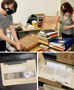
Parkinson was frequently cited by colleagues for his humility and his adherence to the mantra, “Take your work seriously, but never yourself.” Despite his immense stature in the design world, he was known for his openness, frequently welcoming students and fellow designers into his home to view his extensive archive of ephemera and original artwork. This generosity of spirit helped foster a sense of community among typographers and designers in the Bay Area.
His approach to design was grounded in the physical reality of the craft. Even as the industry transitioned toward computer-aided design, Parkinson maintained a tactile connection to his work. This is most evident in his later-life passion for painting vintage neon signs. By capturing the textures of peeling paint and broken glass, he translated his deep knowledge of letterform structure into a medium that explored the passage of time and the fragility of the urban landscape.
A Future Publication: The Parkinson Memoir
The design community will have a final opportunity to engage with Parkinson’s life story in 2027, when the Letterform Archive is scheduled to publish his memoir. This work, written by Parkinson himself, is expected to provide an intimate look at the evolution of American graphic design through the eyes of one of its most essential practitioners. The archive, which has long been a steward of Parkinson’s work, intends for this publication to serve as a definitive resource for future generations of designers.

The Broader Implications for Design
The loss of Parkinson occurs at a time when the field of traditional hand-lettering is experiencing a resurgence in digital design. Parkinson’s career provides a vital link between the pre-digital era of drafting boards and physical ink and the contemporary digital landscape. His ability to maintain the integrity of classic letterforms while adapting to the rapid pace of publication design offers a roadmap for designers navigating an era dominated by artificial intelligence and automated font generation.
Analysis of his work reveals that Parkinson’s success was not merely a result of technical skill, but of an intuitive understanding of the relationship between text and reader. He understood that a masthead is the primary visual anchor for a reader, and his ability to refine these elements repeatedly over decades helped maintain the brand identity of some of the most enduring media outlets in history.
Memorial and Contributions
A memorial service for Parkinson is planned for the autumn of 2025, with details to be announced by his family. The design community, including organizations like the Letterform Archive, has encouraged those wishing to honor his memory to consider donating to the Alzheimer’s Association, a cause that reflects the struggle he faced in his final years.
As the industry reflects on his contributions, it is clear that Jim Parkinson’s influence will persist. Through his retail typefaces, his iconic logos, and his upcoming memoir, he has ensured that his voice will continue to inform the work of future typographers. He remains a testament to the idea that in the digital age, the human hand—guided by study, practice, and a sense of history—remains the most powerful tool in the designer’s kit. His career stands as a comprehensive record of a man who loved his craft, respected his predecessors, and, above all, lived with a sense of joy that defined his professional and personal life.