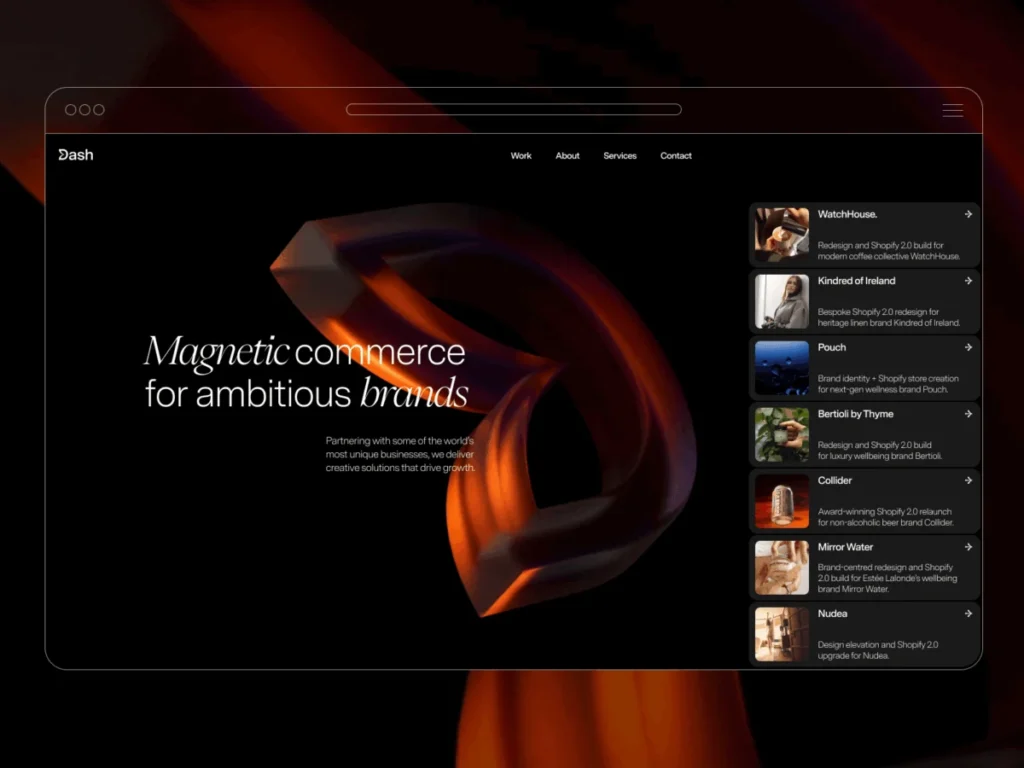

In a strategic move to solidify its market position and articulate its unique value proposition, Dash Creative, a prominent digital experience agency, has officially launched its comprehensive rebrand, centered around the innovative concept of "magnetic commerce." This initiative culminates in a redesigned website that serves as a living demonstration of the agency’s philosophy: crafting digital experiences that not only inform but actively draw users in through sophisticated, tactile, and highly responsive interactions. The cornerstone of this rebrand is an immersive new website, featuring a custom WebGL-driven hero background that dynamically distorts a live video texture in response to cursor movement, setting a new benchmark for interactive web design.
The Strategic Imperative for Rebranding: Defining a Distinct Identity
The decision to embark on a rebrand had been under consideration for some time, driven by a desire to achieve greater differentiation in an increasingly competitive digital agency landscape. As the digital commerce sector continues its rapid expansion, fueled by evolving consumer expectations and technological advancements, agencies are under pressure to not merely offer services but to embody a distinct approach to digital transformation. For Dash Creative, the objective extended beyond a superficial aesthetic overhaul; it aimed to encapsulate and articulate the very essence of their operational philosophy.
The core challenge was to develop an identity that would allow the agency to "stand out, not just look different, but own what we actually do," as articulated by a spokesperson for Dash Creative. This introspection led to the formulation of "magnetic commerce" – a powerful metaphor suggesting that truly great digital experiences possess an inherent ability to attract and engage users, creating a compelling, almost irresistible pull. This concept became the guiding principle for every subsequent design and technical decision, signaling a shift towards experience-driven engagement over static presentation.
Conceptualizing ‘Magnetic Commerce’: From Idea to Interactive Identity
The "magnetic commerce" concept rapidly transitioned from an abstract idea into a tangible design language. The agency’s new logo visually manifests this principle: the letter ‘D’ is depicted with a segment subtly pulled inward, as if by an invisible magnetic force. This emblem was not merely decorative; it served as the foundational asset, informing the aesthetic and interactive direction for the entire website.
A pivotal design decision emerged directly from the logo’s interactive potential. Once the new logo was rendered as a rotating 3D object, the natural progression was to imbue it with interactive qualities. The idea was simple yet profound: the logo should behave exactly as its concept suggested. Dragging a cursor over it would cause it to visually respond, pulling and distorting in a magnetic fashion. This single, intuitive detail set the precedent for the site’s overall motion philosophy, emphasizing dynamic and responsive interactions as a core element of the user experience.

Further extending this tactile and intuitive approach, Dash Creative drew inspiration from iOS design principles for handling critical interface elements such as cards and Calls-to-Action (CTAs). Project cards were deliberately crafted to evoke the familiarity and tactility of iOS notifications, presenting information in a manner that felt both natural and subtly innovative within the website’s context. The development process benefited significantly from stringent brand guidelines. Rather than stifling creativity, these constraints provided a clear framework, preventing design drift and channeling efforts towards more considered and impactful solutions. The development team noted that adhering to these strictures ultimately led to a more cohesive and distinctive final product.
A Phased Development Journey: From Blueprint to Launch
The entire rebranding and website development project spanned several months, characterized by distinct phases of conceptualization, design, development, and iterative refinement. The core "magnetic commerce" concept and its initial visual interpretation were established relatively quickly, providing a strong thematic anchor. However, the bulk of the project’s timeline was dedicated to the meticulous refinement of content and the precise tuning of animations in the development phase.
This emphasis on refinement underscores a critical aspect of modern web development: while initial concepts can form rapidly, the true differentiator lies in the flawless execution and seamless integration of interactive elements. Ensuring that content was compelling and that animations contributed meaningfully to the user experience, rather than merely serving as superficial adornments, required significant time and detailed attention from the development team. This iterative process of tweaking timing, easing curves, and copywriting was crucial in achieving the desired level of polish and impact.
Technological Backbone: A Synergy of Cutting-Edge Tools
The sophisticated interactivity and visual fidelity of Dash Creative’s new website are the result of a carefully selected stack of industry-leading tools, each deployed for its specific strengths:
- Figma for Design: The design phase heavily leveraged Figma, a collaborative interface design tool. Its robust capabilities for systematic design proved invaluable in maintaining the tightly defined brand guidelines. Figma facilitated the consistent application of typography, spacing, and component libraries, ensuring design coherence across the site while simultaneously supporting rapid iteration and prototyping without impeding the creative workflow.
- Webflow for the Build: The website’s primary build was executed on Webflow, a no-code/low-code platform renowned for its design flexibility and powerful animation system. Dash Creative’s decision to build its own site on Webflow was strategic, serving as a tangible "proof of what’s possible on the platform for prospective clients." Most of the site’s interactions and animations were expertly implemented using Webflow’s native animation features, showcasing the platform’s advanced capabilities for dynamic web experiences.
- GSAP (GreenSock Animation Platform) for Enhanced Interactions: While Webflow’s native animation system is robust, certain highly precise, cursor-driven behaviors and complex sequencing required a more granular level of control. For these instances, GSAP, a professional-grade JavaScript animation library, was integrated. GSAP allowed the developers to achieve nuanced motion effects that extended beyond Webflow’s out-of-the-box functionalities, contributing significantly to the site’s fluid and responsive feel.
- Custom WebGL for the Hero Background: The most distinctive technical achievement of the new website is its hero background, which necessitated a custom WebGL implementation. This decision highlights Dash Creative’s commitment to pushing technical boundaries to deliver truly unique visual experiences that cannot be achieved with standard web technologies.
Deep Dive: The Hero Background’s Dynamic Distortion
The hero background stands as a testament to Dash Creative’s commitment to immersive user experiences. The initial concept was straightforward: to use a fullscreen video as a texture and distort it dynamically based on cursor movement. The overarching goal was to create a background that felt responsive and alive, yet remained subtle enough not to distract from the site’s primary content.

Crucially, the team aimed for an effect that transcended a simple ripple emanating from the cursor’s immediate position. Instead, the distortion was designed to carry momentum, propagating in the direction of cursor movement. This subtle yet significant detail imparts the impression that the underlying surface is being actively "pulled" or manipulated, rather than merely reacting to a static hover state. This approach elevates the interaction from a superficial effect to a more organic and engaging tactile experience.
Fragment Shader Mechanics: The Engine of Distortion
The sophisticated distortion effect is implemented entirely within a fragment shader, a program that runs on the graphics card and determines the color of each pixel. This method allows for highly efficient and complex visual transformations. Rather than layering multiple effects over the video, the shader directly remaps the video’s texture coordinates. The cursor’s position and movement define the "area of influence," while the direction of movement dictates how the distortion propagates across the surface. A damped sine function is employed to generate the wave-like displacement, creating a natural, fluid motion.
The behavior of this distortion is governed by a set of configurable values, defined once and passed into the renderer. These parameters allow for fine-tuning the visual characteristics of the effect:
const SETTINGS =
  radius: 0.41,        // Defines the primary radius of influence around the cursor.
  amplitude: 0.082,    // Controls the intensity or height of the distortion wave.
  frequency: 13,       // Determines the number of waves or ripples within the distortion.
  speed: 0.98,         // Dictates how quickly the wave pattern animates or progresses.
  carry: 6,            // Influences how far the distortion "carries" or extends beyond the cursor.
  stagger: 12,         // Adds a staggered or offset effect to the wave, preventing uniformity.
  centerPower: 2,      // Shapes the falloff of the distortion towards the center of influence.
  verticalDampPower: 2.2, // Limits the vertical spread of the wave, ensuring directional shape.
  motionGain: 220,     // Amplifies the raw cursor motion data for a more pronounced effect.
  speedDecay: 0.86,    // Controls how quickly the distortion effect diminishes after cursor movement stops.
;
The underlying geometry for this effect is remarkably simple, consisting of a single fullscreen quad – a rectangle made of two triangles that covers the entire display area:
const vertices = new Float32Array([
  -1, -1, 0, 0, // Vertex 1: X, Y, U, V
   1, -1, 1, 0, // Vertex 2
  -1,  1, 0, 1, // Vertex 3
  -1,  1, 0, 1, // Vertex 3 (repeated for second triangle)
   1, -1, 1, 0, // Vertex 2 (repeated for second triangle)
   1,  1, 1, 1, // Vertex 4
]);
The actual distortion logic is encapsulated within the fragment shader. Key components include:
maskFn(vec2 uv): This function calculates a mask that defines the area of influence. It uses the distancedistfrom the cursor (uMouseSm) and appliespow(smoothstep(...))to create a smooth, radial falloff.wavecalculation: This combines various parameters liked.y * uFreq,dot(d, dir) * uCarry,uTime * uSpeed, andd.y * uStaggerto generate the dynamic wave pattern.d += dir * (wave * amp * maskFn(uv) * damp): This is the core line where the calculated wave, amplified byamp, masked bymaskFn, and damped, is applied to the texture coordinatesdin the directiondir, resulting in the distortion.
The result is a visually rich effect that dynamically responds to cursor input, maintaining momentum and gradually settling, thereby creating a fluid and continuous interaction rather than a series of disconnected reactions.
Motion Persistence and Fluidity: Beyond Immediate Response

A critical aspect of the hero background’s natural feel is its motion persistence. To prevent the effect from abruptly stopping the moment the cursor halts, the interaction state is smoothed and decayed on the JavaScript side before being passed to the shader. This process involves:
motionTarget *= SETTINGS.speedDecay; // Gradually reduces the motion target over time.
const mappedMotion = Math.min(motionTarget * SETTINGS.motionGain, 1); // Maps motion to a usable range.

motion += (mappedMotion - motion) * SETTINGS.momentum; // Smooths the overall motion.
dirSm.x += (dirTarget.x - dirSm.x) * SETTINGS.dirSmooth; // Smooths the X-component of the direction.
dirSm.y += (dirTarget.y - dirSm.y) * SETTINGS.dirSmooth; // Smooths the Y-component of the direction.
This JavaScript-driven smoothing ensures that the distortion gradually loses momentum and returns to its resting state, making the interaction feel more organic and less mechanical. It provides a crucial sense of continuity, enhancing the overall immersive experience.
Principles of Visual Restraint: Enhancing, Not Distracting
Despite its technical complexity, the hero background adheres to a strict principle of visual restraint. The primary aim was to add depth and movement without competing with or overshadowing the site’s content, particularly the typography. The effect is designed to sit subtly behind the text, ensuring readability while providing an engaging visual layer.
The influence field employs a soft falloff rather than a harsh, defined edge, preventing the effect from appearing like a "spotlight" around the cursor. Furthermore, vertical damping limits the spread of the wave, giving the distortion a more directional shape instead of an even expansion in all directions. This deliberate control contributes to a sophisticated, understated aesthetic. The remainder of the hero section is intentionally minimalist – a black background, a full-bleed video, and the shader applied directly to its texture – ensuring that the focus remains squarely on the innovative interaction itself.
Architectural Simplicity and Efficiency
The architecture supporting this complex interaction is surprisingly straightforward, designed for efficiency and ease of integration:
<section id="us-sine-bg" class="hero-sine-bg">
  <video id="bgvid" class="hero-sine-bg__video" muted playsinline autoplay loop></video>
</section>
The setup comprises a dedicated hero container, a hidden HTML <video> element serving as the texture source, and a WebGL canvas layered directly above it. The renderer performs five main tasks: initializing the WebGL context, compiling shaders, setting up vertex buffers, loading the video texture, and managing the render loop.

This lean approach avoids reliance on heavy scene graphs, complex post-processing pipelines, or additional geometry. It operates efficiently with a single texture, a fullscreen quad, and a pair of shaders (vertex and fragment), making it highly practical for integration into a production website. The render loop is kept lightweight, with frame uploads executed only once the video is fully prepared (video.readyState >= 2). Interaction values are smoothed over time, the shader exclusively remaps UV coordinates, and rendering is confined to the hero section, all contributing to optimal performance. This modular design also allows the same approach to be readily reused with different video sources, distortion profiles, or across various sections of a site without requiring fundamental structural changes.
Strategic Insights and Future Considerations
The successful implementation of the new website and brand identity marks a significant milestone for Dash Creative. The final result, according to the agency, "feels much closer to what we wanted the site to communicate." The development team reflected that while the technical implementation came together relatively quickly, the majority of the project’s duration was dedicated to the meticulous refinement of motion, the careful editing of content, and ensuring a harmonious interplay between these two elements.
One of the most valuable lessons learned throughout the process was the critical importance of knowing "when to stop adding." Small, incremental adjustments to timing, easing curves, and copywriting often yielded more substantial positive impact than introducing entirely new effects. This highlights a mature understanding of user experience design, where subtle perfection often outperforms overt complexity.
A key reflection point for future projects involves the reliance on cursor interaction. The development team noted that the experience "changes significantly on touch devices," underscoring the need to consider mobile and touch-based interactions much earlier in the design process rather than adapting them as an afterthought. This insight is crucial in an era where mobile browsing constitutes a significant portion of web traffic, demanding truly responsive and adaptive designs.
Ultimately, the entire project reinforced a foundational idea that guided the rebrand from its inception: effective interaction works best when it subtly supports the core concept or message, rather than drawing undue attention to itself. This philosophy of purposeful interaction aligns perfectly with the "magnetic commerce" principle, where the goal is to create an engaging flow that subtly draws users deeper into the experience.
For the broader digital agency landscape, Dash Creative’s new website serves as a powerful case study. It demonstrates the strategic value of a well-executed rebrand that is deeply integrated with an innovative digital presence. In an age where digital first impressions are paramount, an immersive, technically sophisticated, and conceptually aligned website can significantly enhance brand perception, attract discerning clients, and solidify an agency’s reputation as a leader in cutting-edge digital experiences. The site positions Dash Creative not just as a provider of services, but as a visionary practitioner of the very principles it advocates.