Posted inWeb Development
Elevating FinTech Prototyping: The Imperative of Realistic Login Experiences for Authentic User Feedback
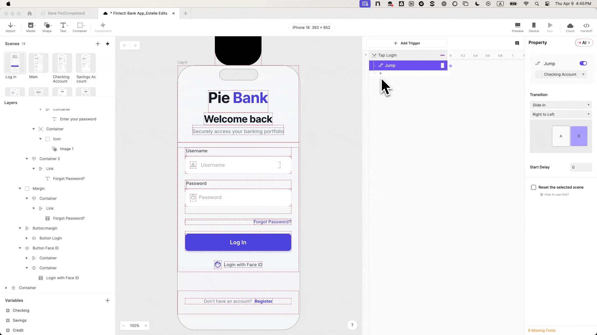
The subtle yet profound moment of hesitation at a login screen during a usability session serves as a critical indicator, frequently signaling a fundamental disconnect between a prototype and a…