
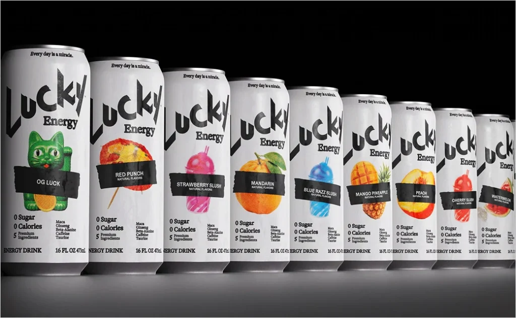

The competitive landscape of the functional beverage industry is undergoing a notable visual and strategic shift as Austin, Texas-based enterprise Lucky Energy officially rolls out its comprehensive brand overhaul. Developed in close collaboration with the Los Angeles-based creative agency Dayjob, the sweeping redesign encompasses a minimalist black-and-white aesthetic, a sophisticated typography system, and an updated product line spanning both carbonated beverages and dietary gummies. The refresh is engineered to position the brand more favorably within crowded retail coolers, moving away from hyper-aggressive, high-octane visual tropes traditionally associated with the energy drink sector and pivoting toward a cleaner, more deliberate, and emotionally resonant market identity.
This visual transformation marks a significant milestone in the company’s relatively brief history, reflecting a broader maturation of its corporate ethos. At the core of the rebrand is a newly minted mission statement—"Every day is a miracle"—which seeks to redefine how consumers perceive luck and personal drive. According to company executives, the underlying philosophy posits that fortune is not a matter of random chance, but rather an active pursuit cultivated through intention and human agency. By adopting this perspective, Lucky Energy aims to forge a deeper, more authentic connection with its demographic, stepping away from empty marketing hype in favor of a voice that is adventurous, optimistic, and grounded.
A Masterclass in Minimalist Packaging Design
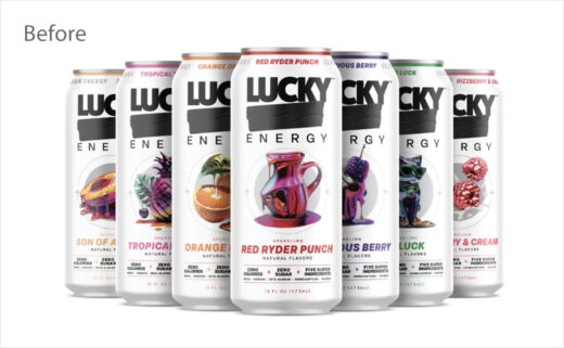
The most striking element of the brand refresh is its bold departure from conventional packaging norms. While many competitors in the functional beverage category rely on chaotic color schemes, neon gradients, and complex graphics to capture attention, Lucky Energy and Dayjob have opted for a disciplined, high-contrast black-and-white design system. This intentional minimalism creates a sharp, premium aesthetic that immediately distinguishes the product on store shelves.
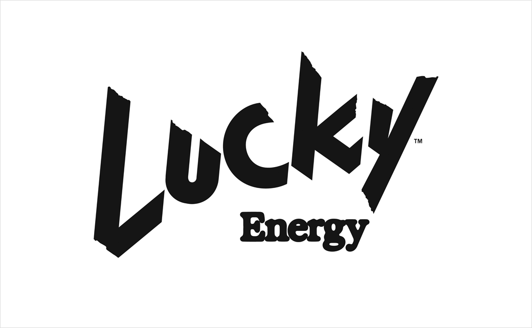
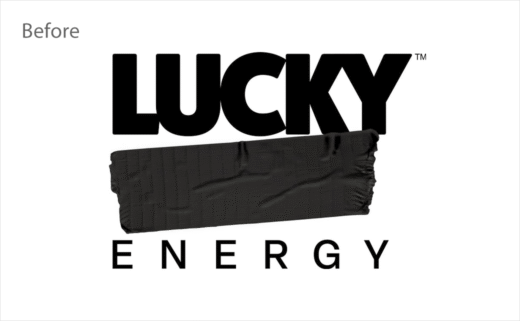
Within this monochromatic framework, the brand’s signature wordmark has been reimagined, cleverly extending the visual motif of its former tape system. The only splash of color on each 473-milliliter can is derived from minimalist, flavor-specific graphic elements. This restrained use of color serves a dual purpose: it simplifies the consumer’s understanding of the product’s flavor profiles while decluttering the overall visual architecture of the can.
Company representatives noted that the minimalist approach was chosen specifically to combat visual fatigue in retail cooler doors. By stripping away extraneous noise, the packaging highlights the simplicity of the product’s formulation. The cleaner lines and sharper typography lend the brand a distinctly grown-up sensibility without sacrificing the adventurous spirit that initially defined its market entry.
Chronology and Corporate Background
To fully understand the trajectory of Lucky Energy, one must examine the entrepreneurial journey of its founder, Richard Laver. Before entering the mainstream energy drink market, Laver established a distinguished track record in the development of nutritionally focused beverages, driven largely by deeply personal motivations. His entry into the health and nutrition sector was catalyzed by his daughter, Katie, who was diagnosed with cerebral palsy. Facing severe dietary constraints that hindered her physical development and weight maintenance, Laver recognized a critical gap in medical and everyday nutrition.
This personal challenge led Laver to establish Kate Farms in 2012, a pioneering medical nutrition enterprise dedicated to producing plant-based, organic formulas tailored for individuals managing chronic illnesses and requiring tube-feeding support. Under his guidance, Kate Farms grew into a respected name in clinical nutrition, establishing a benchmark for clean, accessible health solutions.
Building upon his extensive experience in functional and health-conscious formulations, Laver turned his attention to the mainstream beverage market, founding Lucky Energy in 2023. Upon its initial launch, the brand adopted a notoriously provocative posture, cheekily hitting the market under the moniker "LUCKY F*CK." This disruptive early branding was designed to cut through the noise of legacy competitors and capture the attention of a younger, rebellious demographic.
However, as the brand matured and expanded its retail footprint, leadership recognized the need to transition from a shock-value market entry to a sustainable, enduring lifestyle brand. The partnership with Dayjob and the introduction of the new black-and-white visual identity represent the culmination of this strategic evolution, bridging the gap between the company’s irreverent roots and its long-term commercial ambitions.
Formulation and Nutritional Profile
Beneath its newly redesigned exterior, Lucky Energy maintains a strict commitment to functional efficacy and clean ingredient sourcing. Designed as a healthier alternative to traditional sugar-laden energy drinks, the beverage’s formulation centers around five primary active ingredients, completely omitting sugar to appeal to health-conscious consumers.
Each 473-milliliter can delivers 200 milligrams of caffeine, providing a robust stimulant profile comparable to industry standards, but balanced by a carefully curated blend of adaptogens and performance enhancers. The formulation includes maca root, known historically for its adaptogenic properties and potential to support stamina; beta-alanine, an amino acid frequently utilized in athletic supplements to combat muscle fatigue; ginseng, which has long been used in traditional wellness practices to enhance vitality and cognitive function; and taurine, an essential amino acid that supports cardiovascular health and metabolic function.
By pairing this functional ingredient deck with a zero-sugar promise, the brand has successfully positioned itself at the intersection of performance supplementation and everyday refreshment. The extension of this formulation philosophy into alternative formats, such as dietary gummies, further demonstrates the company’s ambition to evolve into a holistic wellness lifestyle brand rather than remaining a single-category beverage player.
Leadership Perspectives and Official Statements
The unveiling of the new brand identity has been accompanied by reflections from the company’s executive leadership regarding the deeper meaning of the corporate pivot. Richard Laver emphasized that the redesign is not merely cosmetic, but a direct reflection of the brand’s core values and human-centric mission.
"This new identity captures that idea. It is cleaner, sharper, and more grown-up, but it still has the same heart," Laver stated in an official company release. "We are not telling people to wait around for luck. We are inviting them to recognise it, create it, and bring good energy to whatever comes next."
Corporate communications from the firm further elaborated on the philosophical shift underpinning the marketing strategy. "For Lucky, luck is not random; it is something people choose, chase, and create. The idea gives the brand a human voice that is optimistic, adventurous, and emotionally resonant without leaning on extremes or empty hype."
By pivoting away from the aggressive, adrenaline-fueled tropes that dominated the energy drink category throughout the late 1990s and 2000s, Lucky Energy is signaling a broader cultural shift in consumer preferences. Modern consumers—particularly within the demographic cohorts driving growth in the functional beverage sector—increasingly favor transparency, sophisticated aesthetics, and emotional authenticity over bombastic marketing claims.
Broader Market Implications and Industry Impact
The launch of Lucky Energy’s redesigned product line arrives at a pivotal time for the global functional beverage industry. As consumer awareness regarding health, wellness, and clean labelling reaches an all-time high, legacy energy drink brands are facing mounting pressure to reformulate their products and modernize their visual identities. The proliferation of zero-sugar options, functional mushroom-infused tonics, and adaptogenic beverages has fundamentally altered consumer expectations.
By adopting a minimalist black-and-white design system, Lucky Energy is actively challenging the visual hegemony of major industry incumbents. While brands like Red Bull, Monster Energy, and Rockstar have historically relied on complex, colorful, and high-energy iconography to dominate cooler doors, Lucky’s sophisticated restraint suggests that a quieter, more premium approach can be equally, if not more, effective in capturing consumer attention.
Furthermore, the brand’s ability to transition successfully from a provocative market disruptor ("LUCKY F*CK") to a refined, design-forward wellness enterprise offers a compelling case study in brand evolution. It demonstrates that emerging companies can utilize initial shock value to gain initial market traction, provided they possess the strategic foresight to mature their messaging before consumer fatigue sets in.
Rollout Timeline and Future Outlook
The newly minted brand identity, encompassing the updated logo, minimalist packaging, and revised mission statement, is scheduled to begin rolling out across retail channels toward the end of the year. The transition will encompass the brand’s complete product ecosystem, ensuring a cohesive visual and experiential touchpoint for consumers whether they encounter the product in beverage cans or dietary supplement packaging.
As the rollout progresses, industry analysts will be closely monitoring how retail buyers and consumers respond to the dramatic aesthetic shift. If the minimalist gamble pays off, it could inspire a broader wave of design simplification across the functional beverage sector, encouraging other challenger brands to embrace cleaner lines, higher-contrast palettes, and more emotionally grounded brand narratives.
Ultimately, Lucky Energy’s comprehensive rebrand underscores the vital importance of adaptability in the modern consumer packaged goods (CPG) landscape. By synthesizing a personal founding narrative, a clean and functional ingredient deck, and cutting-edge design principles, the company has positioned itself to navigate the complexities of a crowded market while maintaining an authentic connection with its growing consumer base.