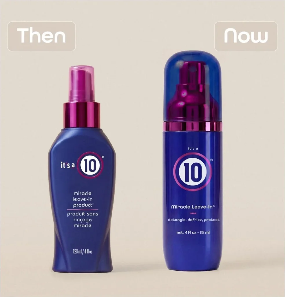

Popular American professional haircare brand It’s a 10 Haircare has officially rolled out its first-ever comprehensive brand overhaul, introducing a modernized logo and completely redesigned product packaging. The sweeping visual refresh made its public debut alongside a targeted global marketing campaign appropriately titled "New Era. Same 10." This milestone initiative is designed to bridge the gap between the company’s celebrated two-decade legacy and the contemporary demands of the fast-evolving modern beauty landscape.
The aesthetic update touches every corner of the brand’s extensive catalog, signaling a mature step forward for the independent hair care titan. While the external visual architecture of the products has undergone a significant transformation, the company has heavily emphasized that the award-winning formulas inside the bottles remain entirely unchanged. By carefully balancing visual modernization with trusted product integrity, It’s a 10 Haircare aims to appeal to a younger, design-conscious demographic of consumers while continuing to honor the loyal customer base that built the brand over the last twenty years.
A Historic Evolution Under Founder Leadership
The decision to undergo such a massive corporate and visual redesign was spearheaded by Carolyn Aronson, a veteran professional hairstylist who serves as the founder, CEO, and sole owner of It’s a 10 Haircare. In an industry increasingly dominated by large conglomerates and private equity buyouts, Aronson’s independent ownership has allowed the brand to retain a distinct, authentic voice.
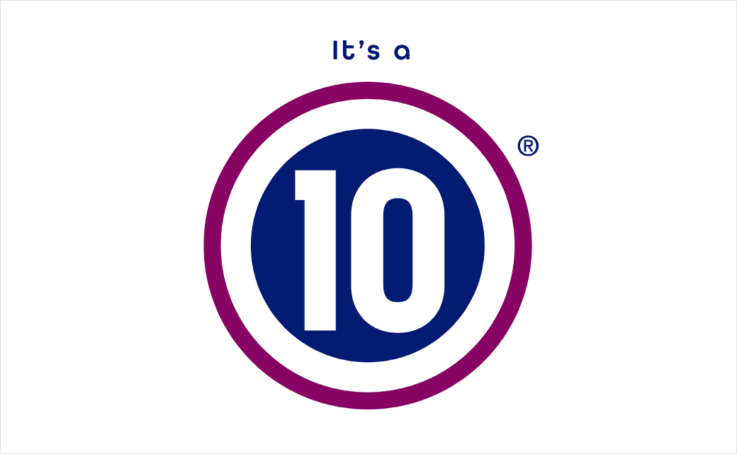
Reflecting on the strategic necessity of the rebrand, Aronson noted that the update is not a departure from the company’s foundational identity, but rather a natural progression of its market presence. "This isn’t a reinvention of who we are—it’s an evolution of how we show up," Aronson explained in an official corporate statement. She further elaborated that the introduction of a more modern, elevated visual expression successfully mirrors current consumer expectations while setting a solid groundwork for future product development and corporate growth. "It’s a new era, but it’s the same 10: honoring our heritage while creating a stronger foundation for future innovation and growth," she added.
The overarching sentiment within the company centers on aligning external aesthetics with internal performance. Over the past two decades, the brand has built a stellar reputation among salon professionals and everyday consumers alike for delivering reliable, salon-quality results. The corporate leadership team recognized that to maintain a competitive edge in a crowded beauty market, the physical presentation of the products needed to reflect the premium quality of the formulations inside.
Timeline of Transformation: Rebranding Over 80 Products
Revamping a globally recognized beauty brand is no small logistical feat, particularly when it involves an extensive product catalog. The current rollout represents the culmination of meticulous planning and execution that unfolded throughout the year. In a staggering display of operational efficiency, the company successfully rebranded and repackaged more than 80 distinct products within a single calendar year—marking the most extensive structural and visual change in the brand’s 20-year history.
The journey toward this new era began years prior with incremental packaging tweaks and digital footprint modernizations, but the 2026 overhaul represents the definitive manifestation of the brand’s new creative direction. The rollout strategy was deliberately structured to minimize consumer confusion while maximizing visual impact on retail and salon shelves. By phasing out old inventory and replacing it with sleek, minimalist, and cohesive packaging, It’s a 10 Haircare has ensured a seamless transition for retail partners and salon distributors across the United States and international markets.
Expanding the Portfolio: New Products and Collections
Beyond the visual refresh, the brand is simultaneously expanding its product footprint to capture new segments of the hair care market. The American company has introduced several innovative formulations designed to target specific hair types, textures, and styling needs. Among the notable individual product additions are the Miracle Styling Foam, the deeply nourishing Keratin Hair Mask, and the high-shine Volumizing Glaze.
In addition to these standalone items, It’s a 10 Haircare has rolled out four entirely new specialized collections: Glossing, Curly, Intense Hydration, and Texture. Each collection has been scientifically formulated to address specialized hair care concerns, utilizing advanced ingredients that align with modern clean-beauty and performance standards. These new lines demonstrate that the brand’s "new era" extends far beyond cosmetic surface changes, signaling an aggressive push into new product categories and consumer demographics.
The Crown Jewel: Miracle Leave-In and Market Dominance
At the heart of the company’s immense commercial success lies its flagship product, the Miracle Leave-In. This iconic blue-and-white bottled treatment has achieved legendary status in the beauty industry, serving as the gateway product for millions of consumers worldwide.
Market data underscores the sheer scale of the product’s popularity. In the United States alone, the Miracle Leave-In reportedly sells more than 11 million bottles each year. To put that staggering figure into perspective, it translates to approximately one bottle sold every three seconds. This high-velocity sales rate has cemented the product as a staple in both professional salons and household bathrooms, providing a rock-solid financial and consumer trust foundation that has allowed the brand to independently fund its recent massive rebranding efforts.
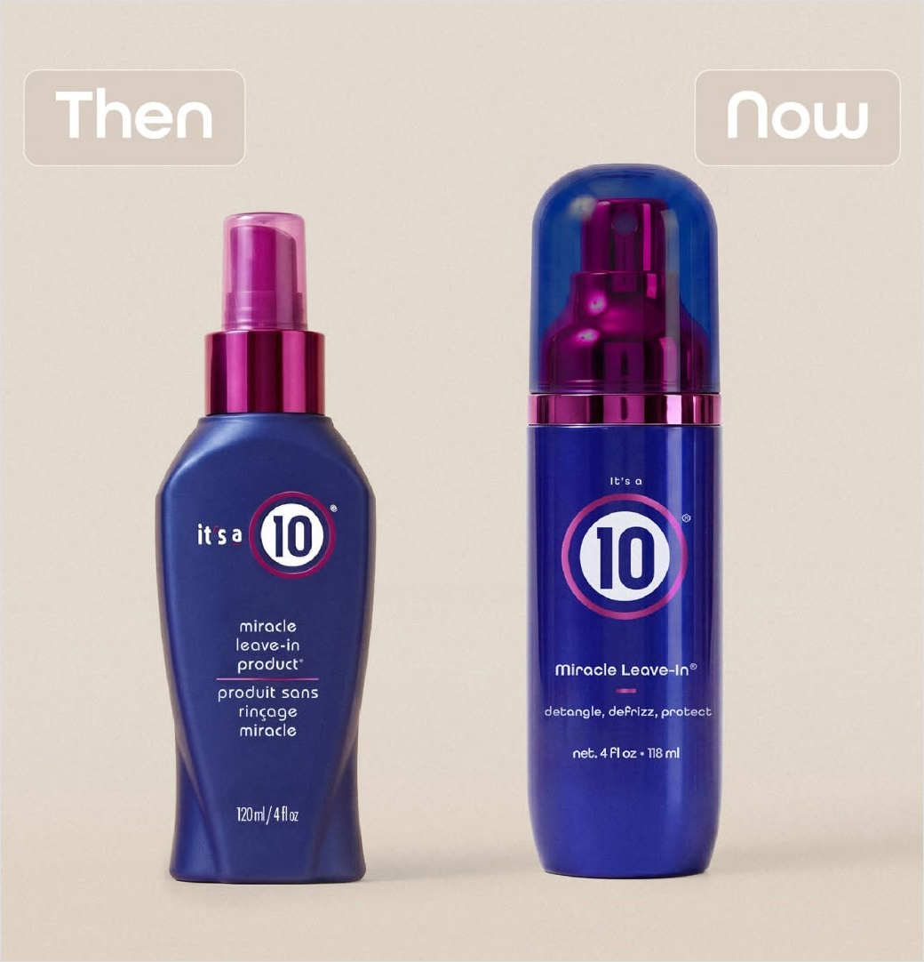
The new packaging design retains the core color palette and recognizable branding cues that made the Miracle Leave-In a household name, while refining the typography, bottle ergonomics, and label finishes to project a more luxurious, contemporary aesthetic. This careful preservation ensures that longtime users can easily spot their favorite products on crowded shelves while experiencing a heightened tactile and visual sensation during use.
Broader Industry Implications and Market Analysis
The comprehensive rebrand of It’s a 10 Haircare arrives at a fascinating juncture for the global health and beauty sector. In recent years, consumer preferences have shifted dramatically toward minimalist luxury, sustainable packaging concepts, and visually cohesive retail displays that translate well across digital platforms such as Instagram and TikTok.
By modernizing its visual identity, It’s a 10 Haircare is positioning itself to capture the attention of digital-native consumers who prioritize brand aesthetics alongside product efficacy. Furthermore, the simultaneous launch of specialized collections—particularly tailored lines for curly hair and intense hydration—reflects a broader industry trend toward hyper-personalization. Modern consumers no longer seek a one-size-fits-all approach to hair care; instead, they demand targeted solutions tailored to their specific hair porosity, texture, and environmental stressors.
As an independently owned enterprise competing against massive multinational conglomerates, It’s a 10 Haircare’s ability to execute a flawless, high-capital rebrand of over 80 products speaks volumes about its financial health and market agility. Industry analysts suggest that this bold move will likely strengthen the brand’s retail partnerships, open doors to high-end department store expansions, and solidify its dominant position in the professional salon channel.
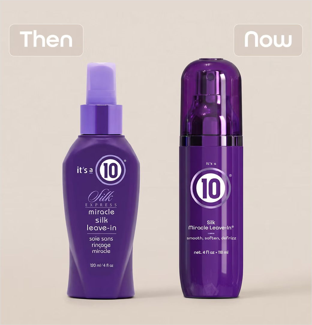
Ultimately, the "New Era. Same 10" campaign serves as a masterclass in brand evolution. By respecting the heritage that fueled its meteoric rise over the past twenty years while boldly stepping into a more elevated design philosophy, It’s a 10 Haircare has successfully future-proofed its business for the next decade of beauty innovation.