
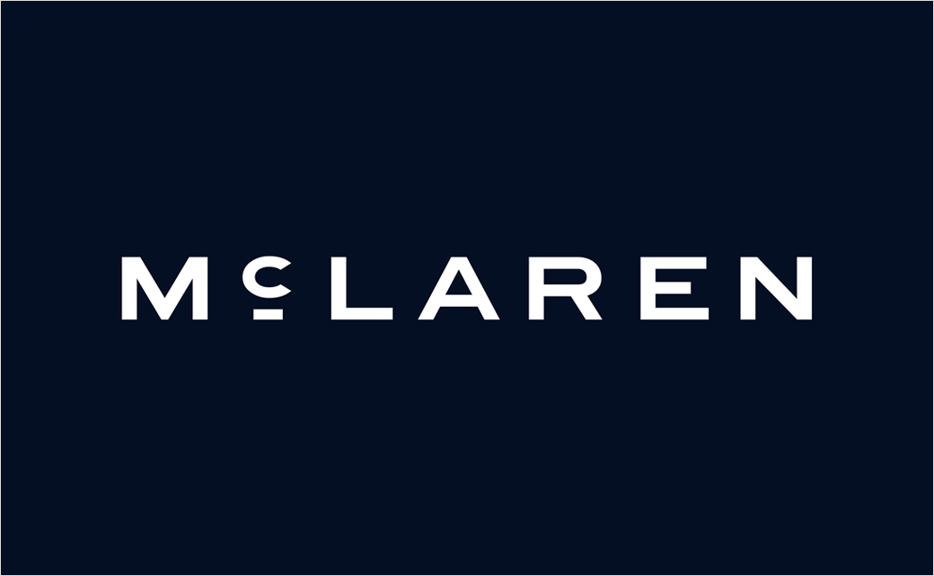
British luxury automotive manufacturer and racing powerhouse McLaren has officially unveiled a comprehensive refresh of its visual brand identity. The new design language pays homage to the storied history of company founder Bruce McLaren while setting a modern trajectory for the brand’s future in both high-performance road cars and motorsport. The redesign, which synthesizes decades of racing heritage with contemporary design principles, introduces a restructured wordmark, honors iconic historical symbols like the "Speedy Kiwi," and incorporates a modernized color palette anchored by the legendary papaya orange.
The unveiling marks a pivotal turning point for the Woking-based manufacturer. As the automotive industry navigates an unprecedented shift toward electrification, digital integration, and shifting consumer demographics, heritage brands are increasingly looking backward to anchor their forward-looking strategies. McLaren’s latest brand evolution seeks to honor its foundational grit, connecting the visionary engineering of its founder in mid-century New Zealand to the cutting-edge supercars rolling out of its production facilities today.
Roots in Racing History: The Typography and Heritage
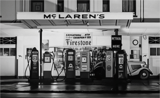
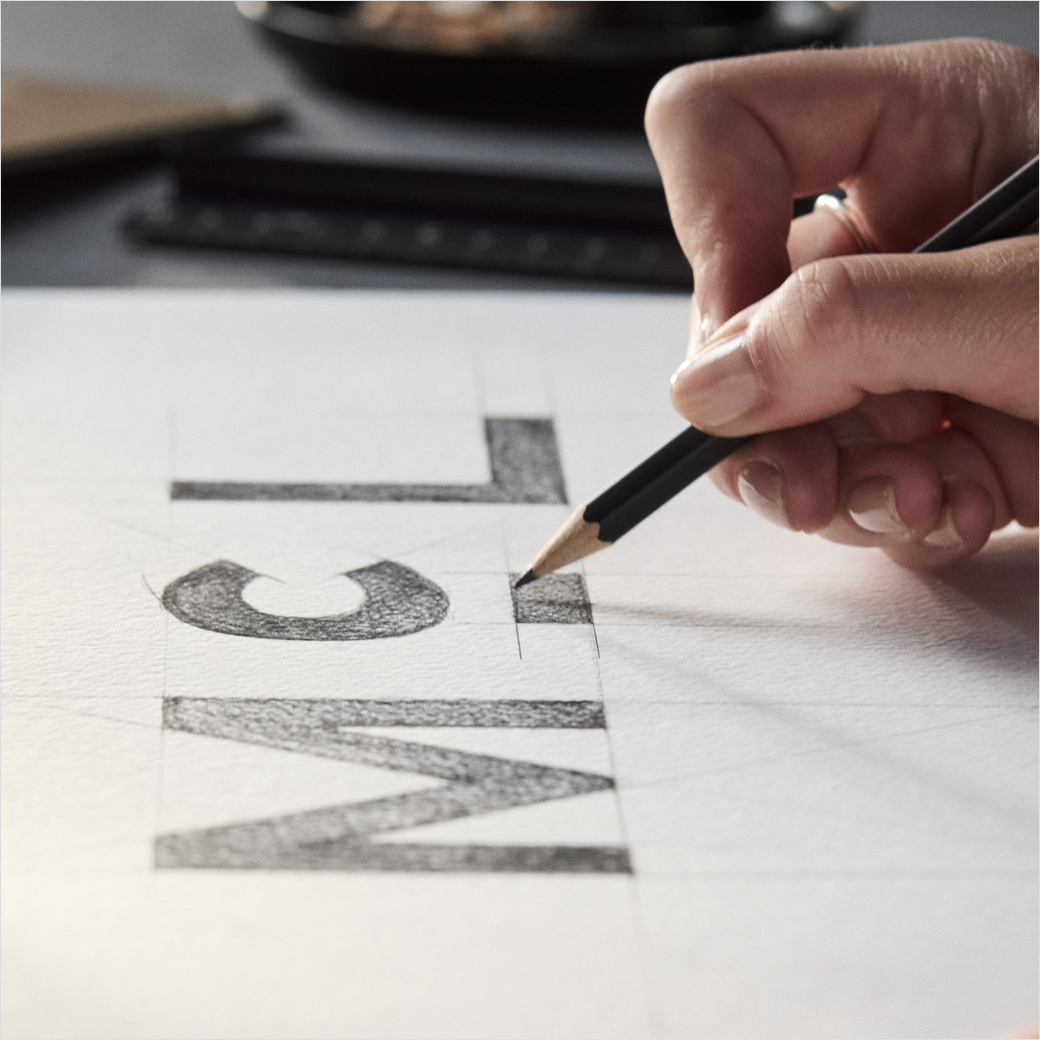
At the core of the newly minted brand architecture is a completely reimagined wordmark. Rather than relying on standard corporate typography, McLaren’s design team turned the clock back to the formative years of the company’s namesake. The new lettering draws direct inspiration from a vintage service station sign located in Remuera, Auckland.
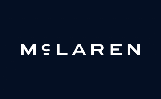
The service station held immense personal significance for Bruce McLaren; it was operated by his parents, and it was on these grounds that the young racing driver and prodigy automotive designer built the very vehicle that would secure his inaugural racing victory. By embedding this geographical and emotional touchstone into the typography of the modern logo, McLaren is bridging the gap between its humble, garage-built origins and its status as a multi-million-pound global enterprise.
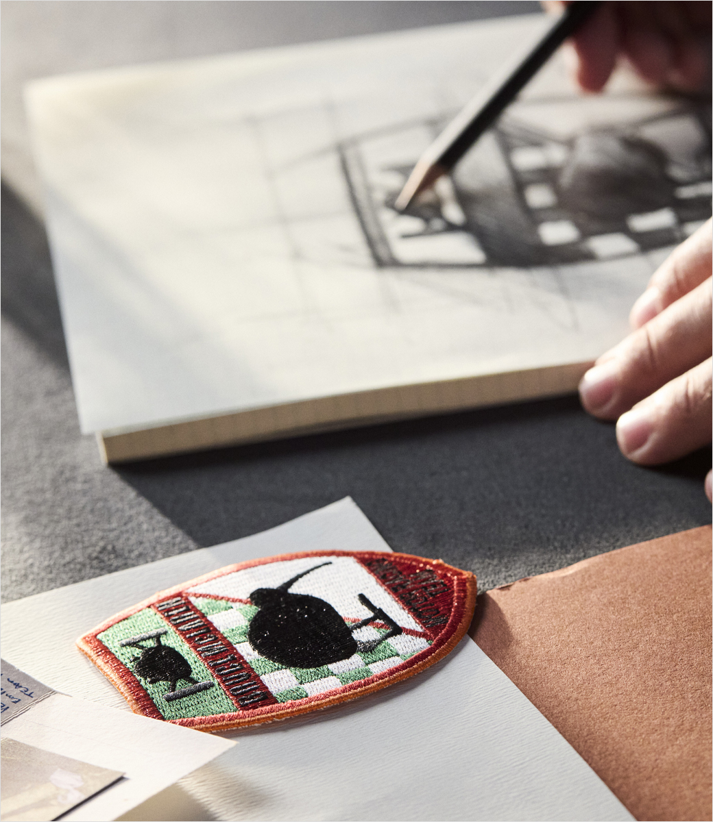
This dedication to historical continuity extends to the retention of the brand’s most recognizable assets. The iconic "speedmark"—arguably the most famous symbol in the company’s modern portfolio—remains a foundational anchor of the visual language. Introduced originally in 1997, the aggressive, fluid silhouette of the speedmark was famously inspired by the turbulent, swirling air patterns generated behind the rear wing of a racing car at top speed. Alongside the speedmark, the brand has steadfastly preserved its cherished avian emblem, the "Speedy Kiwi."

A Chronological Evolution of McLaren’s Visual Identity
To understand the weight of McLaren’s latest brand evolution, one must examine the chronological progression of its visual symbols over the past six decades:
- 1964 (The Birth of the Crest): The original McLaren crest was commissioned for the newly formed Bruce McLaren Motor Racing Team. Designed by Michael Turner, an acclaimed motorsport illustrator and close confidant of Bruce McLaren, the badge prominently featured a kiwi bird, paying direct tribute to Bruce’s proud New Zealand heritage.
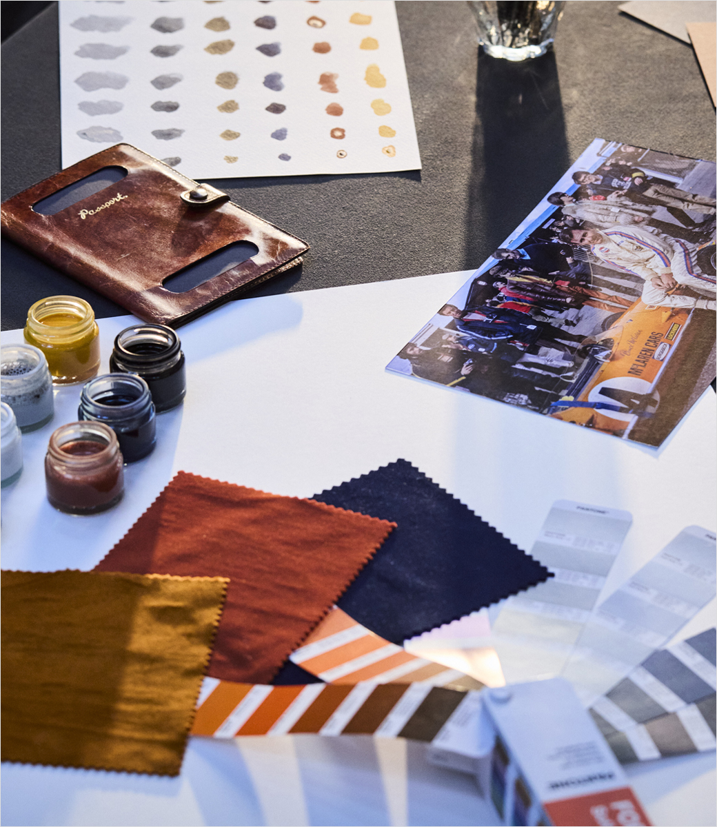
- 1971 (The Energetic Shift): As the team’s racing machines grew faster and more competitive, designer Doug Eyre was tasked with creating a more dynamic version of the emblem. This iteration birthed the "Speedy Kiwi," capturing the breathless acceleration of the cars. It was during this era that the striking papaya orange hue made its debut, quickly becoming the enduring racing color of the team.
- 1997 (The Speedmark Era): Marking a modern era for both the Formula 1 team and the burgeoning road car division, the sweeping "speedmark" was introduced, becoming a ubiquitous symbol of aerodynamic efficiency and speed.
- 2026 (The Heritage Integration): The latest brand refresh unites these historical threads. It marries the aerodynamically driven speedmark and the historical Speedy Kiwi with a heritage-inspired wordmark and an expanded color palette drawn from critical milestones in the company’s timeline.
Official Statements and Brand Philosophy
The visual overhaul is more than just a cosmetic exercise; it is designed to communicate a renewed sense of corporate ambition and a reaffirmation of the company’s core values.
David Woodhouse, Chief Creative Officer at McLaren, elaborated on the psychological and philosophical underpinnings of the new brand identity. "There is something uniquely special about McLaren," Woodhouse stated. "Throughout our history, we’ve never been content to follow established paths. We’ve always looked ahead, driven by a restless desire to innovate, create, and push beyond expectations."
Woodhouse further emphasized that the visual update serves as a physical manifestation of the company’s internal transformation. "This evolution of our visual identity captures that spirit. It’s a reflection of the journey we are on as a company. It marks the beginning of a new chapter for McLaren, giving a physical expression to the ambition, creativity, and forward momentum that is shaping our future."
The strategic deployment of color plays a critical role in this narrative. While papaya orange remains the emotional heartbeat of the brand—representing its racing pedigree and past glories—the expanded palette introduces secondary tones that reference specific epochs in the manufacturer’s timeline, allowing for greater versatility across digital platforms, merchandising, and physical vehicle liveries.
Public Debut: The McL 6GT at Monterey Car Week
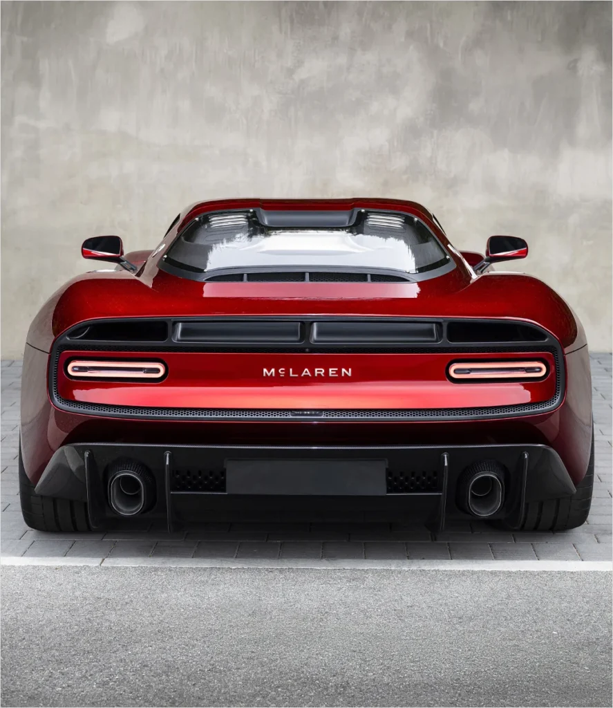
Theory quickly turned into reality last month when the new branding made its global public debut at the prestigious Monterey Car Week in California. The vehicle chosen to wear the inaugural badge was the striking McL 6GT supercar.
Developed by McLaren Special Operations (MSO)—the company’s bespoke vehicle customization and bespoke engineering division—the McL 6GT serves as a rolling tribute to the original 1960s M6GT. The historical M6GT holds a deeply sentimental and structural place in McLaren lore: it was the very first road car built by Bruce McLaren himself, who envisioned transforming his successful racing chassis into a high-performance grand tourer capable of highway driving.
By debuting the new visual identity on a modern interpretation of Bruce’s original road car concept, McLaren created a powerful narrative loop. The vehicle encapsulates the past, present, and future of the marque, demonstrating that even as the company explores advanced lightweight architectures and next-generation powertrain technologies, its compass remains firmly pointed toward the vision of its founder.
Market Implications and Future Outlook
In the competitive landscape of ultra-luxury and high-performance supercars, brand identity is paramount. Automotive marques are increasingly judged not just on horsepower figures, lap times, and aerodynamic downforce, but on the authenticity of their heritage and the emotional resonance of their story.
By anchoring its new logo in the personal history of Bruce McLaren and the physical relics of his early workshops, the company is fortifying its brand equity against newer competitors in the electric vehicle space who lack historical pedigree. At the same time, the modernization of the typography and colorways ensures that the identity remains scalable, highly legible on digital screens, and appealing to a younger, increasingly global demographic of luxury buyers.
As the refreshed branding rolls out across global dealerships, Formula 1 paddocks, and future vehicle models over the coming months, it will serve as the visual banner for McLaren’s next era. Whether this aesthetic evolution translates into sustained commercial success and continued dominance on the racing circuit remains to be seen, but the marque has unequivocally signaled that it is running toward the future with a respectful, steady eye on the past.