
The design world is in mourning following the passing of Jim Parkinson, a foundational figure in American graphic design, who died on June 26, 2025, at his home in Oakland, California. Parkinson, whose career spanned over five decades, leaves behind a legacy that fundamentally shaped the visual identity of the American press and music industry. His death follows a long and courageous battle with Alzheimer’s disease. He is survived by his wife, the accomplished book artist Dorothy A. Yule, who provided him with unwavering care and companionship throughout his illness.
A Life Defined by Letterforms
Born on October 23, 1941, in Oakland, Parkinson’s trajectory was set early by a local encounter that would define his professional ethos. As a child, he lived across the street from Abraham Lincoln Paulsen, a renowned "penman" known for his circus-like displays of calligraphic skill. Observing Paulsen—who could perform the feat of writing the Gettysburg Address upside down and backward using only the numeral "2"—ignited a lifelong obsession with the architecture of letters.
Parkinson’s formal education at the California College of Arts and Crafts (CCAC), where he graduated in 1963, provided the technical foundation for his talent. However, it was his early professional tenure at Hallmark Cards in Kansas City, Missouri, that forced him to refine his craft. Initially hired as a staff artist, Parkinson quickly realized that his strengths lay not in illustration, but in the structural integrity and rhythmic beauty of lettering. By shifting his focus entirely to typography, he pivoted toward a niche that would eventually make him the most sought-after letterer in the publishing world.
Chronology of a Prolific Career
Parkinson’s career can be categorized into three primary phases: his early corporate training, his mid-career transition to independent freelance work, and his later years as a master type designer and fine artist.

- 1963–1967: The formative years at Hallmark Cards. It was here that Parkinson mastered the discipline required to meet commercial deadlines while maintaining artistic nuance.
- 1968–1980: The return to Oakland. Parkinson established himself as a freelance powerhouse. This era saw the birth of some of his most iconic work, including logos for major cultural institutions and the beginning of his long-standing relationship with national magazines.
- 1981–2010: The digital transition. Unlike many of his peers who struggled to adapt to the advent of computer-aided design, Parkinson seamlessly integrated digital tools into his workflow. He evolved from a hand-letterer into a font developer, creating both bespoke custom typefaces and retail fonts.
- 2011–2025: The elder statesman period. Parkinson focused on his personal fine art—painting hyper-realistic depictions of vintage neon signs—while continuing to mentor younger designers and archiving his massive collection of historical ephemera.
Data and Impact: The Scale of His Influence
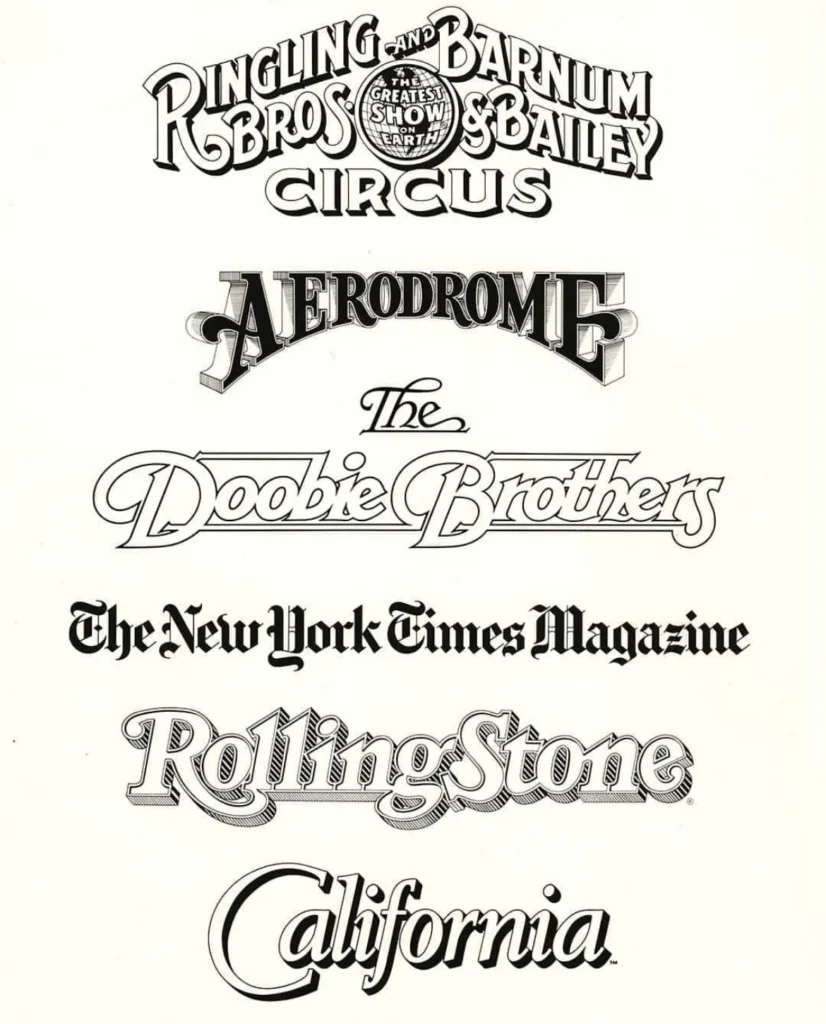
To quantify Parkinson’s influence is to track the visual evolution of the American newsstand. During the late 20th century, if a major publication sought to refresh its masthead or overhaul its typographic hierarchy, Parkinson was almost invariably the first call. His portfolio includes work for Rolling Stone, the Los Angeles Times, and The New York Times Magazine.
Beyond the press, his reach extended into the popular consciousness through logos for iconic entities such as the Ringling Bros. and Barnum & Bailey Circus and the band The Doobie Brothers. His contribution was not merely decorative; it was functional. Parkinson understood that a nameplate is the brand’s most immediate visual signal. His ability to modernize classic type styles while preserving their historical weight allowed these publications to remain relevant in a changing media landscape.
A Legacy of Humility and Technical Mastery
Colleagues and peers often describe Parkinson not just as a technician, but as a cultural custodian. Stephen Coles, a design historian and long-time friend of Parkinson, noted that his home in Oakland functioned as an unofficial museum of the craft. Parkinson’s vast archive of type books, historical manuals, and original artwork was always open to students and enthusiasts.
"He possessed a rare blend of immense talent and profound humility," Coles observed. This sentiment aligns with the philosophy Parkinson practiced throughout his life—a devotion to the seriousness of his work matched by a refusal to take his own status within the industry too seriously. This ethos was best captured by his adherence to the Margot Fonteyn mantra: "Take your work seriously, but never yourself."
Broader Implications for Graphic Design
The death of Jim Parkinson marks the end of a specific era in graphic design—a bridge between the analog tradition of pen-and-ink lettering and the sophisticated digital typography of the modern age. His work remains a primary subject for design students and historians alike because it represents a "living history." He did not just replicate the styles of the past; he synthesized them, ensuring that the legacy of 19th and 20th-century type designers survived within the pages of modern magazines.

His shift toward fine art in his later years—capturing the decay of American neon signage—further cements his legacy as an artist who saw the beauty in the vanishing fragments of American culture. By documenting these signs in his paintings, he extended his career as a letterer into a new dimension, preserving the "soul" of typography that is often lost in purely digital environments.
Forthcoming Memoir and Final Tributes
In a final contribution to the field, the Letterform Archive has confirmed that a memoir written by Parkinson is slated for publication in 2026. The book is expected to provide an intimate look at the evolution of American lettering, told through the perspective of a man who spent his life at the drawing board.
The design community has already begun to mobilize, with tributes appearing across professional forums and social media, celebrating not just his output, but his role as an educator and mentor. A memorial service is being planned by his family for the fall. In light of the circumstances of his passing, the family has requested that, in lieu of flowers, donations be directed to the Alzheimer’s Association to support ongoing research into the disease that defined his final years.
As the industry reflects on his passing, the consensus remains clear: Jim Parkinson’s work is woven into the very fabric of American visual communication. From the mastheads of the most prestigious newspapers to the hand-drawn logos of the rock-and-roll era, his legacy is not just in the fonts he created, but in the timelessness he imbued into every letter he drew. He leaves behind a generation of designers inspired by his discipline, his curiosity, and his enduring love for the craft.