
Nestled against the rugged backdrop of the Cascade foothills in Hope, British Columbia, Mountainview Brewing Co. has emerged as a landmark establishment that bridges the gap between local community hub and essential waypoint for travelers navigating the province’s interior. Located in a town historically recognized as the filming site for the 1982 cinematic classic Rambo: First Blood, the brewery has successfully carved out a unique cultural and commercial niche by transforming a repurposed mechanic garage into a modern center for craft beer enthusiasts. The brewery’s visual identity, developed by the design agency Memory, serves as a cornerstone of its business model, reflecting a commitment to both industrial heritage and contemporary aesthetic precision.

The development of Mountainview Brewing Co. represents a strategic evolution in the British Columbia craft beer landscape. In an industry where market saturation is high, the brewery has distinguished itself by focusing on a balanced portfolio of "crushable" staple beers alongside a rotation of experimental brews designed to capture the curiosity of both locals and transient highway travelers.

A Foundation Built on Visual Cohesion
From its inception, Mountainview Brewing Co. prioritized a comprehensive brand strategy, engaging the design firm Memory to oversee every facet of its visual and physical identity. This holistic approach went beyond mere logo design, encompassing the entire brand suite to ensure a seamless experience from the moment a customer encounters the signage on the highway to the final product they hold in their hand.

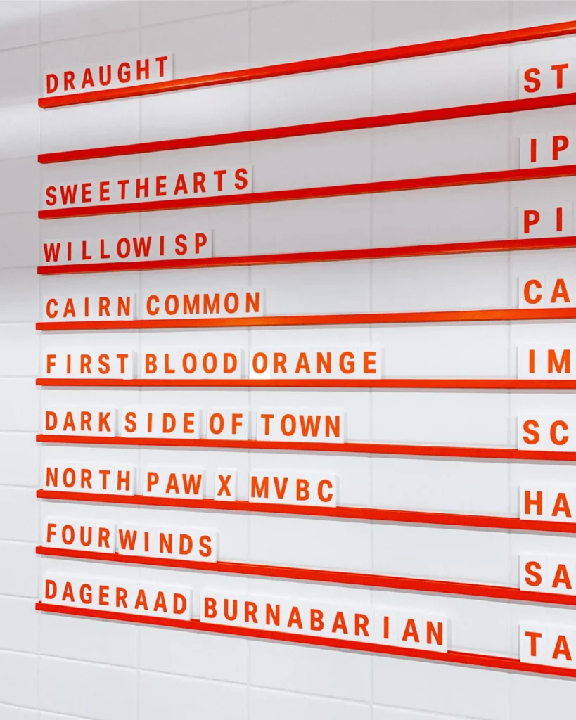
The brand’s visual language is characterized by a clean, utilitarian aesthetic that pays homage to the site’s history as a garage while maintaining a sharp, professional edge. A key component of this identity is the consistent application of the Aktiv Grotesk typeface, developed by Dalton Maag. This font, known for its neutrality and high readability, serves as the primary typographic backbone for the brewery’s signage, wayfinding systems, and menu displays. By utilizing a font that balances modern geometric rigor with subtle humanist qualities, the brewery projects an image of accessibility and reliability—traits that are essential for attracting the diverse demographic of a roadside destination.

Historical Context and Geographical Significance
Hope, BC, has long served as a vital junction in the Pacific Northwest’s transportation network. Positioned at the intersection of several major provincial highways, the town is the last significant stop for travelers entering the challenging mountain passes of the interior. Mountainview Brewing Co. occupies a strategic piece of real estate that leverages this foot traffic, effectively capturing a transient market that is often looking for a high-quality, authentic experience after hours of driving.

The decision to renovate an existing mechanic garage for the brewery space was a calculated move to retain the town’s industrial character. In architectural terms, the adaptive reuse of the structure allows the brewery to integrate into the local urban fabric without appearing as a jarring new development. This integration is reinforced through custom-designed interior collateral, including bespoke tasting flight trays and industrial-style signage, which maintain the continuity of the brand experience from the outdoor facade to the interior taproom.

Chronology of Brand Development
The trajectory of Mountainview Brewing Co. began with a foundational phase dedicated to establishing the brand voice. The development cycle can be categorized into four primary stages:

- Brand Strategy and Identity Formulation: The initial phase focused on defining the core values of the brewery. The goal was to establish a brand that felt local but professional enough to compete with larger, established craft breweries in the Lower Mainland.
- Design and Prototyping: Memory collaborated with the founders to develop the visual assets, including packaging for cans and merchandise. This phase involved extensive testing of materials, ensuring that the packaging was not only aesthetically pleasing but also durable enough for transport.
- Physical Implementation: The transition from digital assets to physical objects involved the fabrication of custom signage, wayfinding markers, and the design of flexible menu systems. These systems were designed to be modular, allowing the brewery to easily update its rotating tap list as production evolved.
- Operational Launch and Integration: Upon opening, the brewery’s brand suite was fully deployed. This included the installation of interior graphics, staff apparel, and retail merchandise, all of which served to solidify the brewery’s presence in the Hope community.
Market Implications of Design-Led Growth
The investment in a cohesive brand identity is a reflection of a broader trend within the craft beer sector: the transition from "product-first" to "experience-first" marketing. According to industry analysis, breweries that invest in professional-grade design and wayfinding often see higher rates of customer retention and brand loyalty.

For Mountainview, the implications of this strategy are twofold. First, it provides a sense of professionalism that helps justify the premium pricing associated with craft beer. Second, the design serves as a silent salesperson. Because the brewery attracts a high volume of first-time visitors, the wayfinding and signage must communicate the quality of the product immediately upon entry. The use of clear, consistent typography and high-quality materials suggests a level of care in the brewing process that matches the level of care in the design process.

Economic and Community Impact
While the brewery serves as a destination for travelers, its success is also tied to its role as a community anchor. In smaller towns like Hope, local breweries often serve as "third places"—social environments separate from the two usual social environments of home and the workplace. By creating a space that feels welcoming to both local residents and outsiders, Mountainview has successfully balanced the competing interests of a transient business model and a community-focused hospitality model.

Data from the Canadian craft brewing industry suggests that breweries with strong community ties are more resilient to economic downturns. By fostering local events, maintaining a flexible menu that caters to local tastes, and engaging with the town’s unique history, Mountainview has secured a position that is difficult for purely commercial competitors to replicate.

Future Outlook and Sustainability
The ongoing collaboration between Mountainview Brewing Co. and Memory highlights the importance of maintaining a brand identity as a business scales. The flexibility built into their menu systems and signage is a key indicator of forward-thinking management. As the brewery continues to experiment with new beer styles, the existing brand architecture provides a framework that can accommodate new product launches without requiring a full redesign.

In conclusion, the success of Mountainview Brewing Co. is not merely a result of its location or its brewing capabilities, but a reflection of its commitment to design as a foundational business pillar. By marrying the rugged, historic spirit of the Cascade foothills with the refined, modern aesthetic of contemporary graphic design, the brewery has established a blueprint for how small-town enterprises can compete on a broader stage. As the brand continues to evolve, the emphasis on quality, consistency, and professional presentation will likely remain the primary drivers of its growth and its enduring appeal to both the local population and the countless travelers passing through Hope.