

May 2026 marks a significant milestone for web developers and users alike, as major browser vendors, Chrome, Firefox, and Safari, rolled out a suite of powerful new features designed to enhance performance, improve developer ergonomics, and expand the capabilities of web applications. The simultaneous release of Chrome 148, Firefox 151, and Safari 26.5 to stable channels has ushered in a new era of cross-browser compatibility for several highly anticipated web standards, alongside intriguing advancements in their respective beta programs. These updates collectively underscore the web platform’s continuous evolution towards a more robust, interactive, and efficient user experience, further blurring the lines between native and web-based applications.
Stable Browser Releases: A Leap Forward in Web Capabilities
The stable releases of Chrome 148, Firefox 151, and Safari 26.5 on May 29, 2026, have brought a wealth of new functionalities to the mainstream web, with several key features achieving "Baseline Newly available" status, signifying broad cross-browser support. This synchronized advancement is a testament to the collaborative efforts within the web standards community, particularly the W3C and WHATWG, to ensure consistent and reliable development experiences across the ecosystem.
The :open CSS Pseudo-class Achieves Baseline Status
Among the notable additions in Safari 26.5 is the long-awaited support for the :open CSS pseudo-class, which now officially achieves "Baseline Newly available" status. This seemingly minor addition addresses a long-standing challenge for web designers and developers in styling dynamic, interactive elements. Historically, styling elements like <details> and <dialog> when they are in their "open" state often relied on attribute selectors such as details[open], which, while functional, lacked the semantic elegance and consistency offered by a dedicated pseudo-class.
The :open pseudo-class allows developers to apply styles directly to elements that possess an "open" and "closed" state when they are in the open configuration. This extends beyond <details> and <dialog> to include interactive UI components like <select> dropdowns and <input> elements (e.g., color or date pickers) when their associated picker interfaces are actively displayed. For instance, a developer can now easily add a visual indicator, such as a border or a background change, to an open <details> element or a focused date picker, providing clearer user feedback. This standardization simplifies CSS, reduces the need for JavaScript-driven state management for basic styling, and promotes cleaner, more maintainable codebases. Web standards proponents have lauded this as a step towards a more declarative and robust styling environment, reducing reliance on less semantic workarounds and improving the overall accessibility and user experience of interactive components.
CSS Name-Only Container Queries Become Baseline
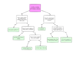
Chrome 148 introduces a significant enhancement to the powerful world of CSS Container Queries with the full implementation of name-only container queries, also achieving "Baseline Newly available" status. This development builds upon the foundational concept of container queries, which enable developers to style elements based on the characteristics of their parent container rather than the viewport size – a paradigm shift from traditional media queries.
Previously, using container queries required specifying a size or style query condition alongside the container’s name, and explicitly setting a container-type property on the ancestor. With name-only container queries, developers can now query for the mere presence of a named container. This simplifies the creation of highly modular and reusable components, allowing them to adapt their layout and styling based on where they are placed within a named container structure, irrespective of its specific dimensions or styles. The critical simplification is the removal of the requirement to declare a container-type on the ancestor if the query is solely based on the container’s name. This streamlines the development process for component-driven architectures, where a component might need to behave differently simply because it’s inside a sidebar container versus a main-content container.
For example, a component can now query @container --sidebar ... to apply specific styles when rendered within a container named --sidebar, without needing to specify (min-width: 300px) or similar conditions. This semantic approach to component placement empowers developers to build more flexible and resilient layouts, fostering a true component-based responsiveness that has been a long-standing goal for modern web design.
Container Style Queries for Custom Properties Reach Baseline
Further bolstering the utility of container queries, Firefox 151 introduces comprehensive support for style() queries on @container, specifically for custom properties, bringing this functionality to "Baseline Newly available" status. This feature unlocks an entirely new dimension of responsive design, moving beyond mere size adaptations to enable styling based on the actual CSS properties of a parent container.
While size queries are indispensable for layout adjustments, style queries allow components to react to non-size characteristics of their context. The full cross-browser support for querying custom properties is particularly impactful. This means a component can dynamically alter its appearance or behavior based on the value of a CSS custom property set on an ancestor element. For instance, a card component could query @container style(--theme: dark) ... to apply a dark background and light text when placed within a container where the --theme custom property is set to dark.
This capability is revolutionary for building dynamic theming systems, context-aware UI components, and adaptive designs that react to environmental variables or user preferences. It significantly reduces the need for JavaScript to manage complex styling logic, pushing more of the presentation layer into declarative CSS. Web designers can now create more sophisticated, adaptable, and maintainable design systems that respond not just to viewport size, but to a rich tapestry of contextual style information provided by their parent components. This advancement is anticipated to streamline development workflows and enhance the robustness of modern web applications.
Native Lazy Loading for Video and Audio Elements
Chrome 148 introduces a crucial performance optimization with the native implementation of lazy loading for <video> and <audio> elements via the loading="lazy" attribute. This feature, previously available for <img> and <iframe> elements, extends the browser’s ability to defer the loading of media resources until they are near the user’s viewport.
The benefits of native lazy loading are substantial. For media-rich websites, this translates directly into faster initial page load times, reduced bandwidth consumption, and lower data usage for users, especially on mobile networks. Instead of downloading all media assets upfront, the browser intelligently prioritizes critical content, fetching off-screen videos and audio only when they are about to become visible. This not only improves the Core Web Vitals metrics, such as Largest Contentful Paint (LCP), but also contributes to a smoother, more responsive user experience. Developers no longer need to rely on complex JavaScript solutions or third-party libraries to implement this essential optimization, simplifying their code and ensuring a more consistent, performant experience across devices. Industry experts have highlighted that this native solution is often more efficient than JavaScript alternatives, as the browser can make more informed decisions about resource prioritization.
The Document Picture-in-Picture API Expands Functionality
Firefox 151 makes a significant contribution to multi-tasking and interactive web applications by introducing support for the Document Picture-in-Picture API on desktop platforms. This API represents a powerful evolution beyond the standard Picture-in-Picture API, which is limited to displaying a single <video> element in an always-on-top floating window.
The Document Picture-in-Picture API allows web applications to open an independent, always-on-top window that can contain arbitrary HTML content. This capability unlocks a new paradigm for web-based productivity tools and interactive overlays. Imagine a video conferencing application where participants’ video feeds are displayed in a customizable grid within a floating window, persisting even when the user navigates to other tabs or applications. Or a stock trading dashboard that keeps a live ticker or a small interactive chart visible while the user browses other financial news. Timers, calculators, chat widgets, or even small, interactive control panels can now maintain their presence and interactivity without being confined to the main browser window.
This API significantly enhances the "desktop application feel" of web experiences, enabling users to maintain context and interactivity across different tasks. It offers unprecedented flexibility for developers to design rich, multi-window user interfaces, promising to elevate the utility and engagement of complex web applications.

Web Serial API Extends Platform Reach
The ability of web applications to interact with hardware peripherals has seen a major boost, with Firefox 151 adding support for the Web Serial API on desktop platforms, and Chrome 148 extending its reach to Android devices. This API provides a standardized and secure mechanism for websites to communicate with serial devices, bridging a critical gap between the web and the physical world.
The Web Serial API enables web applications to read data from and write data to serial devices such as microcontrollers (e.g., Arduino, Raspberry Pi), 3D printers, development boards, and various types of peripheral hardware. This opens up a vast array of possibilities for web-based applications in fields like industrial automation, IoT device management, educational robotics, medical device interfaces, and specialized consumer electronics. For instance, a web application could provide a user interface to program a microcontroller, monitor sensor data from an environmental station, or control a 3D printer directly from the browser.
Crucially, the implementation of the Web Serial API prioritizes user security and privacy. In Firefox, users are required to install a synthetically generated site permission add-on, providing an explicit and transparent mechanism for managing access to sensitive hardware. Similarly, on Android, Chrome’s implementation necessitates clear user consent, ensuring that websites cannot access serial devices without explicit permission. This controlled access model is vital for building trust and preventing malicious use, while simultaneously expanding the web’s capabilities into exciting new domains.
Beta Browser Releases: Glimpses into the Future
Beyond the stable releases, the beta channels offer an exciting preview of features poised to become standard in the near future, allowing developers to test and prepare for upcoming changes. May’s beta releases include Chrome 149 and Firefox 152, with no Safari beta announced this month.
Chrome 149 Beta: Enhancements in Layout, Graphics, and Performance
Chrome 149 beta is packed with a diverse set of updates, signaling a continued focus on advanced CSS capabilities, intricate graphic design, and core web performance.
One of the standout CSS updates is CSS gap decorations, which allows developers to style the whitespace (gaps) between flex and grid items. This seemingly minor feature offers significant aesthetic control, enabling designers to apply borders, backgrounds, or shadows to the spacing itself, creating more visually engaging and sophisticated layouts without resorting to complex pseudo-elements or additional markup.
Further enhancing graphic design capabilities, Chrome 149 beta now supports path(), shape(), rect(), and xywh() basic shape functions within the shape-outside CSS property. This empowers designers to create complex text wrapping effects, allowing text to flow around arbitrary, non-rectangular shapes, moving beyond the limitations of traditional floating elements. This is a game-changer for magazine-style layouts and visually rich content presentation, providing greater creative freedom. Additionally, the path-length CSS property is introduced, offering enhanced control over SVG path animations, crucial for dynamic infographics, loading indicators, and interactive vector graphics.
On the API front, programmatic scroll methods such as scrollTo(), scrollBy(), and scrollIntoView() now return Promises that resolve when smooth scrolling completes. This seemingly subtle change provides developers with more robust control over scroll animations, allowing for more precise sequencing of UI interactions and reliable detection of scroll completion, which is vital for building polished, interactive user experiences.
Perhaps one of the most impactful performance enhancements in Chrome 149 beta is the ability for pages with active WebSocket connections to now qualify for back/forward caching (BFCache). BFCache is a powerful browser optimization that allows for instant back and forward navigation by storing a complete snapshot of a page in memory. Historically, active WebSocket connections prevented pages from being cached in BFCache, leading to slower navigation for real-time applications. This update removes that barrier, promising significantly faster perceived performance for web applications that rely on real-time communication, such as chat applications, collaborative editors, and live dashboards.
Firefox 152 Beta: Responsive Forms and Enriched Notifications
Firefox 152 beta brings its own set of compelling features, with a strong emphasis on improving form usability and enhancing notification interactivity.
The beta introduces full support for the field-sizing property, a critical advancement for responsive form design. This property allows form controls, such as <textarea> and <input>, to automatically adjust their size to fit their contents. This eliminates the need for JavaScript to dynamically resize input fields, ensuring that content is never truncated and that form elements provide an optimal user experience without manual intervention. It’s a boon for accessibility and overall form ergonomics, particularly for multi-line text inputs.
Furthermore, Firefox 152 beta enhances the Notification interface by adding actions and maxActions properties. This upgrade enables web applications to create richer, more interactive push notifications. Users can now be presented with actionable buttons directly within the notification itself (e.g., "Reply," "Archive," "Snooze"), allowing them to perform common tasks without needing to open the full web application. This significantly improves user engagement and productivity, making web notifications more useful and responsive.
Finally, the beta adds options.pseudoElement support in Element.getAnimations(). This allows developers to programmatically inspect and manipulate animations applied to CSS pseudo-elements, offering more granular control and debugging capabilities for complex UI animations that often leverage :before and :after elements.
Broader Impact and Implications for the Web Ecosystem
The comprehensive updates across Chrome, Firefox, and Safari in May 2026 signify a powerful acceleration in the development of the web platform. The emphasis on "Baseline Newly available" features, such as the :open pseudo-class and container queries, reflects a concerted industry effort towards greater interoperability and a more consistent developer experience. This standardization reduces cross-browser compatibility headaches, allowing developers to build more confidently, knowing their features will work reliably across major browsers.
The continued evolution of CSS with advanced layout controls, shape functions, and pseudo-element styling empowers designers to create more visually stunning and adaptive user interfaces with less reliance on complex JavaScript. Performance optimizations like native lazy loading for media and BFCache support for WebSocket-enabled pages directly translate to faster, more efficient, and more enjoyable experiences for end-users, reducing frustration and improving engagement metrics.
The expansion of web capabilities into areas traditionally reserved for native applications, exemplified by the Document Picture-in-Picture API and the Web Serial API, underscores the web’s trajectory towards becoming an even more capable and versatile platform. These APIs unlock new possibilities for web applications in productivity, hardware interaction, and multi-tasking, further blurring the lines between web, desktop, and mobile applications.
As Rachel Andrew noted in her publication on May 29, 2026, these advancements are not isolated incidents but part of a continuous, collaborative effort by browser vendors and standards bodies. The rapid pace of innovation, coupled with a strong commitment to performance, security, and developer ergonomics, ensures that the web platform remains a dynamic and fertile ground for creativity and technological progress. This month’s releases reinforce the notion that the web is not just a delivery mechanism for content, but a powerful and ever-expanding application platform, poised to redefine how users interact with digital services and information.