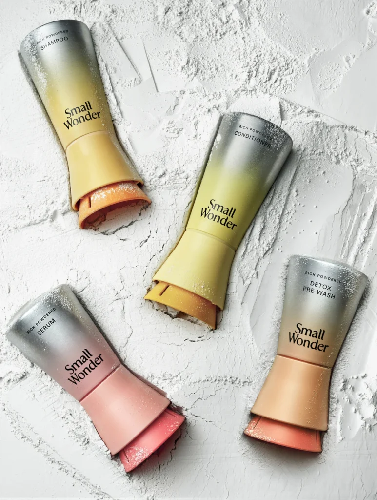

Innovating within the beauty and personal care sector requires a delicate balance between scientific efficacy and environmental responsibility. For sustainable haircare brand Small Wonder, this balancing act has culminated in a comprehensive brand overhaul and an award-winning packaging solution. By partnering with renowned branding agency Red Antler, Small Wonder has redefined how consumers perceive waterless beauty, introducing a futuristic visual identity and a patented aluminum vessel designed to protect its dry-formulation products. This strategic pivot aims to bridge the gap between advanced cosmetic science and intuitive, sustainable consumer habits, positioning the brand at the forefront of the burgeoning waterless beauty movement.
The Evolution of Waterless Haircare: Main Facts and Product Mechanics
At the core of Small Wonder’s product philosophy is a fundamental challenge to traditional liquid-based cosmetics. Conventional shampoos and conditioners typically consist of up to 80% water, requiring heavy plastic containers, significant shipping emissions due to excess weight, and synthetic chemical preservatives to maintain shelf life. Small Wonder bypasses these inefficiencies by offering concentrated powder formulas. When consumers mix the powder with water during application, it instantly transforms into a rich lather or conditioning cream.
The brand succinctly captures this chemical interaction with its defining ethos: “Powder is potential. Water, the catalyst.” This waterless approach yields significant environmental benefits. According to the company, washing hair with Small Wonder’s powder formulas uses up to 90% less water per wash cycle compared to standard liquid alternatives and drastically cuts down on single-use plastic waste.
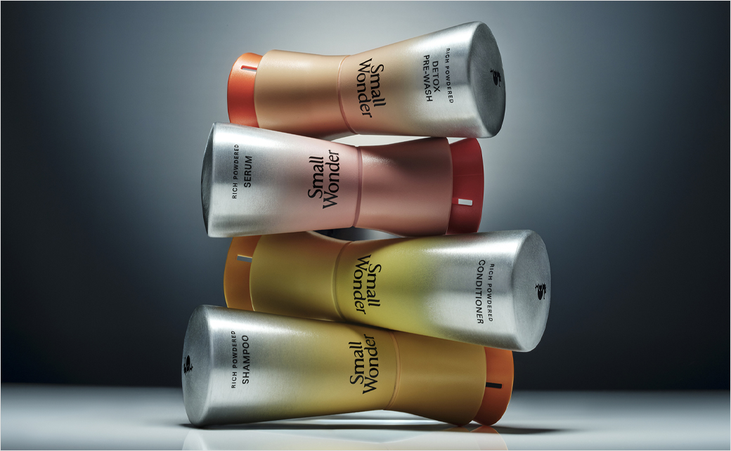
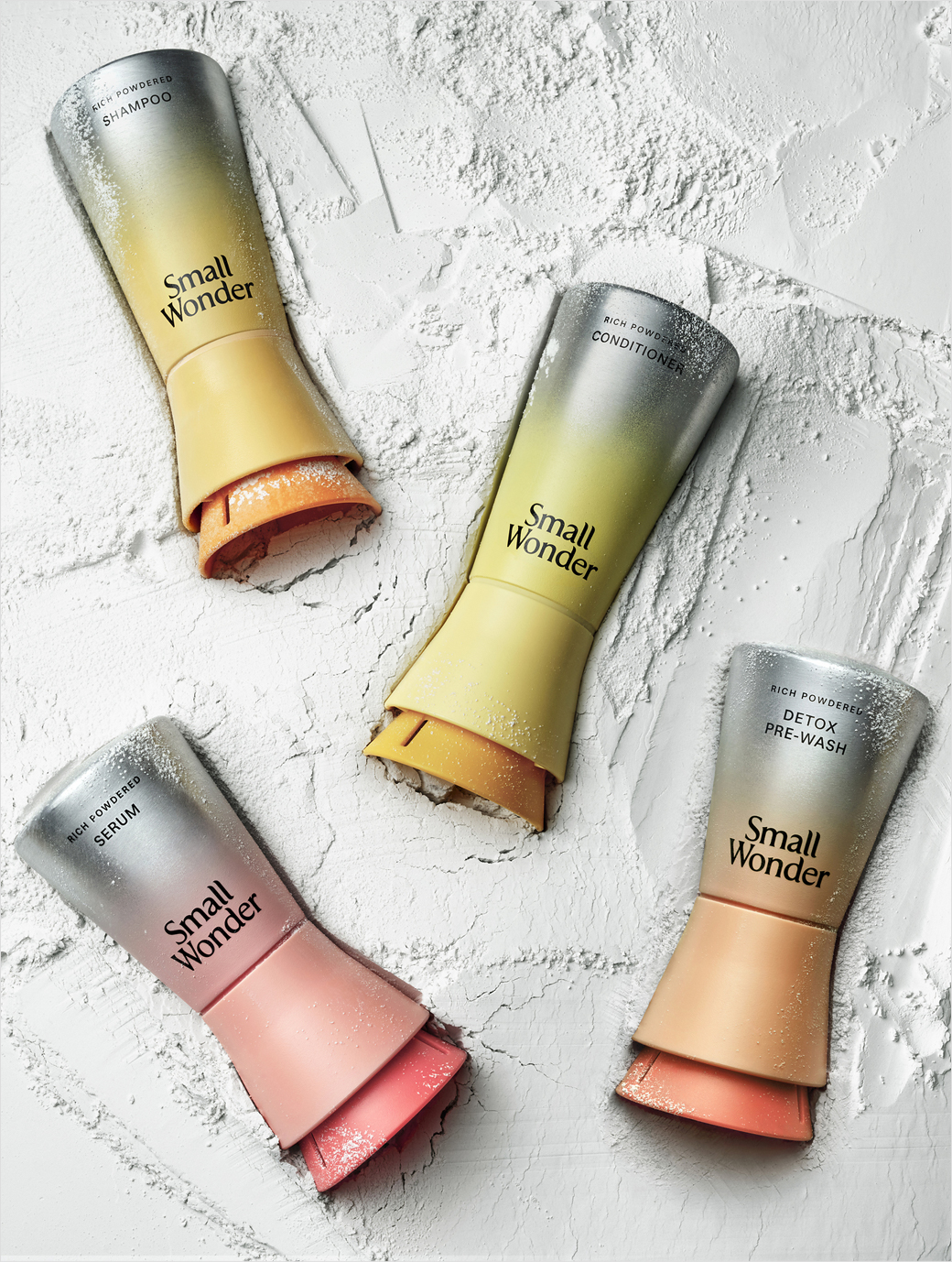
To bring this innovative formulation technology into sharper focus, Small Wonder collaborated with branding agency Red Antler to develop a forward-looking brand platform centered around the tagline, “Made Possible by Powder.” While the brand’s logo has evolved subtly—transitioning primarily to clean, lowercase lettering for a more contemporary aesthetic—the physical packaging has undergone a revolutionary transformation. The product now comes housed in sleek, recyclable aluminum bottles rendered in a signature, eye-catching marigold hue that stands out on retail shelves and in home bathrooms.
Chronology of the Rebrand: From Concept to International Recognition
The journey toward Small Wonder’s new visual identity and packaging system was a methodical process rooted in engineering precision and strategic positioning.
In the initial stages of the company’s launch, the founding team recognized that the market was largely unfamiliar with powder-based haircare formats. Early iterations of the brand communicated the eco-friendly aspects of the product effectively, but struggled to convey the sophisticated science behind the dry formulations. Consumers accustomed to traditional liquid pumps and squeeze bottles required a tactile and visual experience that signaled high performance alongside sustainability.
Recognizing this disconnect, Small Wonder initiated a comprehensive redesign project in collaboration with Red Antler. The primary objective was to align the exterior packaging and brand messaging with the advanced technology inside the bottle. This effort resulted in a completely reimagined structural design tailored specifically to protect water-sensitive active ingredients.
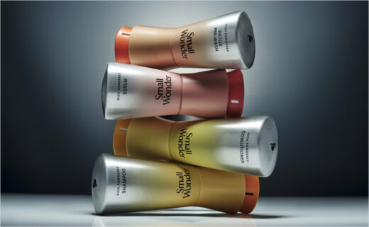
The culmination of this development process arrived when Small Wonder unveiled its newly engineered aluminum bottle. The container features two distinct patents—one covering utility and the other governing design. These engineering safeguards are critical for a waterless powder product, as they actively protect the contents from moisture intrusion, humidity, and condensation, thereby preserving the integrity and shelf-life of the active ingredients over time.
The market and industry response to the new packaging was swift. Even prior to the wider rollout of the rebrand, Small Wonder’s innovative bottle earned prestigious recognition from the International Design Excellence Awards (IDEA), validating the cross-section of industrial design, sustainability, and functionality achieved by the development team.
Official Responses and Leadership Insights
The impetus behind the rebrand stemmed from a critical internal assessment regarding how effectively the company’s mission was being communicated to the end consumer. Small Wonder co-founder and CEO Stephanie Farsht candidly addressed the limitations of the brand’s initial market entry and the strategic necessity of the recent updates.
“We knew we had developed something truly innovative, but our original packaging and brand world weren’t fully communicating the inside or the science or sophistication of the product,” Farsht stated during the launch.
By refining the visual vocabulary of the brand, Farsht and her team sought to elevate consumer perception, shifting the narrative away from a purely utilitarian eco-alternative toward a luxury, science-backed lifestyle choice.
“This next chapter is about showing consumers the power of powder,” Farsht added, emphasizing that the new aesthetic is designed to build trust, inspire curiosity, and normalize waterless routines in mainstream beauty regimens.
Broader Impact and Industry Implications
Small Wonder’s strategic redesign arrives at a critical juncture for the health and beauty sector. Environmental scrutiny regarding single-use plastics and the global carbon footprint of shipping water-heavy consumer goods has intensified among regulators and shoppers alike. Consequently, waterless beauty formats—ranging from shampoo bars and toothpaste tablets to powder-to-liquid cleansers—are transitioning from niche market experiments to viable mainstream categories.
However, widespread adoption of waterless products has historically faced consumer friction points, particularly regarding user experience, product stability, and packaging functionality. Powders can clump if exposed to bathroom humidity, and consumers accustomed to decades of liquid-based conditioning routines often require ergonomic and intuitive packaging to facilitate the mixing process.

By securing dual utility and design patents for its aluminum bottle, Small Wonder has established a technical benchmark for how dry formulations can be safely and attractively stored in high-moisture environments like showers and bathrooms. The use of infinitely recyclable aluminum also addresses the growing regulatory push against plastic packaging, offering a circular economy solution that aligns with corporate sustainability targets.
Furthermore, the collaboration with Red Antler highlights a broader design trend within the beauty industry: the fusion of high-tech minimalism with tactile sustainability. By adopting a vibrant marigold color palette and refined typography, Small Wonder successfully avoids the overly clinical or rustic aesthetic that has traditionally defined eco-friendly brands. Instead, the visual identity borrows cues from prestige cosmetics, signaling that sustainability does not require a compromise on luxury or visual appeal.
As consumer awareness surrounding water scarcity and carbon footprints continues to grow, innovations in formulation technology and packaging engineering will heavily influence market leadership. Small Wonder’s comprehensive rebrand serves as a case study in how emerging beauty labels can recalibrate their market positioning, leverage industrial design to solve functional challenges, and communicate complex product science to a broader audience. Through its patented aluminum packaging and scientifically driven platform, the brand has established a durable foundation for future growth within the evolving landscape of sustainable personal care.