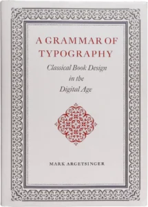
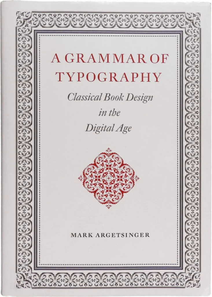

The printed codex, an invention that has defined the dissemination of human knowledge for over five centuries, currently faces a dual crisis of technological obsolescence and industrial devaluation. As trade and academic publishers increasingly prioritize rapid, automated production over the meticulous craft of the typographer, the role of the designer as a custodian of the reading experience has been systematically marginalized. Amidst this climate of transition, Mark Argetsinger’s 2020 publication, A Grammar of Typography: Classical Design in the Digital Age, emerges as a significant, albeit contentious, contribution to the field of book design. Published by David R. Godine, the volume functions as both a manifesto for traditional craftsmanship and a pedagogical manual for designers navigating the transition from physical composing sticks to digital interfaces.
The Historical and Technical Context of Book Design
The history of the book is inextricably linked to the evolution of the printing press, a technology that matured over 570 years to reach the zenith of the neoclassical and baroque periods. For centuries, the typographer was viewed not merely as a technician, but as a literary craftsman whose work bridged the gap between raw manuscript and the visceral experience of the reader. However, the digital revolution has reframed typography as a subdiscipline of graphic design, often subsumed under broader applications such as web development, user interface design, and motion graphics.
By contrast, Argetsinger’s work serves as a recalibration, arguing that the printed codex remains the preeminent medium for the presentation of text. The book, spanning 514 pages and designed in a substantial folio format, acts as an instructional guide intended to uphold the standards of historical master printers. Argetsinger posits that while the tools of the trade have evolved—from lead type to digital swatches—the foundational principles of legibility, balance, and aesthetic harmony remain immutable.
A Chronology of the Craft
To understand the significance of Argetsinger’s work, one must view it within the timeline of modern typographic education. Following the decline of traditional hot-metal typesetting in the mid-20th century, the pedagogical focus shifted toward digital efficiency. The 1990s and 2000s saw a proliferation of "desktop publishing" software that democratized design but often eroded the nuanced understanding of historical spacing, kerning, and typographic hierarchy.
A Grammar of Typography represents a corrective measure. The first 135 pages of the text are dedicated to the philosophical and historical scaffolding of the craft, attempting to ground modern designers in the legacy of the great scholar-printers. The subsequent chapters transition into practical application, covering paper selection, binding, and the technical aspects of digital typesetting. Despite its ambition, the work highlights a growing tension between theoretical rigor and the practical demands of contemporary digital workflows.
Structural Analysis and Editorial Execution
While the publication is widely regarded as a necessary defense of the printed object, critics and industry observers have noted inconsistencies in its execution. At 514 pages, the volume is physically demanding, mirroring the grandeur of the baroque era it seeks to emulate. However, the internal consistency of the design has faced scrutiny. For instance, the use of large running heads and folios—a design choice reminiscent of late-19th-century American typography—occasionally clashes with the continental European aesthetic that permeates the rest of the book.

Furthermore, the work contains a notable density of typographical errors, with an average frequency of one error per two pages. These lapses include the misidentification of typefaces—such as the mislabeling of Garamond Premier as Adobe Garamond—and technical inaccuracies, such as the incorrect characterization of ligatures in the Zapfino typeface. These oversights are particularly striking in a manual that advocates for the highest standards of precision.
The Debate Over Aesthetic Scope
One of the most significant points of contention regarding the book is its narrow definition of "classical" design. Argetsinger centers his instruction on the neoclassical and baroque periods, essentially ignoring the innovations in serifed text faces that emerged in the late 20th and early 21st centuries. By limiting his scope to digital revivals of early-modern metal type, Argetsinger risks relegating typography to a static, historical exercise rather than a living, evolving discipline.
Industry experts, including designers like the late Richard Eckersley, have historically advocated for a more pluralistic approach. Eckersley’s work often demonstrated that a mastery of historical convention could serve as a springboard for postmodern experimentation. In contrast, Argetsinger’s approach suggests a rigid adherence to a specific past, which some critics argue may limit the utility of the book for projects that require a more contemporary or experimental aesthetic language. The absence of modern masterpieces, such as Mário Feliciano’s Rongel or Cristobal Henestrosa’s Espinosa Nova, leaves a gap in the book’s survey of the current typographic landscape.
Implications for the Future of Publishing
The broader implications of A Grammar of Typography extend beyond its technical instruction. It serves as a litmus test for the industry’s commitment to the codex. As digital reading platforms gain dominance, the "backlash" against the perceived disposability of electronic text is driving a renewed interest in the materiality of the physical book. Argetsinger’s work appeals to a generation of designers seeking to reclaim authenticity in an age of digital saturation.
However, the book also highlights a persistent disconnect between the ivory tower of traditional typography and the pragmatic requirements of the modern publishing market. For a book to successfully bridge this divide, it must do more than reiterate historical context; it must provide a framework for applying those values to contemporary, and often non-traditional, texts. The failure to address the structural logic behind historical designs—rather than merely imitating their appearance—limits the book’s potential to influence the next generation of designers beyond a narrow, aesthetic orthodoxy.
Conclusion and Industry Outlook
Despite its flaws, A Grammar of Typography serves as a vital reminder of the cultural importance of bookmaking. Its existence is a defiant affirmation that the design of a book is a significant intellectual and artistic endeavor. For the student or professional interested in the fine-art side of book production, the book provides a wealth of information regarding binding and material selection that is increasingly difficult to find in contemporary design curricula.
Ultimately, the volume sits at a crossroads. It is a work of immense passion and scholarship that is simultaneously hampered by editorial oversights and a prescriptive aesthetic framework. For it to achieve its stated goal of becoming a comprehensive guide for the digital age, future editions would benefit from a more rigorous editorial process and a more inclusive view of the modern typographic canon. Until then, it stands as a polarizing but essential text for anyone invested in the survival and evolution of the printed book. The debate it has sparked is indicative of a wider, necessary conversation about the future of human literacy and the continued relevance of the codex in a world increasingly dominated by the ephemeral nature of digital media. As the industry continues to evolve, the challenge remains to synthesize the wisdom of the past with the technological and creative possibilities of the future.