
The evolution of responsive web design has reached a critical juncture, yet a significant portion of the development community remains anchored in legacy methodologies. Despite CSS Container Queries reaching approximately 94% global browser support, their adoption remains stagnant. According to the 2025 State of CSS survey, while 86% of professional developers are aware of the technology, only 41.4% have integrated it into their production workflows. This disparity highlights a fundamental misunderstanding: developers continue to treat container queries as a direct, interchangeable alternative to media queries, ignoring the shift in architectural philosophy they represent.
The Evolution of Responsive Design
For over a decade, responsive web design was synonymous with media queries. Introduced in CSS3, the @media rule allowed developers to adapt website layouts based on the properties of the user’s viewport—primarily screen width. This approach fundamentally viewed the browser window as the sole source of truth. If a screen was 1024 pixels wide, the CSS would trigger a specific "tablet" or "desktop" state.
However, the web environment has become exponentially more fragmented. With over 2,300 unique viewport sizes identified in recent data, relying on global breakpoints has become an exercise in diminishing returns. A component—such as a product card—might look correct in a main content area but break when placed in a sidebar or a narrow grid cell, regardless of the overall viewport width. The media query is, by design, "blind" to the interior context of the page, focusing entirely on the outer shell of the browser.

Chronology of a CSS Milestone
The industry’s demand for element-based queries dates back to the early 2010s, with "container queries" consistently topping developer wishlists on platforms like CSS-Tricks and the W3C community groups. The technical challenge was substantial: preventing infinite loops where a component’s style changes triggered a resize, which in turn triggered a style change.
By 2021, browser vendors and the W3C began finalizing the specification for container queries. The rollout occurred in stages, with Chromium-based browsers leading the charge, followed by Safari and Firefox. Despite this rapid standardization, the industry failed to pivot its training models. Educational resources continued to frame the feature as "the new media query," cementing a conceptual error that persists today. During the 2026 SmashingConf in Amsterdam, industry experts like Kevin Powell noted that the under-utilization of the feature is a byproduct of developers failing to distinguish between "macro-layouts" and "micro-layouts."
Macro vs. Micro: Defining the Boundary
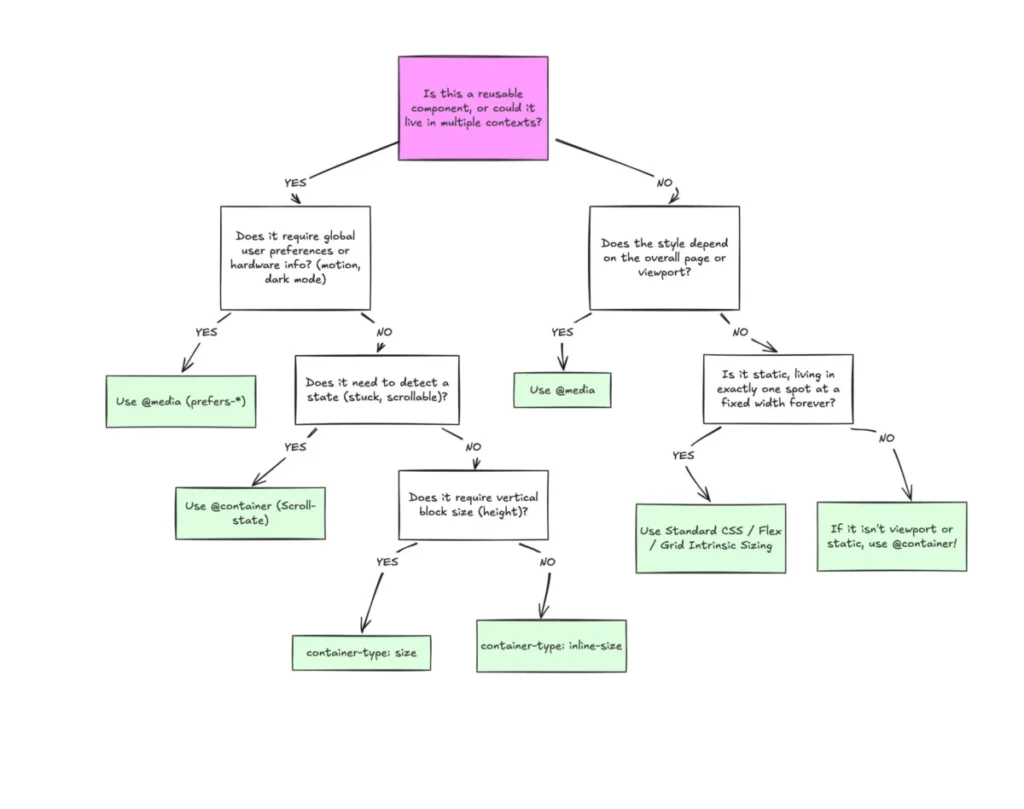
To effectively utilize modern CSS, developers must categorize layout requirements. Macro-layouts refer to the page-level structure: the header, footer, and primary grid columns that organize the viewport. These elements remain best served by traditional media queries, as they are inherently tied to the device’s physical screen size and orientation.
Conversely, micro-layouts refer to individual components: cards, widgets, navigation menus, and form fields. These elements should function independently of the page container. By utilizing container-type: inline-size, a developer instructs the browser to monitor the specific parent element. If that parent is a sidebar, the component adapts to the sidebar’s width. If that same component is moved to a full-width section, it automatically expands, regardless of the device’s screen size. This shift transforms components from static, brittle objects into modular, context-aware entities.

Technical Implications and Data Accuracy
The technical implementation of container queries goes beyond simple layout shifts. One of the most significant advancements is the use of container-relative units—cqi (container query inline-size) and cqb (container query block-size). When combined with the CSS clamp() function, these units enable fluid typography that scales in direct proportion to the component’s space rather than the viewport.
However, the transition is not without challenges. Critics of premature adoption point to three primary hurdles:
- The Self-Querying Paradox: A container cannot query its own dimensions. To apply container queries, developers must introduce a parent wrapper. This requires a disciplined approach to HTML structure, which some legacy projects find difficult to retrofit.
- Layout Collapse: When using
container-type: size, the browser calculates dimensions without regarding the element’s children. If an explicit height is not provided, the element may collapse to zero pixels, rendering the content invisible. This is a common pitfall for developers accustomed to the more forgiving nature of media queries. - Custom Property Limitations: Current specifications do not allow for querying custom properties (CSS variables). This is a safety mechanism designed to prevent circular dependencies and performance degradation. As the W3C continues to refine the CSS Containment Module, this remains a point of contention for developers seeking a more dynamic, variable-driven approach.
Industry Impact and Future Outlook
The broader implication of this stagnation is a persistent "responsive debt." As websites grow more complex, the cost of maintaining brittle, media-query-heavy CSS increases. Organizations that have successfully adopted container queries report a reduction in codebase complexity and an increase in component reusability.
The industry is currently at a crossroads. As frameworks like React, Vue, and Svelte push for more granular componentization, the underlying CSS must align with this architectural trend. The continued reliance on media queries for component-level logic represents a failure to modernize the CSS toolset, resulting in designs that are less resilient to the realities of modern multi-device browsing.

For developers and organizations looking to optimize their workflow, the focus should shift from "device-first" to "container-first" development. By treating the container as the primary driver of layout logic, developers can create interfaces that are not only more robust but also more efficient to maintain. The technology exists, the browser support is nearly universal, and the performance benefits are documented; the final barrier to adoption is purely pedagogical. The era of the viewport-centric layout is effectively over, and the era of the container-aware component has already begun, even if the industry has been slow to recognize the change.