
Despite broad browser support, CSS container queries remain a significantly underutilized feature in modern web development, with industry data suggesting that the majority of developers have yet to integrate them into their production workflows. While media queries have served as the cornerstone of responsive design since their introduction in CSS3, the advent of container queries represents a fundamental shift in how components adapt to their surroundings. By allowing elements to respond to the size of their parent container rather than the total width of the browser viewport, this technology solves long-standing issues regarding component modularity and layout integrity.
The Evolution of Responsive Design
The history of web design is marked by a transition from fixed-width layouts to the fluid, responsive architectures common today. Media queries, introduced by the W3C in 2012, allowed developers to adjust page layouts based on the characteristics of the device, primarily screen width. This approach proved transformative for the mobile web, enabling a single codebase to support smartphones, tablets, and desktops.
However, as design systems shifted toward modular, component-based architectures—exemplified by the rise of frameworks like React, Vue, and Angular—the limitations of viewport-based design became apparent. A card component, for instance, might be designed to display horizontally on a desktop and vertically on a phone. When that same card is placed inside a narrow sidebar on a large desktop monitor, media queries often fail to account for the restricted space, causing the component to break or display awkwardly. The web community had identified this "element query" problem as a top priority for years, leading to the eventual implementation of the CSS Containment Module Level 3 specification.

Data and Adoption Trends
Current adoption metrics highlight a striking gap between awareness and implementation. According to the 2025 State of CSS survey, while 86% of developers are aware of the existence of container queries, only 41.4% have actively implemented them in their projects. This is despite the feature reaching roughly 94% global browser support, covering nearly all modern versions of Chrome, Edge, Firefox, and Safari.
Industry analysts note that this hesitation often stems from a conceptual misunderstanding. Developers frequently treat container queries as a drop-in replacement for media queries, leading to confusion when the syntax or behavior does not produce the expected results. The technical hurdle is not necessarily the complexity of the CSS itself, but the paradigm shift required to stop thinking about the "viewport" as the ultimate authority for layout decisions.
Technical Discrepancies: Media Queries vs. Container Queries
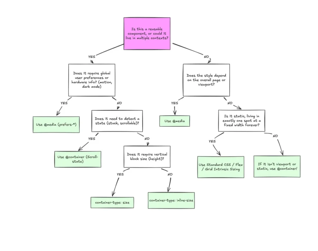
To understand why adoption has been sluggish, one must examine the fundamental differences between these two systems. Media queries are outward-looking; they query the user agent—the browser window—for information regarding screen size, orientation, and device capabilities. They are inherently "macro-level" tools, best suited for defining the broad structure of a page, such as shifting from a single-column to a multi-column grid.
In contrast, container queries are inward-looking. They allow a specific element to monitor its own parent container. By using the container-type property, a developer can define an element as a "container," and then use the @container at-rule to apply styles based on the space available within that specific parent. This allows for "micro-level" layout adjustments. A component can now be truly autonomous; if it is moved from a main content area to a narrow sidebar, it can automatically reorganize its internal structure (such as collapsing a flex-row to a flex-column) without needing to know the size of the viewport.

Practical Implications and Implementation
The shift toward container-based logic is particularly powerful for fluid typography and complex UI patterns. Traditional fluid typography, often achieved through clamp() functions tied to viewport units (vw, vh), can fail when a component is constrained within a small container. Container query units—such as cqi (container query inline-size)—allow font sizes to scale in direct proportion to the component’s parent, ensuring consistent readability regardless of where the element is placed.
Furthermore, container queries enable advanced layout logic that was previously only possible with JavaScript. For instance, detecting when a flexbox container wraps its items is traditionally impossible with CSS alone. By using a container query, developers can observe the size of the flex item itself. When the parent container shrinks to a point where the item must wrap, the container query triggers a style change, allowing the component to adapt gracefully. This reduces the reliance on heavy JavaScript libraries and ResizeObserver APIs, contributing to better performance and reduced page complexity.
Potential Pitfalls and Best Practices
Despite the clear advantages, the implementation of container queries requires a careful approach to avoid common pitfalls. One significant limitation is that an element cannot query itself, as this would create an infinite loop. Developers must ensure there is a clear parent-child relationship where the parent acts as the container and the child is the element being styled.
Additionally, the use of container-type: size requires caution. This property forces the browser to calculate the container’s dimensions independently of its contents, which can result in the container collapsing to a height of zero if an explicit height or aspect ratio is not defined. In most scenarios, container-type: inline-size is the preferred choice, as it allows the container to grow naturally based on its children while still providing enough data for the query to function.

Another constraint is the current inability to use CSS custom properties (variables) directly within the container query condition. Because custom properties depend on the DOM cascade, allowing them within the query itself could lead to circular logic dependencies. As a result, developers must use hard-coded values or pre-defined breakpoints for now.
The Road Ahead
As the web continues to embrace component-driven design, the role of container queries is expected to expand. The "macro vs. micro" distinction provides a clear framework for developers: use media queries for page-level structural decisions, such as site-wide grids and global navigation, and reserve container queries for modular, reusable components that need to remain responsive in diverse contexts.
The transition to container-based responsive design is more than a technical upgrade; it is a shift in philosophy. By moving away from the "viewport-as-proxy" model, developers can build more resilient, maintainable, and flexible user interfaces. The 94% browser support threshold indicates that the infrastructure is ready; the next step for the industry is to refine the design patterns that leverage this capability to its fullest potential. With the current trend of component-first development, the adoption of container queries is likely to rise as developers move toward cleaner, more encapsulated styling strategies, ultimately resulting in a more robust and responsive web for the end user.