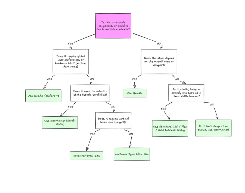

Despite broad browser support, container queries remain one of the most underutilized and frequently misunderstood advancements in modern front-end web development. While media queries have served as the backbone of responsive design for nearly two decades, the evolution of component-based architecture has exposed the inherent limitations of viewport-centric styling. Today, CSS container queries offer a sophisticated alternative, allowing individual interface components to respond dynamically to the specific space they occupy rather than the size of the user’s screen.
The Evolution of Responsive Design
To understand the significance of container queries, one must look at the historical context of web design. When responsive web design first emerged in 2010, the focus was on the "macro" layout—adjusting the overall page structure as the browser viewport changed. The W3C standardized media queries to allow developers to query the dimensions of the browser window. For years, this was the industry standard.
However, the industry shifted toward component-based frameworks like React, Vue, and Web Components. Developers began building modular interfaces where a single "card" or "widget" might be reused in a full-width main content area, a narrow sidebar, or a dense grid. In this paradigm, the viewport is an unreliable proxy for the component’s needs. If a card is placed in a 300px-wide sidebar on a 1920px-wide desktop monitor, a media query checking for "desktop" widths will force the component into a wide-screen layout, leading to visual breakage or content cramping.

Data and Adoption Trends
The disparity between the capability and the adoption of this technology is stark. As of early 2026, CSS container queries boast approximately 94% global browser support, according to data from Can I Use. Despite this, the 2025 State of CSS survey revealed a significant gap in implementation: while 86% of professional developers are aware of the feature, only 41.4% have actively integrated it into their production workflows.
Industry experts, including noted CSS educator Kevin Powell, have highlighted this trend as a critical failure in modernizing web development stacks. The inability to move away from legacy viewport-based thinking is often cited as the primary hurdle. When the feature was first introduced, many developers treated it as a direct replacement for media queries, failing to recognize that it represents a fundamental shift in layout logic—moving from external constraints to internal context.
Technical Distinction: Macro vs. Micro Layouts
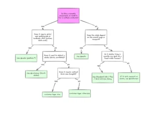
The primary challenge in adoption lies in distinguishing between "macro" and "micro" layout management. Media queries remain the optimal tool for macro layouts, such as managing page-wide navigation, global font-size scaling based on system preferences (like prefers-color-scheme), and overall grid structure. These elements are inherently tied to the browser environment.
Conversely, container queries excel at micro layouts. By defining a container using the container-type property, developers can create self-contained components that query their own parent wrappers. For example, by setting container-type: inline-size, a component can effectively ask, "How much horizontal space is available in my immediate parent?" This allows the card in the sidebar to collapse into a vertical stack while the same card in the main feed expands into a horizontal layout, all without the developer needing to know the specific pixel width of the viewport.

Advanced Capabilities and Fluidity
The utility of container queries extends beyond simple structural changes; it includes the introduction of container-relative units such as cqi (container query inline-size). When combined with the CSS clamp() function, these units enable fluid typography that scales in relation to the component container. This solves the long-standing issue of text becoming disproportionately large or small when a component is moved between different structural contexts.
Furthermore, container queries address complex layout states that were previously only accessible via JavaScript. One notable example is the "flex-wrap" detection problem. Traditionally, CSS had no mechanism to detect when flex items wrapped to a new line, often necessitating the use of the ResizeObserver API in JavaScript. By applying a container query to a flex item, developers can now trigger style changes the moment that specific item reaches a threshold width, effectively offloading logic from the main thread and improving site performance.
Practical Implementation and Limitations
While powerful, container queries are not a universal panacea and come with specific architectural requirements. Developers must ensure a proper parent-child relationship in the DOM, as an element cannot query itself for size—an operation that would create a circular dependency. Implementing these queries often requires adding a wrapper element to the DOM, which may necessitate minor adjustments to existing HTML structures.
Moreover, developers must exercise caution when using container-type: size. Because this property instructs the browser to calculate the container’s dimensions independently of its contents, an element without an explicit height or aspect ratio will collapse to zero pixels. Finally, current CSS specifications do not support using custom properties (CSS variables) directly within container query breakpoints. This limitation exists because custom properties can cascade, leading to potential infinite loops if a container query were allowed to change the very variable that determines its own breakpoint.

The Path Forward for Web Architecture
The transition toward container-based logic marks a maturation of the web as a platform. As the web becomes increasingly fragmented—with over 2,300 unique viewport sizes identified in recent technical audits—relying on the viewport as a single source of truth is no longer sustainable.
The industry’s slow adoption of container queries may be attributed to the comfort of established workflows, but the benefits of component reusability and reduced JavaScript reliance are becoming too significant to ignore. As design systems continue to grow in complexity, the ability to encapsulate layout logic within the component itself will likely move from an "advanced feature" to a core requirement for front-end engineers. For developers looking to future-proof their interfaces, the shift from "How big is the screen?" to "How big is my container?" is the next essential step in the evolution of professional web development.