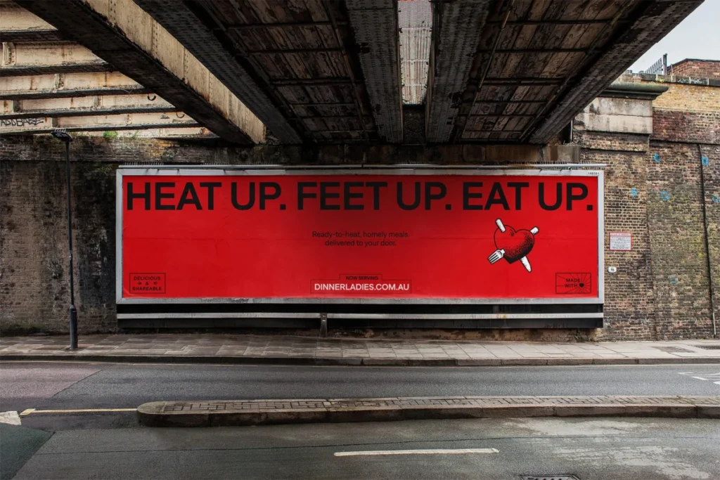

In a strategic move designed to amplify its established reputation for homestyle comfort and challenge the often-clichéd landscape of the frozen meal industry, The Dinner Ladies has unveiled a comprehensive rebrand. This initiative, spearheaded by the creative agency Universal Favourite, aims to contemporize the visual and verbal identity of Australia’s leading frozen meal service, ensuring it resonates with its growing customer base while honouring its unique origins. The rebrand encompasses everything from the company’s website and packaging to its overall brand narrative, signaling a renewed commitment to delivering delicious, no-fuss meals to busy Australians.

From Backyard Shed to National Reach: A Legacy of Convenience
The Dinner Ladies’ story began in 2007, not in a corporate boardroom, but in the humble setting of a Sydney-side backyard shed. Founded by two enterprising women, the company emerged from a profound understanding of the daily dinner-time chaos faced by families. Their vision was simple yet powerful: to offer ready-to-heat meals that tasted as good as if they were homemade, thereby alleviating the pressure on parents and caregivers. Over the past seventeen years, The Dinner Ladies have cultivated a loyal following, becoming a trusted name synonymous with quality, flavour, and genuine convenience. Their commitment to delivering meals that meet the discerning standards of a "mum’s tick of approval" has remained a cornerstone of their brand ethos.

The Australian market for pre-prepared meal delivery is undeniably crowded. It is a sector often characterized by generic messaging, with competitors frequently touting similar claims of health, convenience, or superior taste. This saturation has, in many cases, led to a dilution of brand personality and a lack of genuine relatability for consumers who are, by necessity, time-poor. These individuals are seeking more than just a quick meal; they desire simple, high-quality, home-style food that genuinely simplifies their lives. It is within this context that The Dinner Ladies have carved out a distinct niche, positioning themselves as a flavour-forward service that handles dinner, freeing up valuable time for life’s other pursuits.

Reinvigorating a Beloved Brand: The Genesis of the Rebrand
While The Dinner Ladies had garnered widespread recognition and affection for their distinctive, no-nonsense, and sometimes audacious approach, their visual identity had, over time, become somewhat diluted. The original "attitudinal punch" had waned, necessitating a significant refresh to reflect the company’s continued growth and ambition. The objective of the rebrand was to recapture the essence of their early brand iterations, infusing it with a renewed energy and clarity that would communicate their position as a serious player in the meal delivery sector.

Universal Favourite embarked on an immersive journey to understand the core of The Dinner Ladies’ identity. This involved delving into past website designs, examining hand-drawn logos sketched on napkins, and visiting both the original backyard shed where the business took root and the modern factory where its operations now thrive. This deep dive allowed the agency to identify and leverage the most potent existing brand elements. Key among these were the early, trad-tattoo-esque illustrations and a consciously cultivated "anti-mumsy" stereotype that set them apart from competitors. These foundational elements were then reinterpreted for a contemporary audience, forming the bedrock of the new visual identity. The guiding principle, "Food from the Heart," became a central theme, with every element of the revamped identity designed to encapsulate the brand’s essence and its unwavering, straightforward confidence in simplifying dinnertime.

A Refined Emblem: Logo Evolution and Artistic Collaboration
A pivotal aspect of the rebrand was the meticulous refinement of the logo. The original logo, which featured a heart intertwined with the wordmark, was deconstructed to enhance its flexibility and readability across all platforms. By separating the heart element, the logo gained versatility, allowing it to be used more effectively at various scales and on diverse applications. The agency designed a custom heart graphic, which, in conjunction with the wordmark, was then entrusted to illustrator Jake Foreman. Foreman, known for his distinctive style, was tasked with redrawing and personalizing these elements with his signature texture and gritty stipple, imbuing the brand with a unique artistic flair. This collaboration ensured that the logo retained its established recognition while gaining a fresh, contemporary edge.

The existing brand color palette, a distinct red that had become a recognizable asset within the meal delivery category, was retained but refined with a brighter, more modern hue. This hero red is now complemented by a secondary palette of warm, approachable, and subtly retro colors. This balanced palette offers a range of vibrant and engaging combinations, particularly effective for digital applications where visual dynamism is crucial.

Typography with Personality: The Denim Collection
For the brand’s typography, the selection fell upon the "Denim" collection by Displaay Type Foundry. This typeface was chosen for its ability to convey the brand’s confident personality while maintaining practicality and legibility. "Denim Wide" is employed for headings and calls to action, effectively commanding attention and conveying a sense of boldness. The regular cut of Denim provides a friendly, clean, and highly legible option for subheadings and body copy. The subtle detailing within the typeface allows it to function as a prominent hero element, showcasing the brand’s bold tone of voice, while also seamlessly integrating with more expressive design components. This dual functionality ensures that the typography is both impactful and adaptable to a variety of communication needs.

Crafting a Voice: The Art of "No-BS" Communication
The tone of voice for The Dinner Ladies was carefully crafted to encapsulate their joyful, cheeky, yet comforting personality, while consciously avoiding patronizing "mumsy" tropes. The brand sought to strike a delicate balance between an empathetic caregiver and the charmingly rebellious spirit of its founders. In an industry often characterized by an overabundance of insincere friendliness, The Dinner Ladies’ verbal identity, developed in collaboration with copywriter Cat Wall, offers a refreshing departure. It injects a sprinkle of irreverence and a straightforward, no-nonsense approach that directly addresses the needs and realities of their target audience. This authentic voice aims to resonate deeply with consumers who appreciate directness and genuine understanding.

Capturing Real Life: Photography that Tells a Story
The rebrand’s photography strategy was designed to celebrate the authentic, often messy, reality of dinnertime. Eschewing overly stylized or staged imagery, the campaign embraced raw, unvarnished moments. The shoot captured the remnants of a satisfying meal alongside the preparation of a new one, the joyful chaos of family interactions, and even the endearing mess left by a toddler enjoying their food. This approach directly reflects the brand’s tell-it-like-it-is attitude, showcasing generous, mouth-watering food presented in a relatable, everyday context.

The visual narrative was brought to life through a talented team of creatives. Photographer Alana Dimou, stylist Jerrie-Joy Redman-Lloyd, wardrobe stylist Oriana De Luca, hair and makeup artist Gavin Anesbury, and producer Michaela Le collaborated to create a series of images characterized by warm, natural lighting. Quirky styling choices, strategic pops of color and pattern, and intentional "chaos" contributed to a scene that felt both homely and inviting, with an undeniable hint of rebellion. This visual storytelling reinforces the brand’s promise of delicious food that simplifies life, captured in moments of genuine connection and enjoyment.

Illustrative Roots: A Modern Take on Traditional Artistry
Illustration has always been a significant component of The Dinner Ladies’ brand identity. The rebrand sought to honor this heritage by evolving the original illustrations’ punk, rough-around-the-edges flair, which drew inspiration from traditional tattoo artistry. Further collaboration with illustrator Jake Foreman resulted in a suite of illustrations designed to serve as both personality-rich storytelling devices and functional brand elements. Smaller illustrations depict specific product offerings, while a hero illustration encapsulates the love and care that goes into every Dinner Ladies dish, symbolizing the comforting, shared experiences that gather around the dining table. These illustrations are further supported by a collection of "type-furniture" elements, designed to enhance layouts and add further character to the brand’s visual communication.

Packaging for Practicality: Color-Coding for Clarity
Recognizing that their products are often stored in freezers and accessed in haste, legibility and ease of differentiation were paramount in the packaging design. A sophisticated color-coded system has been implemented to allow customers to quickly identify different protein groups at a glance. This intuitive approach ensures that consumers can effortlessly locate their desired crowd-pleasing meal, saving valuable time and reducing frustration. The packaging now not only protects the product but also serves as a clear and functional communication tool, reinforcing the brand’s commitment to convenience.

A Future-Proofed Brand: Ready for the Next Chapter
With this comprehensive rebrand, The Dinner Ladies are equipped with a visual and verbal identity that not only celebrates their seventeen-year legacy but also provides a robust foundation for future success. The flexible design system, coupled with a punchy and authentic tone of voice, pays homage to their tenacious origins, the pioneering spirit of the founding ladies, and their enduring mission to infuse joy into dinnertime. The Dinner Ladies can now stand confidently with a brand that truly reflects their readiness to serve delicious, wholesome meals to an entire nation, solidifying their position as Australia’s tastiest frozen meal service. This strategic evolution ensures they remain relevant, relatable, and resonant in an ever-evolving market.