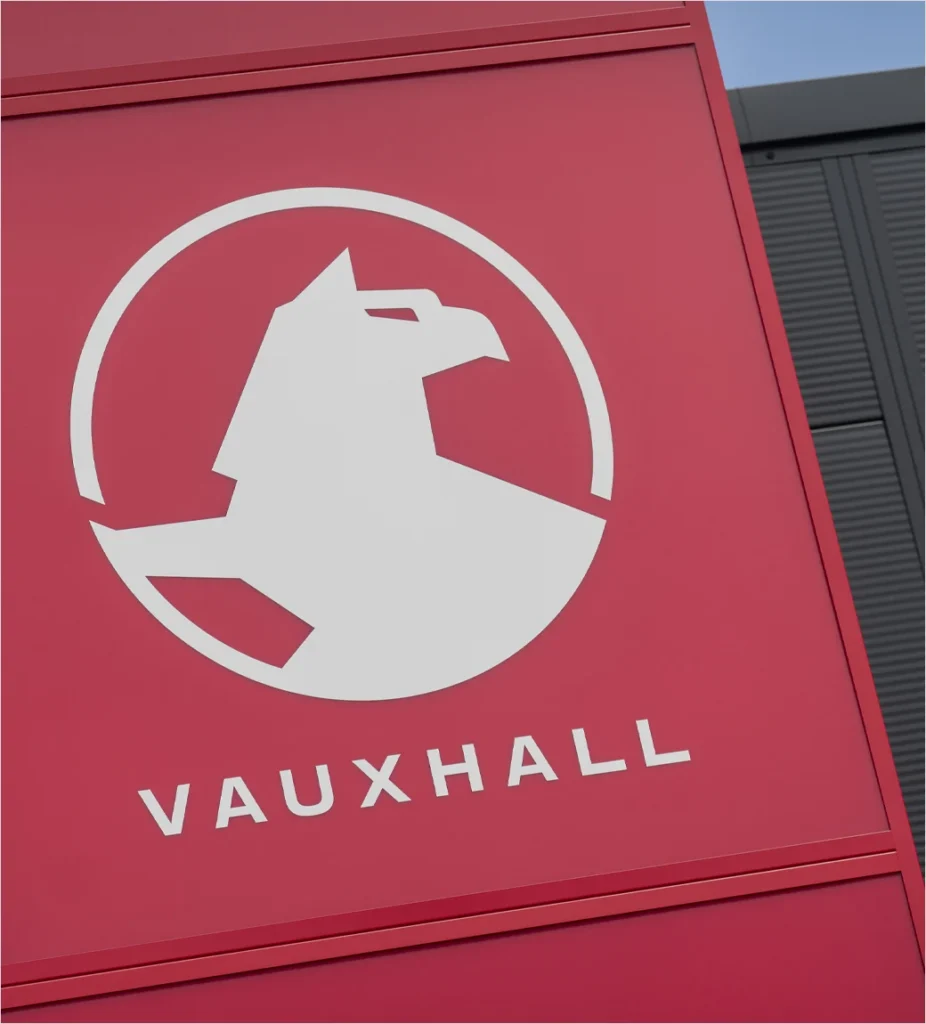

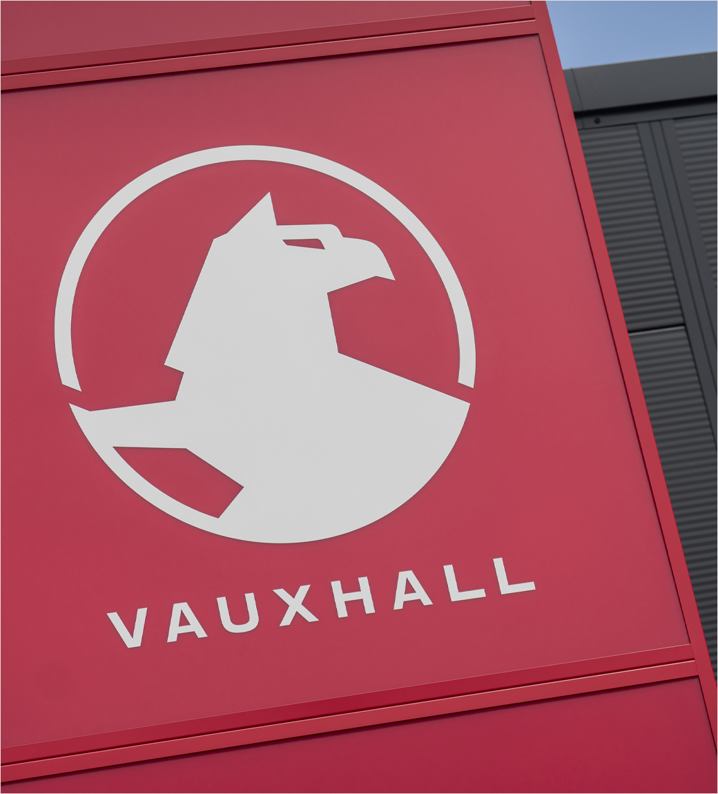
British automotive manufacturer Vauxhall has officially unveiled a contemporary iteration of its iconic "Griffin" emblem, marking the thirteenth major redesign in the brand’s storied history. The updated visual identity introduces a sharper, cleaner aesthetic that completely removes the traditional background flag, aligning with the company’s modern "Bold and Pure" design philosophy. This strategic brand evolution is tailored specifically to optimize the emblem’s appearance on modern vehicle architectures, particularly the illuminated Vizor grilles that have rapidly become a signature design element across Vauxhall’s latest lineup of electrified passenger vehicles.

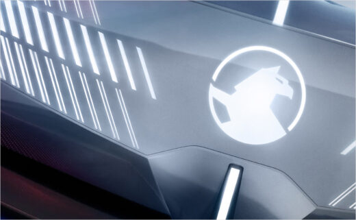
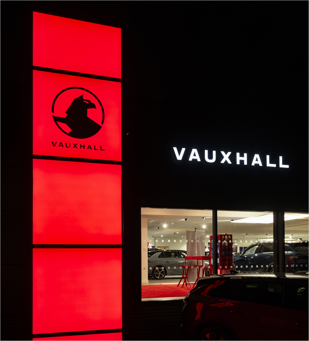
The refined emblem is engineered to meet the demands of contemporary automotive manufacturing and lighting technology. As automakers increasingly transition toward digital integration, minimalist branding, and illuminated exterior components, traditional, intricate logos often struggle with clarity and digital reproduction. By streamlining the Griffin’s linework and removing extraneous background elements, Vauxhall’s design team has ensured that the emblem remains instantly recognizable, crisp, and visually striking whether viewed on a smartphone screen, a dealership storefront, or glowing brightly on the front fascia of a zero-emission vehicle at night.
Engineering for the Electric Era
The transition toward a simplified logo is far more than a purely aesthetic choice; it represents a fundamental alignment with the brand’s mechanical and digital future. According to the Coventry-headquartered marque, the streamlined badge was specifically conceived to appear sharper on the illuminated Vizor grille. This innovative front-end treatment traces its direct lineage back to the acclaimed 2023 Vauxhall Experimental Concept and made its successful mass-production debut on the second-generation Grandland SUV in 2024.

Mark Adams, Vauxhall’s Vice-President of Design, emphasized the delicate balance between honoring a 120-year automotive heritage and preparing the brand for the next generation of electrified mobility. "The Griffin emblem is instantly recognisable, with Vauxhalls seen on almost every street in Britain," Adams noted. "Having adorned our vehicles in different forms for more than 120 years, we wanted to retain its essential elements while streamlining it for the next generation of electrified vehicles. As the Griffin is now illuminated on the front of our latest models, this simpler design also makes it clearer and easier to identify."
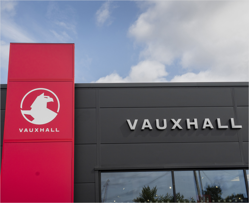
The debut of this thirteenth iteration will take place on the international stage at the upcoming Paris Motor Show. There, the new logo will adorn an all-new concept vehicle meticulously engineered as an aerodynamic estate model, signaling the brand’s ongoing commitment to maximizing driving range and efficiency through intelligent aerodynamic design. Alongside the physical badge appearing on vehicles, the brand refresh extends comprehensively into a newly conceptualized retailer look and an integrated multi-platform marketing campaign designed to unify the customer experience across digital and physical touchpoints.

A 700-Year Heraldic Chronology
To fully appreciate the weight of Vauxhall’s modern rebranding, one must look back through more than seven centuries of history, tracing the motif from medieval English nobility to the assembly lines of the twenty-first century. The origins of the Griffin symbol predate the automotive industry by hundreds of years, finding their roots in the thirteenth-century coat of arms of Sir Falkes de Bréauté, an ambitious and powerful Anglo-Norman mercenary who served King John.
Following his military service and loyalty to the Crown, Falkes de Bréauté was granted the Manor of Luton and subsequently married Margaret de Redvers, a wealthy heiress who possessed extensive lands situated south of the Thames River. The estate established by Falkes in this region was initially referred to as "Fulk’s Hall," a linguistic ancestor that gradually corrupted and evolved over centuries into the modern placename, Vauxhall. Centuries later, the famous Vauxhall Pleasure Gardens were established precisely where the historical hall once stood, cementing the name into the geographic and cultural fabric of London.
The bridge from real estate and pleasure gardens to heavy industry and engineering occurred in 1857, when Scottish engineer Alexander Wilson founded the Vauxhall Ironworks on the south bank of the Thames. Initially specializing in marine engines and pumps, the enterprise eventually shifted its focus toward the burgeoning internal combustion engine market.
Interestingly, the earliest motorcars produced by Vauxhall from 1903 onward did not prominently feature the company name on their bodies. It was only as automotive manufacturing matured and upright, imposing radiators became the industry standard that the "Vauxhall" script and the early "VM" monogram began appearing on vehicle radiator caps, a practice that continued until 1913.
The turning point for the brand’s visual identity arrived via an internal design competition won by a young company apprentice named Harry Varley. Drawing direct inspiration from the historical heraldic symbol of Falkes de Bréauté, Varley conceptualized and executed the very first round Griffin badge, forever binding the medieval knight’s coat of arms to the identity of the British automaker.
Since the introduction of that initial round badge in the 1920s, the Griffin has undergone a dozen major stylistic evolutions. Each redesign reflected the prevailing industrial design trends of its era—moving from ornate, hand-crafted metallic medallions through mid-century modern simplifications, corporate geometric blocks, and finally into the sleek, digital-first vector graphics of the modern era. The previous major brand redesign occurred just over five years ago, making this latest thirteenth iteration a carefully timed step forward for a marque actively navigating the transition to full electrification.
Strategic Implications and Market Context
The rollout of Vauxhall’s new logo arrives at a critical juncture for both the brand and the wider European automotive landscape. As legacy manufacturers face mounting competitive pressure from new market entrants, stricter environmental regulations, and the complex logistical challenges of transitioning entire vehicle architectures to battery-electric power, visual identity plays a vital role in signaling forward momentum to consumers.
From a brand architecture perspective, simplifying corporate insignia is an industry-wide trend adopted by major global manufacturers over recent years, including Volkswagen, BMW, Nissan, and Peugeot. These redesigns are universally driven by the necessity of "flat design"—ensuring that logos render flawlessly across smartphone applications, digital instrument clusters, social media avatars, and illuminated physical hardware. By removing unnecessary gradients, fine internal lines, and extraneous graphical elements like the historic background flag, Vauxhall has future-proofed its primary visual asset for digital integration.
Furthermore, tying the launch of the new logo to an aero-efficient estate concept at the Paris Motor Show underscores a clear product strategy. Estate cars, while facing fierce competition from crossover SUVs, remain vital fleet and family vehicles where aerodynamic efficiency directly translates into valuable extra miles of electric range. By anchoring the rebranding to a vehicle designed specifically around aerodynamic performance, Vauxhall is communicating a cohesive corporate message: heritage matters, but efficiency and forward-looking engineering are paramount.
As the new visual identity rolls out across international motor shows, retail spaces, and ultimately onto consumer driveways via the latest generation of electrified passenger cars, it represents a calculated bridging of past and future. More than a century after an apprentice named Harry Varley first sketched a medieval knight’s beast onto a radiator cap, the Vauxhall Griffin remains an enduring symbol of British automotive culture—sharpened, illuminated, and ready for the roads of tomorrow.