
Mountainview Brewing Co., strategically positioned in the picturesque town of Hope, British Columbia, at the foot of the Cascade foothills, has undergone a comprehensive visual identity and brand voice development. Nestled within a region famously known for the 1982 filming of the action classic "Rambo: First Blood," the brewery occupies a unique niche, serving both the local community and the transient highway travelers who make their way through this vital mountain pass. The rebranding effort, led by a creative agency, aimed to solidify Mountainview’s dual identity as a community hub and a destination for those seeking a respite on their journeys, offering an extensive selection of both approachable, everyday craft beers and more adventurous, experimental brews.

The Genesis of a Brand: From Mechanic Garage to Craft Brewery
The establishment of Mountainview Brewing Co. within a repurposed mechanic garage speaks to its origins and its commitment to an authentic, unpretentious craft beer experience. This unique setting provides a tangible connection to the industrial heritage of the area while offering a warm and inviting atmosphere for patrons. The brewery’s location in Hope, BC, a town that serves as a gateway to the rugged beauty of the surrounding mountains, presents a compelling narrative for its brand. This narrative was central to the development of its visual identity and brand voice, aiming to capture the spirit of adventure, community, and the raw, natural beauty of its surroundings.
The collaborative process with the branding agency, which began from the inception of the project, involved an in-depth exploration of Mountainview’s core values and target audience. The objective was to create a brand suite that was not only aesthetically pleasing but also functionally robust, capable of encompassing the brewery’s diverse offerings and operational needs. This extensive undertaking included the design and production management of crucial brand touchpoints, from the visible brewery signage and intuitive wayfinding systems to flexible menu designs, bespoke tasting flight trays, impactful packaging for their canned beverages, and a range of interior collateral and merchandise designed to enhance the customer experience. The careful selection of the Aktiv Grotesk typeface by Dalton Maag underscores a commitment to clarity, modernity, and a professional aesthetic that complements the brewery’s overall vision.

Crafting a Visual Identity: More Than Just a Logo
The development of Mountainview Brewing Co.’s brand identity was a multifaceted process that extended beyond mere visual aesthetics. It involved the creation of a cohesive brand voice that resonates with the brewery’s ethos – one of authenticity, community, and a passion for craft beer. This voice is evident across all facets of their brand presentation, from their marketing materials to their interactions with customers.
The visual identity is characterized by its strong connection to the natural landscape that surrounds Hope, BC. Imagery often evokes the ruggedness of the Cascade mountains, the clear waters of nearby rivers, and the sense of exploration and adventure that draws people to the region. This is reflected in the use of color palettes, typography, and graphic elements that are both contemporary and timeless.

Key Components of the Brand Suite:
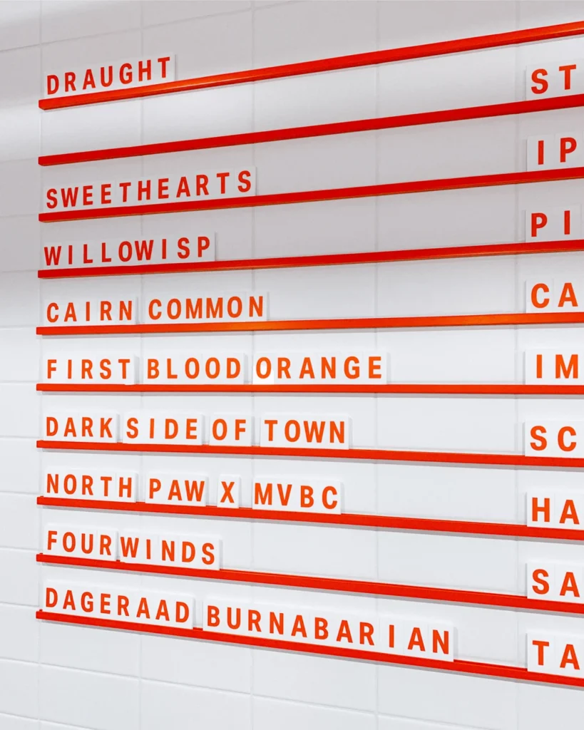
- Brewery Signage and Wayfinding: Designed to be both prominent and informative, ensuring that visitors can easily locate and navigate the brewery. The signage aims to be an extension of the brand’s personality, welcoming and indicative of the quality craft beer experience within.
- Flexible Menu Systems: Recognizing the dynamic nature of a craft brewery’s offerings, the menu systems were designed for adaptability. This allows for the easy integration of new brews, seasonal specials, and food pairings without compromising the overall brand integrity. The design prioritizes readability and visual appeal, making the selection process an enjoyable part of the customer’s visit.
- Custom Tasting Flight Trays: These bespoke items serve as functional pieces of art, enhancing the experience of sampling multiple brews. They are designed to be durable, aesthetically pleasing, and capable of showcasing the brewery’s branding, reinforcing the craft quality of the beer itself.
- Packaging Design: The cans for Mountainview Brewing Co. are a critical element of their brand communication, especially for retail sales and off-premise consumption. The designs are intended to stand out on shelves, convey the brewery’s story, and appeal to the discerning craft beer consumer. Each can likely tells a story, whether through imagery, color, or typography, connecting the consumer to the brewery’s identity and its location. The use of Aktiv Grotesk in packaging suggests a deliberate choice for legibility and a modern, clean aesthetic that complements the often intricate designs of craft beer labels.
- Interior Collateral and Merchandise: From coasters and tap handles to t-shirts and glassware, every touchpoint is an opportunity to reinforce the brand. These items are designed to extend the brewery experience beyond the taproom, allowing customers to become brand ambassadors.
The Role of Aktiv Grotesk
The selection of Aktiv Grotesk, a sans-serif typeface developed by Dalton Maag, is a strategic choice that reflects a commitment to a clean, modern, and highly legible brand identity. Aktiv Grotesk is known for its geometric structure, open counters, and excellent readability across a wide range of applications, from small print on packaging to large-scale signage. Its neutrality allows the visual elements of the brand to take center stage, while its inherent clarity ensures that information is easily communicated. This typeface lends a sense of professionalism and sophistication to Mountainview Brewing Co.’s brand, aligning with the quality of their craft beer offerings.

Supporting Data and Context
The craft beer industry in British Columbia, and Canada as a whole, has seen significant growth over the past decade. According to industry reports, the number of craft breweries has steadily increased, leading to a more competitive market. This makes a strong and cohesive brand identity crucial for differentiation and consumer recognition. Mountainview Brewing Co.’s strategic branding aims to capture a share of this growing market by offering a compelling narrative and a memorable visual experience.
The choice of Hope, BC, as a location is also significant. As a town that bridges the Lower Mainland with the interior of British Columbia, it experiences a constant flow of both local residents and tourists. This dual audience requires a brand that can appeal to a broad spectrum of consumers, from those seeking a familiar, comforting pint to those looking for a unique craft beer adventure. The "Rambo: First Blood" connection, while a pop culture nod, also taps into the area’s rugged, adventurous reputation, a theme that can be subtly woven into the brewery’s branding.

Chronology of Development (Inferred)
While a precise timeline is not provided, the development of such a comprehensive brand suite likely follows a phased approach:
- Discovery and Strategy Phase: This initial stage would involve in-depth consultations with Mountainview Brewing Co. to understand their vision, values, target audience, and market position. Research into the local context of Hope, BC, and the broader craft beer landscape would also be conducted.
- Brand Identity Development: This phase would focus on conceptualizing and designing the core visual elements, including logo development, color palettes, typography selection, and the establishment of the brand voice.
- Application Design and Production: Once the core identity is established, it would be applied across various brand touchpoints, as detailed in the brand suite. This would involve designing signage, menus, packaging, and merchandise. Production management would ensure that these elements are manufactured to a high standard.
- Launch and Implementation: The rollout of the new brand across all physical and digital spaces, ensuring consistency and a cohesive customer experience.
- Ongoing Brand Management: Continuous evaluation and refinement of the brand strategy to adapt to market changes and evolving consumer preferences.
Inferred Statements and Reactions
While direct quotes are absent, it can be inferred that Mountainview Brewing Co. has embraced this rebranding with enthusiasm. The investment in a comprehensive visual identity suggests a long-term vision for growth and a commitment to elevating their brand presence. The success of such an initiative often hinges on the brewery’s dedication to consistently delivering on the promise of their brand, both in the quality of their beer and the experience they offer to their customers.

The creative agency involved would likely view this project as a testament to their ability to translate a client’s vision into a tangible and effective brand. Their statement would likely emphasize the collaborative nature of the project and the strategic thinking behind the design decisions.
Broader Impact and Implications
The successful rebranding of Mountainview Brewing Co. has several implications for the brewery and the local tourism landscape:

- Enhanced Brand Recognition: A strong, consistent visual identity makes Mountainview more memorable and recognizable to both locals and travelers. This can translate into increased foot traffic and customer loyalty.
- Competitive Advantage: In a crowded craft beer market, a well-executed brand can significantly differentiate a brewery. Mountainview’s cohesive branding positions it as a professional and quality-conscious establishment.
- Tourism Appeal: The brewery’s branding, deeply connected to its location, can become an attraction in itself, drawing visitors who are interested in experiencing the essence of the region. This can contribute to the local economy and bolster Hope’s reputation as a destination.
- Consistency in Customer Experience: From the moment a potential customer sees the signage to the last sip from a branded glass, the unified brand experience fosters trust and reinforces the brewery’s commitment to quality.
- Foundation for Future Growth: A robust brand identity provides a solid foundation for future expansion, whether it be through new product lines, additional locations, or wider distribution.
The strategic rebranding of Mountainview Brewing Co. is more than just a cosmetic update; it is a fundamental step in solidifying its identity, enhancing its market presence, and ensuring its continued success in the vibrant craft beer scene of British Columbia. The careful integration of its location, its history, and its commitment to craft beer has resulted in a brand that is both authentic and aspirational.


